5 alternatives to dual axis charts
In a previous article, we discussed the common confusions that arise when using dual axis charts. Now let’s talk about what to use instead of dual axis charts. Here are 5 alternatives to dual axis charts.
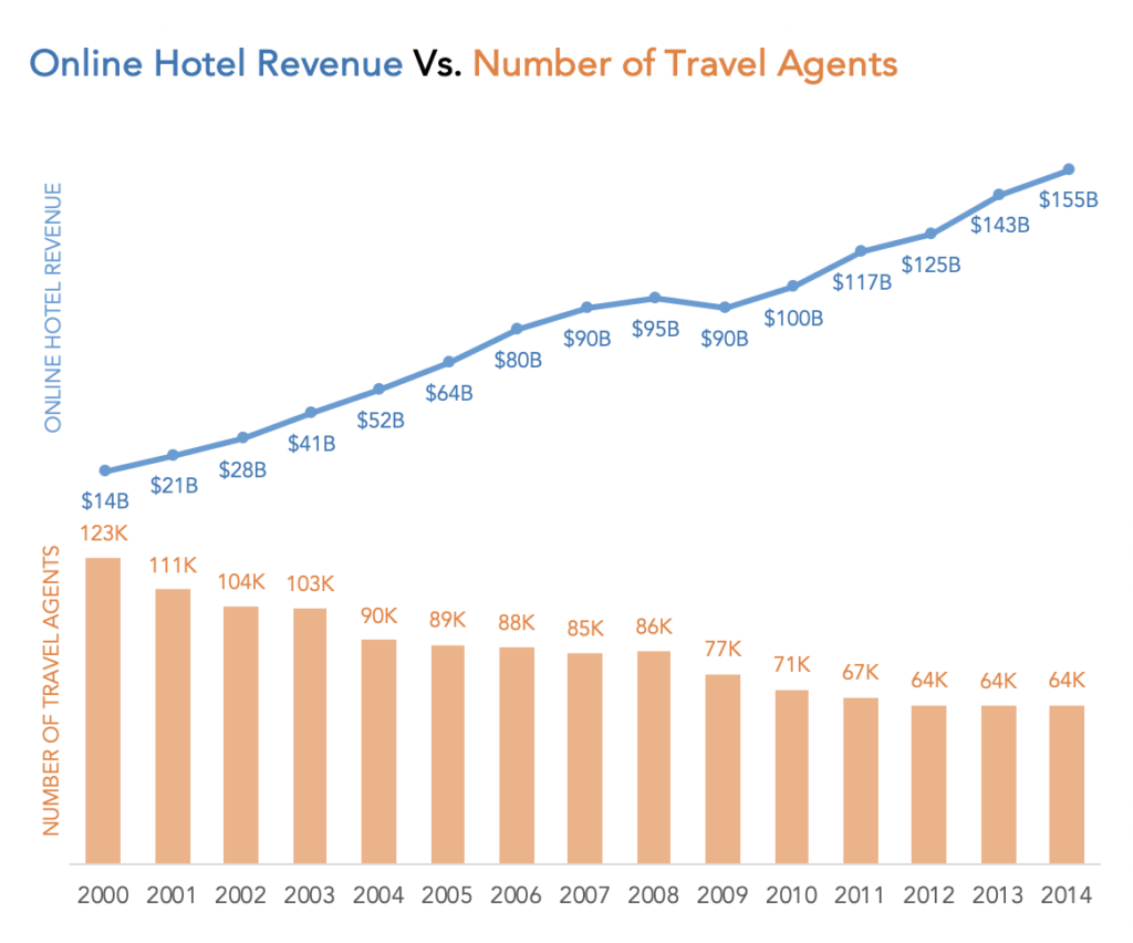
Side-by-side-charts
A simple alternative to dial axis charts is to separate them into two side-by-side charts. This shows each chart with its own axis and eliminates the confusions that dual axis charts create.
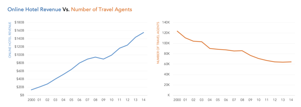
One downside to this approach is the amount of space needed to display two charts. Also, the side-by-side charts are not easy to compare. We can see the overall trend easily but can’t easily compare values for a particular year.
Use 2 charts, but label directly
One of the disadvantages of a dual axis in charts is that it is often not clear which series belongs to which axis. This second approach attempts to solve this confusion by removing the secondary axis or both the axes, and labeling the charts directly.
You will notice that it is much easier to compare the values between the two series with this chart.
The downside of this approach is again the space needed to display both charts.
What if we have space for only one chart?
Prioritizing and labeling
One option is to pick one of the two series, the more important story and just show one chart. We can bring in details about the second series with additional text like annotations.
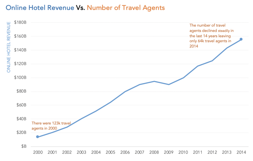
This approach is not an elegant one and will not work for all scenarios. This works well if we are using a dual axis to show the same data in absolute and relative measures – unemployment rate and the number of unemployed people, for example.
Connected scatterplot
In a dual axis chart, there are two continuous variables and we try to show the relationship between these two continuous variables. A scatterplot is used to display the relationship between two variables. Since we are also interested in the rate of change of these variables over time, we can use a connected scatterplot. Scatterplot + time = connected scatterplot.
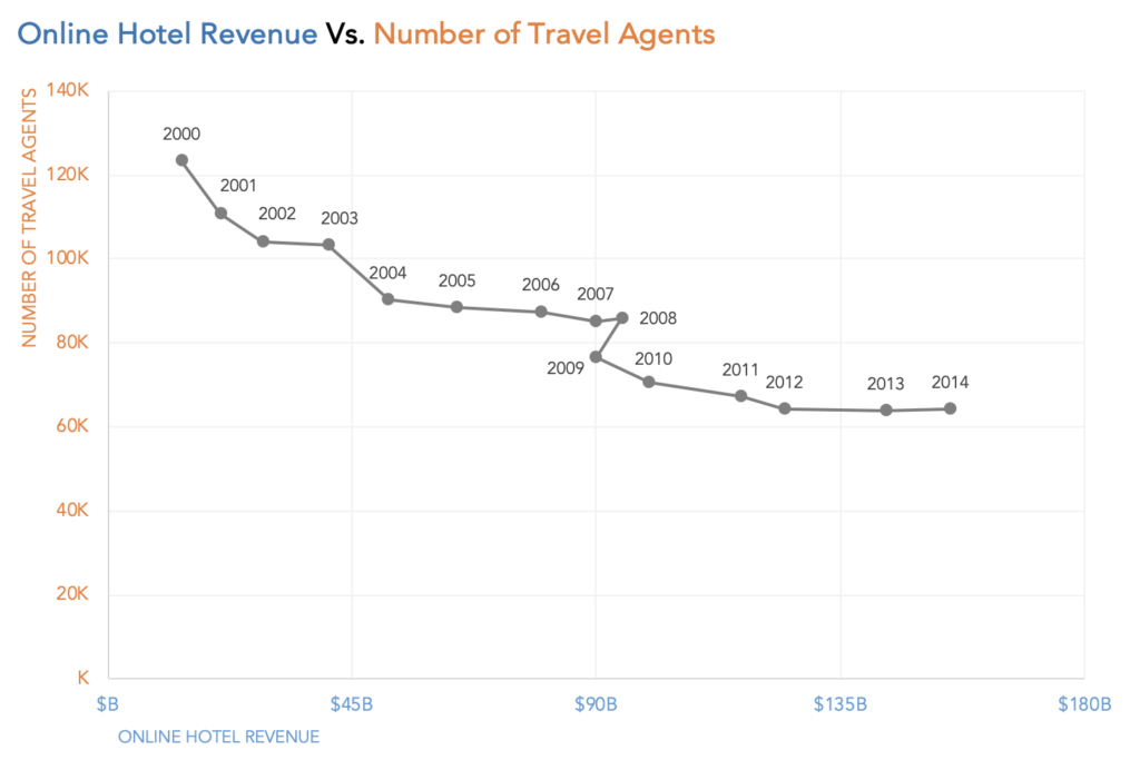
A connected scatterplot is not very intuitive to read but it has awesome storytelling powers.
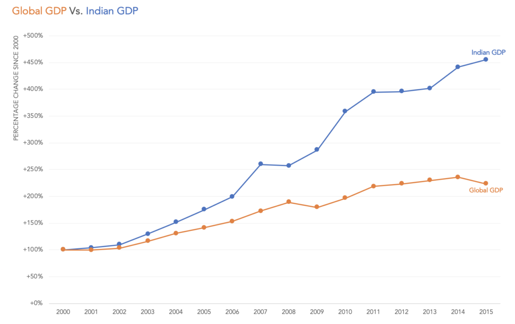
Indexed charts
Indexed charts tell us how two variables changed over time even if they are vastly different. To create an indexed chart, we calculate the relative change of a variable compared to a base number. The base number is the same for both series and replaces the first value in the chart.