5 Tips To Create Functional And Beautiful Bar Charts
Bar charts are one of the most commonly used chart types. They are easy to understand and are great for comparisons. But every so often we come across bar charts that are colorful, poorly designed and misleading.
In this post, I want to give you 5 easy tips to create functional and beautiful bar charts. I have used Microsoft Excel to create all the visuals in this post.
1. Always start the quantitative scale with Zero
Bar charts use the length or height of the bar to encode the numerical value. When the quantitative scale does not begin at 0, the length or width cannot correctly represent the value.
When we read bar charts, we use the length or height of the bars to compare values. If the length or height is incorrect, the comparisons are meaningless.
Let’s understand this with an example:
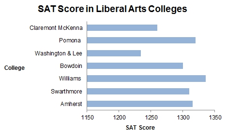
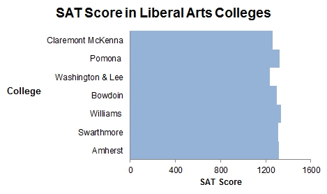
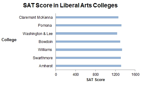
In this visual, it appears as if the SAT scores for Williams are double that of Washington & Lee. Williams has a SAT score of 1336 and Washington & Lee has 1234. The fact that the quantitative scale did not start at zero causes this misrepresentation.
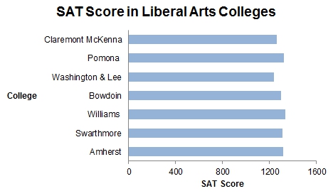
With the quantitative scale starting at zero, we can see the actual relationship between the various SAT scores.
Tip: Excel by default gives a non-zero scale for data such as the one used in this example. Remember to modify the minimum value to zero in “Format Axis”.
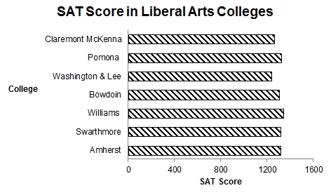
2. Avoid fill patterns
Fill patterns, like horizontal, vertical or diagonal lines, cause a distorting effect on the charts.
For example, this chart with diagonal pattern can create a strange effect on the eyes.
3. Use colors with discretion
When distinct colors are used on the bars, we see them are individual units and this does not encourage comparison.
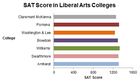
Too many colors, in fact, distract us from comparing individual bar values.
A single color fill works well with bar charts. It provides a sense of grouping and encourages us to compare the bars.
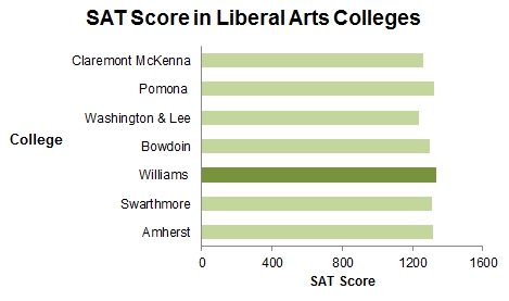
Colors can also be strategically used to highlight some data in the chart. Like in the example below, the dark green color fill is used to highlight that Williams has the highest SAT score in the data set.
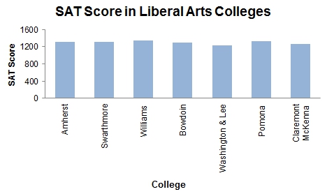
4. If your data labels are too long, consider using a horizontal bar chart
If the labels for your data are very long, vertical bars are not the best idea. Use horizontal bars instead.
If you must use a vertical bar, orient the labels to an angle of 45 degrees or less. As you can see, orienting the labels at 90 degrees makes it very hard to read them.
5. Review the spacing between the bars
The spacing between bars is “Bar width to white space ratio “.
This is mostly a personal preference and there are no rules around what space to use. Having said that, too much white space or bars too close to each other are both not preferred.
I prefer to use 1:1 ratio most times. (The charts in points 1-4 are created with 1:1 spacing). Occasionally I use values anywhere from 1:0.5 to 1:1.5.
Tip: Excel by default provides a 1:1.5 bar width to white space ratio.
So these are my top 5 tips to make bar charts easily readable and pleasing to the eye. What are your top tips for creating bar charts? Please share them in the comments section below.


One Comment