What to keep in mind when creating dual axis charts?
Like with most other charts, dual axis charts have their good and bad. They are often used to compare two data series in a small amount of space. Our aim with data visualization is to help our users understand the story behind the data “accurately”. Dual axis charts in their default form do not always achieve this objective. In this article, let’s talk about the common confusions that arise with these charts. Understanding these can help us design dual axis charts with more care.
What are dual axis charts?
Dual axis charts plot two data series on the same chart using a secondary axis.
Why do we use dual axis charts?
We use dual axis charts to compare two trends with each other. These could be two different data series of the same units but different magnitude or different units altogether.
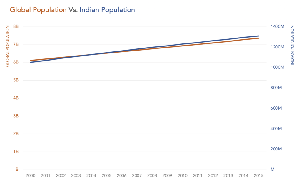
Same units, different magnitude
The below chart plots data from World Bank representing Global Population and Indian Population on the same chart. Both the y-axes represent the same unit, population but at different magnitudes – the global population in billions and Indian population in millions.
Different units
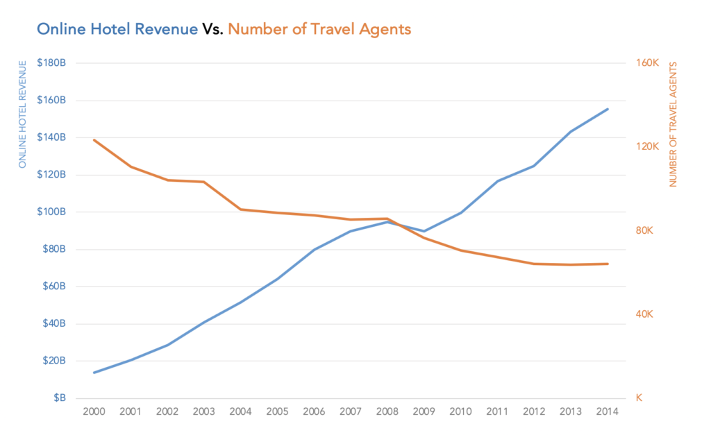
This chart below is a makeover of the Tech Chart of the Day published on Business Insider. Here we have two different units, online hotel revenue in billions of dollars and number of travel agents represented in thousands plotted on the two Y-axes.

We use dual axis charts to compare these trends because they are related in some meaningful way. But we need to be cautious in using dual axis charts because there are certain drawbacks in plotting data on two axes.
What are some of the pitfalls of using dual axis charts?
Here are some of the most common confusions that arise with dual axis charts:
1. It is often not clear which data series belongs to which axis
2. Crossing lines can be misleading
3. It may appear that two lines are moving at the same rate
4. Zero baselines at different heights can be misleading
5. We can draw any conclusion we like if we tweak the scales a little bit
The challenge with adding a second axis is it is often not clear which data series belongs to which axis.
Let’s look at the original chart from Business Insider, showing the trend of Online hotel revenue and the number of travel agents.

It is hard to tell which axis represents Online hotel revenue and which one represents the number of travel agents. This drawback, of course, can be overcome by using different colors for the two axes, as in the makeover at the beginning of the post. Nevertheless, this is something to be aware of when creating dual axis charts.
Now, what about the crossing lines?
The appearance of the crossing line seems to be of importance, but it is actually a result of the scales used in the axis.
Whenever we see lines intersecting in a chart, we assume something noteworthy happened.
For example, it appears that something important happened in 2009-2010 where the lines cross. In reality, this meeting point is just an effect of the scale chosen.
See how the lines meet at 2008 with a slightly different scale.
What if the lines don’t cross? Then there is no confusion.. or is there?
It may appear that two lines are moving at the same rate.
When we see two line charts together, we immediately compare the rate of change. The problem with dual axis charts is the rate of change does is not equal for the lines plotted on the two axes. This is because the axes themselves are on different scales.
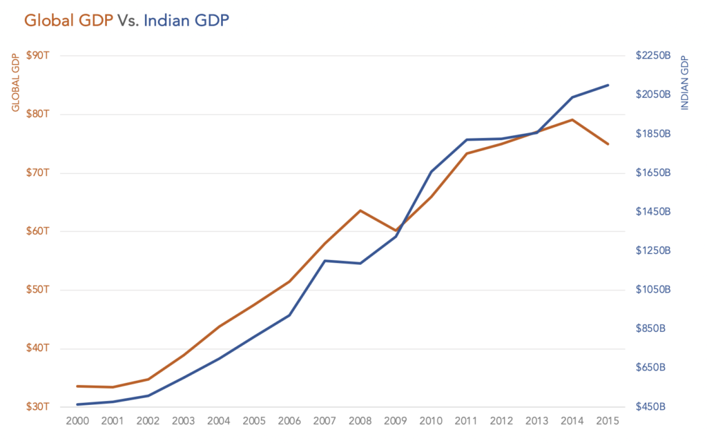
For example, when we look at the Global GDP and Indian GDP, it may appear that they are moving at the same rate at least until 2009. But the Global GDP grew by 70% between 2000 and 2009, while the Indian GDP grew by 186% for the same time period.
What if both the axes had a zero baseline?
Zero baselines at different heights can also be misleading.
Even with a zero baseline on both axes, dual axis charts can be misleading.
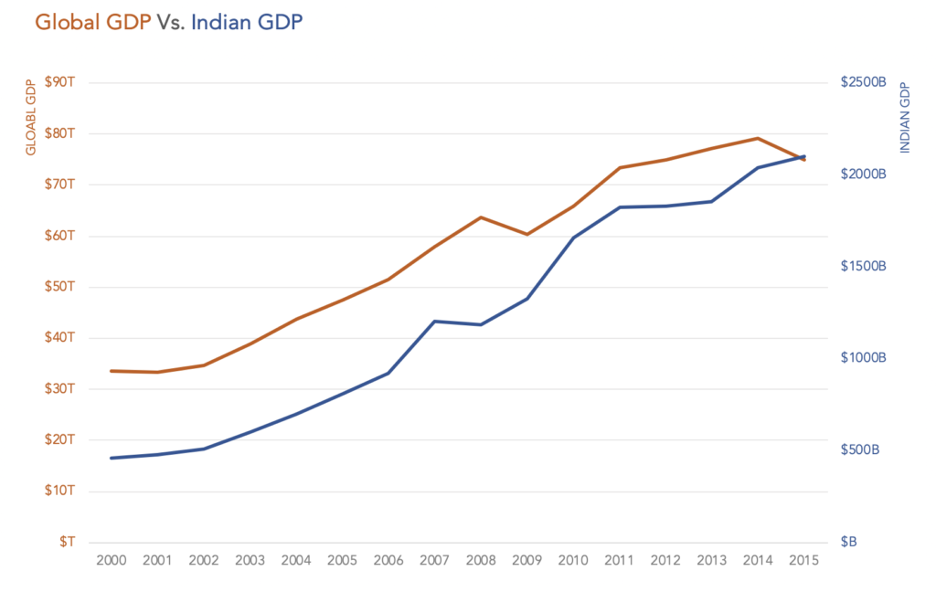
The world GDP and Indian GDP seem to be at the same point in 2015. It is easy for someone to misunderstand that “Oh, Indian GDP is the same as World GDP in 2015 !!” (Which really does not make sense, I know)
We may think how dumb a person has to be to draw that conclusion. But objects or shapes that are close together appear to form groups. We may think lines close together are actually a group (Gestalt law of proximity).
And this is not the only wrong conclusion we can draw from dual axis charts.
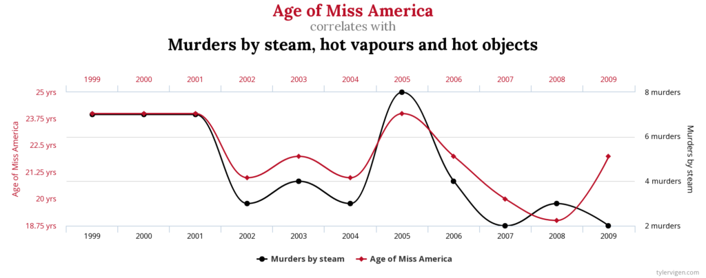
We can draw any conclusion we like from a dual axis chart if we tweak the scales a little bit.
Here is an example from the website Spurious Correlations.
Conclusion
When creating dual axis charts, remember
- To use color to clarify which data series belongs to which axis
- Crossing lines do not mean anything
- Not to compare rate of change between the two series
- Not to compare heights, as the axes could be on different scales
- Not to tweak axes scales to show correlation


2 Comments