Comparing change through time
A clustered bar chart is one of the most commonly used representations to compare change through time. A clustered bar chart, though a good option to compare values, does not represent the change through time effectively.
Here is some data on which technology products consumers intend to buy in 2016 and how it compares against 2015.
Let’s draw a clustered bar chart.
| Product | Intent to buy in 2015 | Intent to buy in 2016 |
| Smartphone | 57% | 48% |
| Laptop | 36% | 30% |
| Television | 38% | 30% |
| Tablet | 38% | 29% |
| Smartwatch | 12% | 13% |
| Fitness monitor | 12% | 13% |
| Connected surveillance cameras | 10% | 11% |
| Smart thermostat | 9% | 9% |
| Personal drones | 6% | 7% |
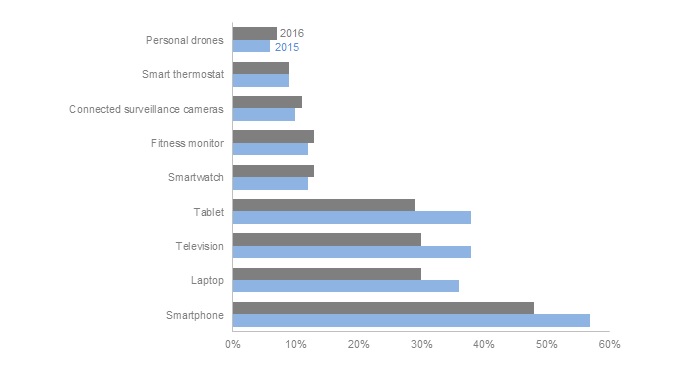
As you can see, it’s not easy to identify what increased and decreased from a clustered bar chart.
What are some alternatives to visualize change through time?
We will look at 4 options in this post.
- Slopegraph
- Range Bar Chart
- Deviation bar
- Small multiples line chart
Slopegraph

The change between 2015 and 2016 is very clearly visible with a Slopegraph. The direction of the line indicates the increase or decrease and the slope quantifies the magnitude.
Slopegraphs can be hard to read if there are too many similar values, as in this case. The bottom 5 categories are so closely spaced that it is not easy to label them.
See also: How to create your first Slopegraph in R
Small multiples line chart
The overlapping problem with Slopegraph can be overcome by small multiples line chart.

We do not get the overall view of the trend that Slopegraph provides with this chart. But it does show all the individual lines clearly and in the same frame, where they can be compared.
Range Bar
A Range bar uses the length of the bar to show the amount of change between 2 points in time. Additionally color can be used to show the direction of change.
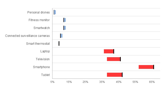
The starting point (2015 value) is represented by a black bar for clarity.
The range bar accomplishes both comparison of magnitudes and comparison of magnitude of change in a single chart.
Deviation Bar
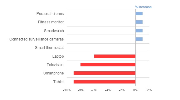
A deviation bar shows the difference through time. We do lose the individual values, but we can see the change and direction of change very easily.
Paired with a Slopegraph or a Range Bar, a deviation bar is a great way to show change through time.
Combinations
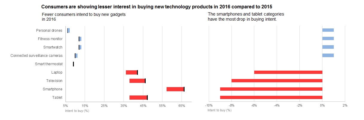
Sometimes one chart cannot tell the whole story. For example, in this case, a range bar + a deviation bar works very well.
Which of these graphs would you use to show change through time?