Connected scatterplots: explained with an example
What is a connected scatterplot?
A connected scatterplot is a scatterplot with a third ordered variable used to connect the encoding between X and Y positions. This third variable is often time.
How to read a connected scatterplot?
At first glance, a connected scatterplot may seem confusing to read. But it has great storytelling capabilities.
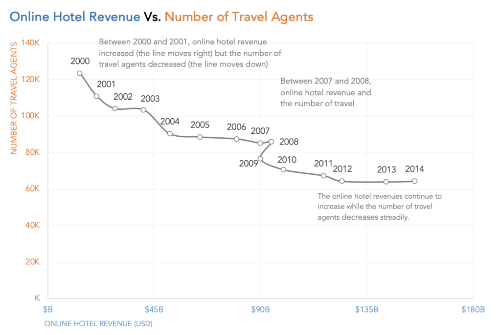
In the first segment of the chart, between 2000 and 2001, the online hotel revenue increases(the line moves right) but the number of travel agents decreases(the line moves down). The trend continues this way until between 2007 and 2008 when the number of travel agents sees a slight rise (the line moves up). Between 2008 and 2009, online hotel revenue decreases(the line moves left) and the number of travel agents also decreases(the line moves down). In the later part of the graph, online hotel revenues continue to increase while the number of travel agents decreases steadily.
When to use one?
A connected scatterplot is used to compare two data series. When these two data series have different magnitudes or units of measures, a single line chart is not enough. A dual axis chart is commonly used in such cases. But a dual axis chart does have its pitfalls. A connected scatterplot is a good alternative to dual axis charts.
What are the pros and cons of using a connected scatterplot?
A well designed connected scatterplot can be a powerful storytelling medium.
The disadvantage of connected scatterplots is they are not intuitive to read. Most viewers at first glance may not understand what’s going on in the chart. It may be helpful to add annotations to the chart to guide the user.


Your site is very good and we used it. I hope you are always successful.