#1. Bar charts require a zero based scale
This series is a collection of small changes in data visualization that make a big difference to the end result.
When using bar charts, the axis needs to start at zero. Why?
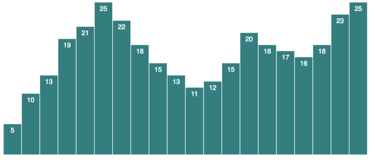
Its simpler to understand this if we start with an example. This chart below was used by Twitter in its IPO filing.
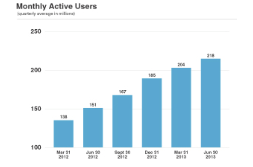 What do you think these bars represent? The number of Monthly Active Users?
No. The y-axis of this chart starts at 100 instead of 0. Hence the bars do not represent the number of Monthly Active Users, but the number of Monthly Active Users over 100. The first bar that represents 138, really represents 38 (138-100). Confusing isn’t it?
Its not just that. The length of a bar is one of the attributes that encodes its quantitative value. In other words, when we interpret a bar chart, we read the number it represents as being directly proportional to its length.
So our minds interpret the number of Monthly Active Users for Dec 31 2012 as double that of Mar 31 2012. Which is not the truth.
Now let’s see what it looks like if the same bar chart started at zero.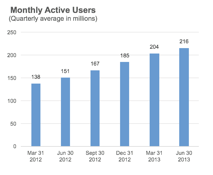 Notice the difference? The increase in the number of Monthly Active Users is not as dramatic as in the first chart.
Let’s see them side by side
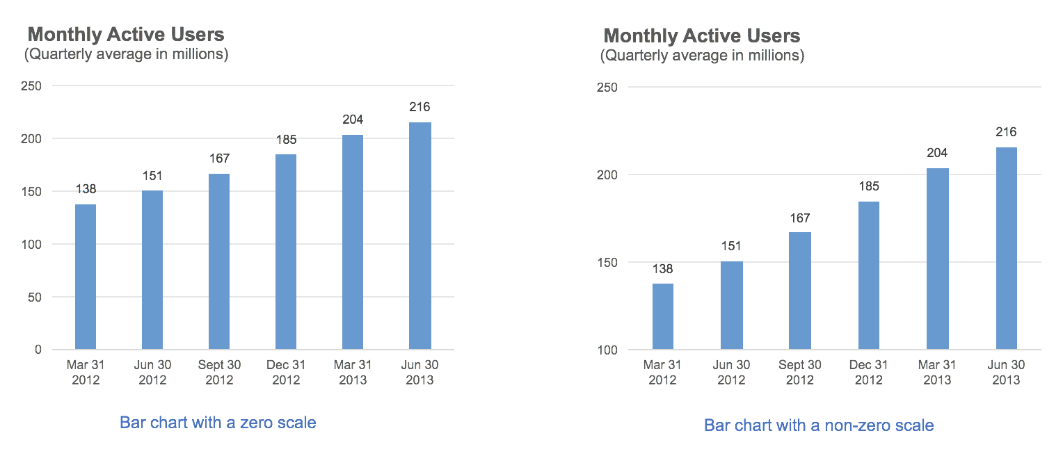
So bar charts that do not have a zero based scale are confusing and misleading.
Do you agree? Disagree? Let me know in the comments below.