Gestalt Laws Applied to Data Visualization

Gestalt is German for "Unified Whole". Gestalt psychologists Max Wertheimer, Kurt Koffka and Wolfgang Kohler sought to understand how we humans make sense of what we see from the chaotic stimuli around us. Their findings were that we seek to form patterns, group objects in particular ways and simplify complex images. The main principle of…

2 Comments

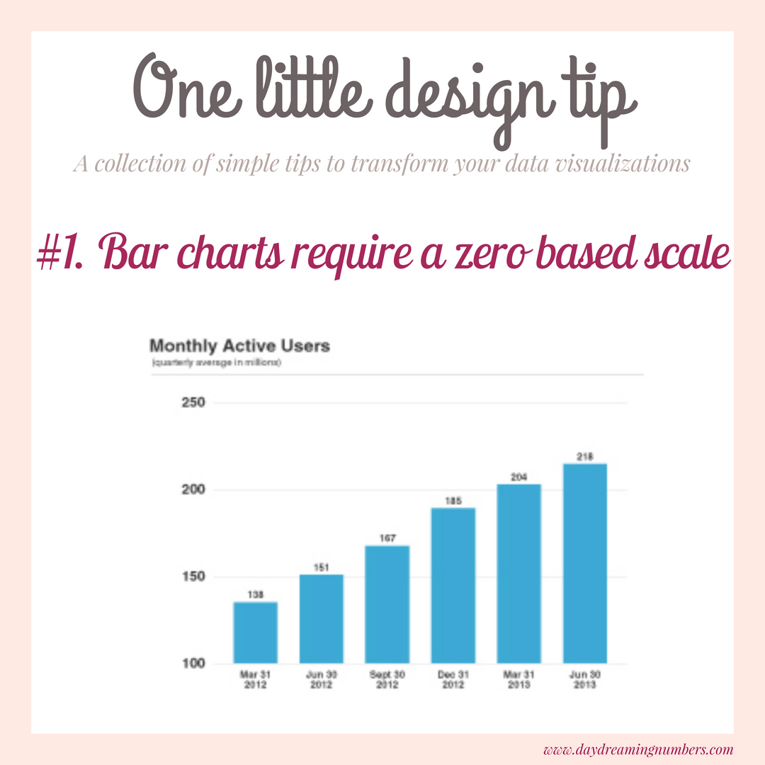
#1. Bar charts require a zero based scale

This series is a collection of small changes in data visualization that make a big difference to the end result. When using bar charts, the axis needs to start at zero. Why? Its simpler to understand this if we start with an example. This chart below was used by Twitter in its IPO filing. What do you…

0 Comments
Read more about the article The one advice I would give my last year self
OneAdvice

The one advice I would give my last year self

If there is one advice I could give my last year self, it would be to stop running behind learning new tools. Don’t get me wrong, tools are very useful in every realm we use them in. The problem begins when we skip learning concepts and jump directly to learning tools. Allow me to explain…

0 Comments
Read more about the article 20 tips to design tables for better communication
TablesDesign

20 tips to design tables for better communication

We use tables in our daily work to share data with co-workers as well as to present data in meetings and other events. Tables are great for look up, comparison and are widely understood. But do we pay enough attention in choosing the right design for a table? It is very simple to create a table…

0 Comments

The Art of Truthful Rhetoric in Visualization

The Rhetoric of Data Rhetoric is defined as the art of effective or persuasive speaking or communication. In information visualization, rhetoric is like a double-edged sword. Let’s first visit the dark side of rhetoric, the side that can be used to manipulate viewers into reaching incorrect conclusions. Data can be used to create a variety…

0 Comments

How to create your first Slopegraph in R

Slopegraphs first appeared in Edward Tufte's book The Visual Display of Quantitative Information. Slopegraphs compare changes usually over time for a list of nouns located on an ordinal or interval scale - Tufte Creating a Slopegraph in R While there are templates and tools available to create a Slopegraph, creating one in R still takes a…

2 Comments

5 Tips To Create Functional And Beautiful Bar Charts

Bar charts are one of the most commonly used chart types. They are easy to understand and are great for comparisons. But every so often we come across bar charts that are colorful, poorly designed and misleading. In this post, I want to give you 5 easy tips to create functional and beautiful bar charts. I…

1 Comment