The Art of Truthful Rhetoric in Visualization
The Rhetoric of Data
Rhetoric is defined as the art of effective or persuasive speaking or communication. In information visualization, rhetoric is like a double-edged sword.
Let’s first visit the dark side of rhetoric, the side that can be used to manipulate viewers into reaching incorrect conclusions.
Data can be used to create a variety of arguments and conclusions.
Data does not equal truth.
Yes, we can find the truth or in some cases multiple truths in data through honest reasoning, but it is just as easily possible to find and argue falsehoods from data.
So how do we ensure we develop a sound argument from data? Here are some tips.
Context and Data Provenance
It all starts with being truthful about our data.
Sometimes it is important for our audience to know the context of the dataset in order to fully understand the bigger picture and evaluate the story we are trying to tell. We should always disclose details about the data sources.
For example, if the sample size for our survey was 10 participants, that information should go on the chart. This will help our audience understand the magnitude of the impact of the survey results.
Uncertainty Representation
We should be the first critiques of our data.
It is important to tell a story but it is even more important to tell a truthful one.
It is always good to ask a few basic questions before setting out to present a persuasive visualization. Some sample questions are:
- What is measured in the data?
- How was it sampled?
- Is there any uncertainty in the data that should be communicated?
- Does the data offer only aggregations? If so, what about outliers?
Visual Representation
It is very easy to lie with charts. This is where most of us make the mistake of providing false information from the data.
The type of visual representation used, scales and annotations on the visual sometimes tell a lie. Let’s understand this with a couple of examples.
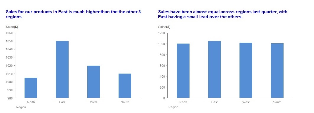
As per the chart on the left, the sales for East are approximately 150% higher than the sales for North. Is it the truth? No. Once we correct the y-axis to start at Zero, we can see that the sales are almost equal (chart on the right)
Let’s look at one more.
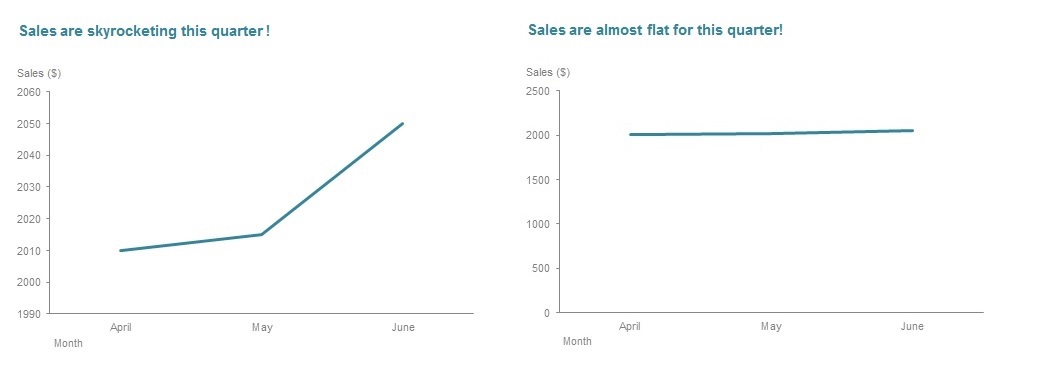
By zooming on the axis, we have created an illusion of a steep rise in the sales (chart at the left). Also, notice the title? It emphasizes this illusion. In reality, the sales are almost flat, as shown in the chart at the right. Be aware of the fact that sometimes our tools generate these misleading axes. Both the charts at the left have Excel default axes.
Rhetoric in Truthful Storytelling with Data
Now that we have seen the dark evil side of rhetoric, let’s look at how we can put rhetoric to good use.
Here is an example. Let’s assume these are the results for a survey conducted by our company and we want to review the worst performing areas.
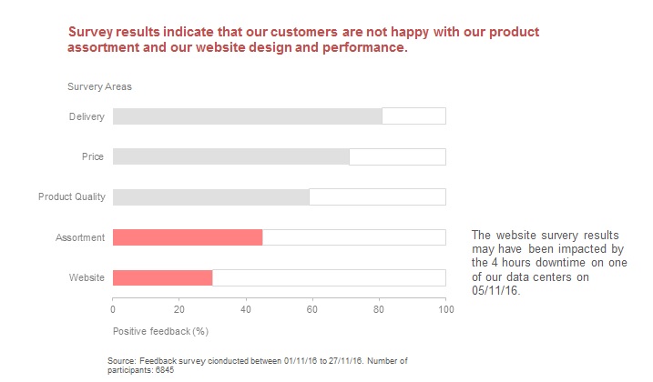
Let’s review this, shall we?
The colors do the job of highlighting. The title emphasizes the same.
Notice the 2 little things that make a difference to our story here.
- Data source: The chart clearly calls out the survey dates and the number of participants in the Source section at the bottom. This will help our viewers put this survey result in perspective. For instance, if our customer base is 8000 customers, this is a fairly significant representation of how our customers feel. If our customer base is 100,000 then this is a very sparse representation.
- Annotation: The additional annotation indicates the website survey result may be skewed due to a temporary issue. Why is this important? Again, this will help our viewers take the right action from the story. Should they fire the web designers and hire a new team? Or should they just make minor changes to the web design and improve website uptime?
Conclusion
It is possible to create a persuasive story from data that also tells the truth. Paying attention to these 3 things would enable us to do so:
- Add context to the story
- Represent uncertainty where applicable
- Use the right visuals; always verify default views created by tools
Data is rhetorical by definition and can be used for truth finding as well as truth hiding.
Do you use rhetoric in your visualizations? How do you manage to keep your visualizations truthful at the same time? Please share your tips in the comments section below.