20 tips to design tables for better communication
We use tables in our daily work to share data with co-workers as well as to present data in meetings and other events. Tables are great for look up, comparison and are widely understood. But do we pay enough attention in choosing the right design for a table?
It is very simple to create a table that effectively pairs with your message. In this post I outline 20 table design tips to help you do exactly that.
20 tips to design tables for better communication
1. White space
When space permits, use white space in the ratio of 1:1. If your font size is 10 points, use a row height of 20 points. In the absence of space, you can use subtle fill colors for alternate rows (zebra striping). If you are unable to use colors, use subtle rules.
2. Grids
Avoid using grids to separate the rows and columns. Use rules to separate the header and footer from the rest of the table.
3. Down the rows or across the columns
Defining the structure of a table is a very important step. The way a table is structured will determine how useful it is in terms of comparison or providing a particular view of the data.
It is helpful to ask yourself this question when determining the structure – How many categorical variables do you want to show in the table? If there are a few categorical variables, you can arrange them in individual columns. If there are more variables than what would fit in a screen consider breaking them into rows.
Here is an example, that should help clarify this tip.
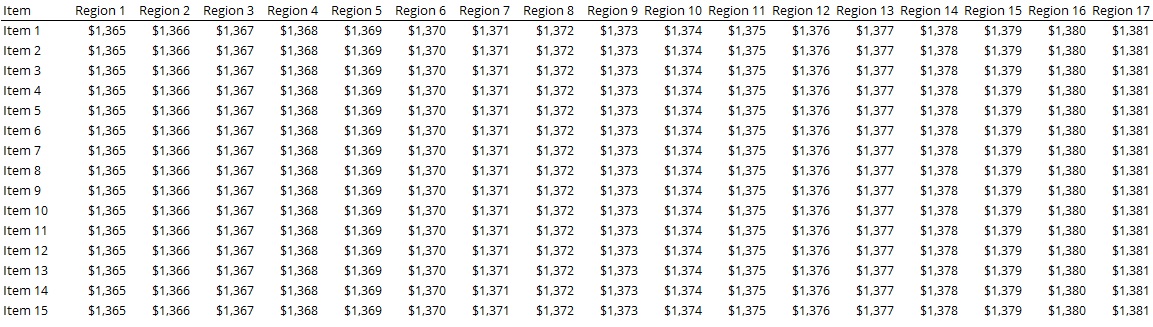
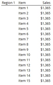
Quick definition: Quantitative variables measure something (Like units sold). Categorical variables identify what the quantitative variables measure (Like Region, Item).
4. Ranking/Time Series
If you have a ranking or time series relationship, sort the data by rank or time respectively.
5. Grouping
It is sometimes appropriate to group the data in order to make it more understandable. For example, sales by countries.
6. Color
Use a noticeable color to highlight data that you want to stand out in the table.
7. Font
Use a legible font. Use the same font throughout the table.
8. Remove duplicates
Remove duplicates in the table to create more white space and make the reading process easier.
9. Sequencing for totals
Place the “total” columns next to the fields that they represent the sum of.
10. Sequencing for categorical data
For categorical data like names of people or products, when there is no other natural sequencing in data, follow an alphabetical order. A natural sequencing could be a meaningful sorted sequence like highest to lowest or chronological.
11. Positioning for comparison
Place quantitative values that you want to compare close to each other.
12. Text Orientation
Use horizontal orientation for text. There is rarely a good reason to orient text in other ways in a table.
13. Numbers Alignment
Numbers that represent quantitative values should be aligned right. Use consistent number of decimal digits in each category.
14. Text Alignment
Align all text to the left. Numbers that are not quantitative, like customer IDs, should also be aligned left.
15. Date Alignment
Date alignment can be left or right. It is important to use consistent formatting of month, day and year as well as consistent number of digits in each. For example, format all dates as 01/13/2017, 01/26/2017 if using mm/dd/yyyy.
16. Header Alignment
Align headers to the data. The only exception is a spanner header (a header that spans across multiple columns), which can be center aligned.
17. Summarize
Summaries are very important in tables. If you think a column or a row summary may be important in a table, include it.
18. Summarize groups
Summarize individual groups in a table.
19. Header or Footer
If a summary, say total for example, is the most important data in your table, place it near the header. This will make it easier to find and your reader’s attention will be drawn to the totals immediately.
20. Repeat headers
If your table spans across pages, repeat the column and row headers on each page.
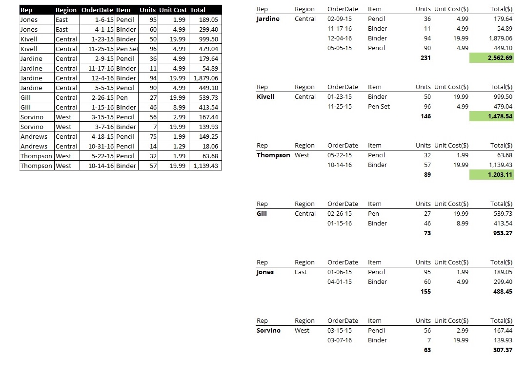
A Redesign
Applying some of the tips from above, here is a snapshot of a table before and after.
So these are my 20 tips for table design. Do you use any of these while creating tables? Are there any more you would add to this list? Please let me know in the comments section below.