This week’s MakeOverMonday dataset comes from XWord Info.
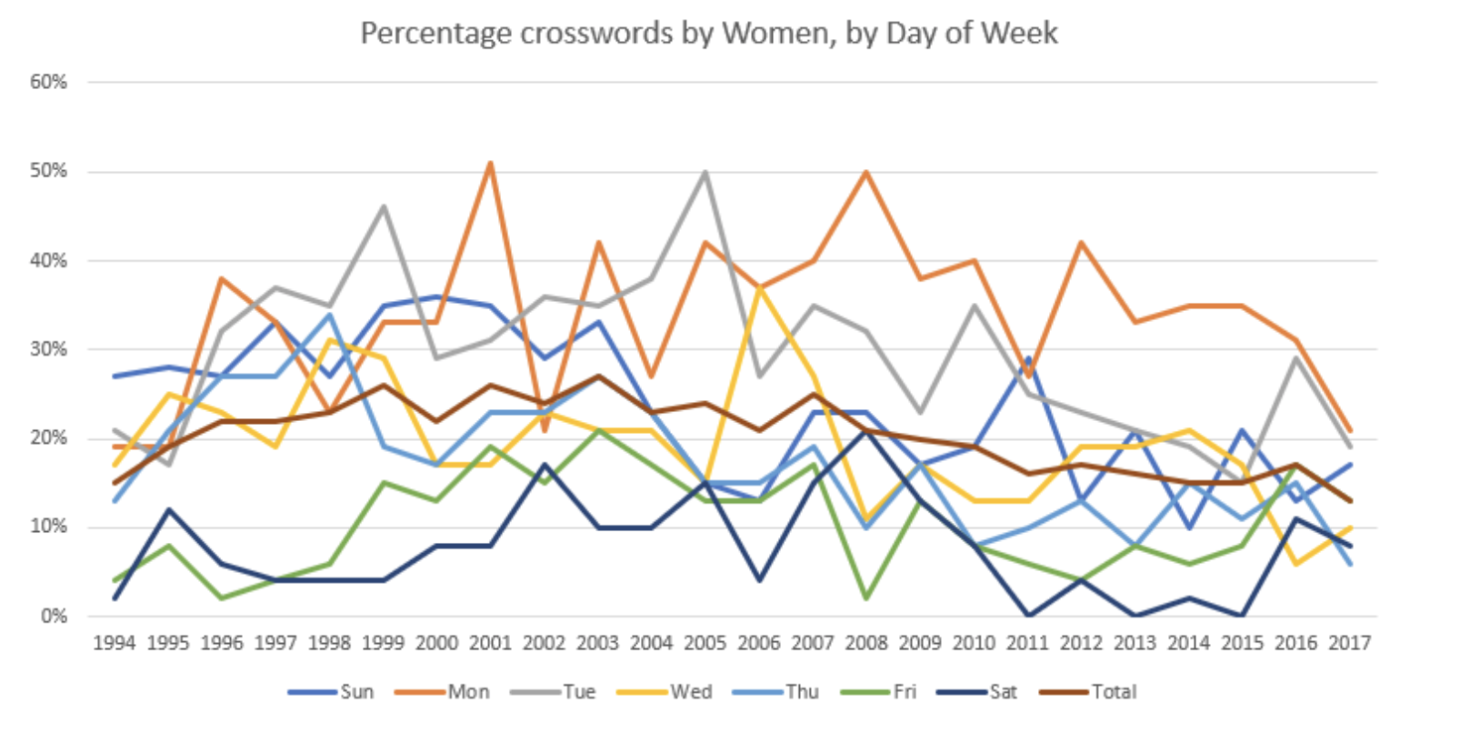
Here is the original graph
What works well?
- The title is clear.
- The time is alone the X-axis, which is how we normally visualize time.
What could be better?
- The 7 lines create a spaghetti effect. It is not easy to see the trend of a single line.
- There are too many colours. It looks cluttered and our eyes are not drawn to a particular message in the chart.
- The title does not have a clear call to action.
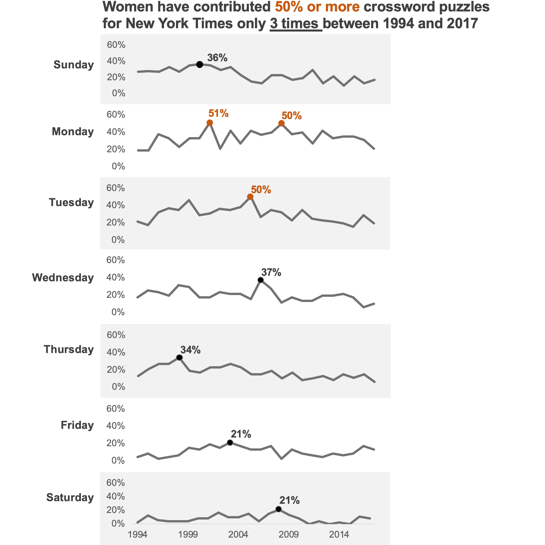
My objectives with the makeover
- Separate the line charts so that they are easier to read.
- Highlight the highest contribution made by women for a day of the week.
- Highlight how often women contribute 50% or more. This is my key takeaway point.
- Include a clear call to action in the title.
- Use colours sparingly to draw attention to my key takeaway point.
Here is the makeover
You can download the excel file for this makeover here.


