4 ways to visualize Likert Scales
Halloween just went by and it is Diwali this week in India – which means there are a lot of sweets around. I am on a no-sugar diet now, so no candies or sweets for me. To satisfy my sweet tooth, I thought it would be fun to use a candy data set to learn how to visualize Likert Scales. I found a blog post on Datawrapper titled “The most controversial candy bar” and the dataset was perfect for this post.
So lets get on to Likert Scales with some candy data!
What is a Likert scale?
Likert scale is a type of rating scale commonly used in surveys. When responding to a Likert type question, respondents simply state their level of agreement or disagreement on a symmetric agree-disagree scale.
A typical 5-level Likert scale may look like
- Strongly disagree
- Disagree
- Neither agree or disagree
- Agree
- Strongly agree
Visualizing Likert Scales: Understanding what is important
Every visualization is built with certain objectives in mind. Before we talk about how to visualize Likert scales, it is important to understand what is important to us in a Likert scale.
Here are some possibilities:
- Read values of strongly agree + agree and strongly disagree + disagree
- Read values of strongly agree and strongly disagree
- Read values of agree and disagree
- Read values of neutral
- Splitting the neutral responses equally between positive and negative is acceptable
- Splitting the neutral responses equally between positive and negative is misleading
- Part to whole relationship is important
- Part to whole relationship is not important
Remember, one visualization cannot do all the above. Every chart comes with a trade-off. That’s why it’s essential to understand what is important to us.
Now let’s see 4 different ways to visualize Likert scale.We are not going to pick favourites, we are merely going to understand when each of these charts work well and when they don’t.
4 ways to visualize Likert scales
1 – 100% stacked bar
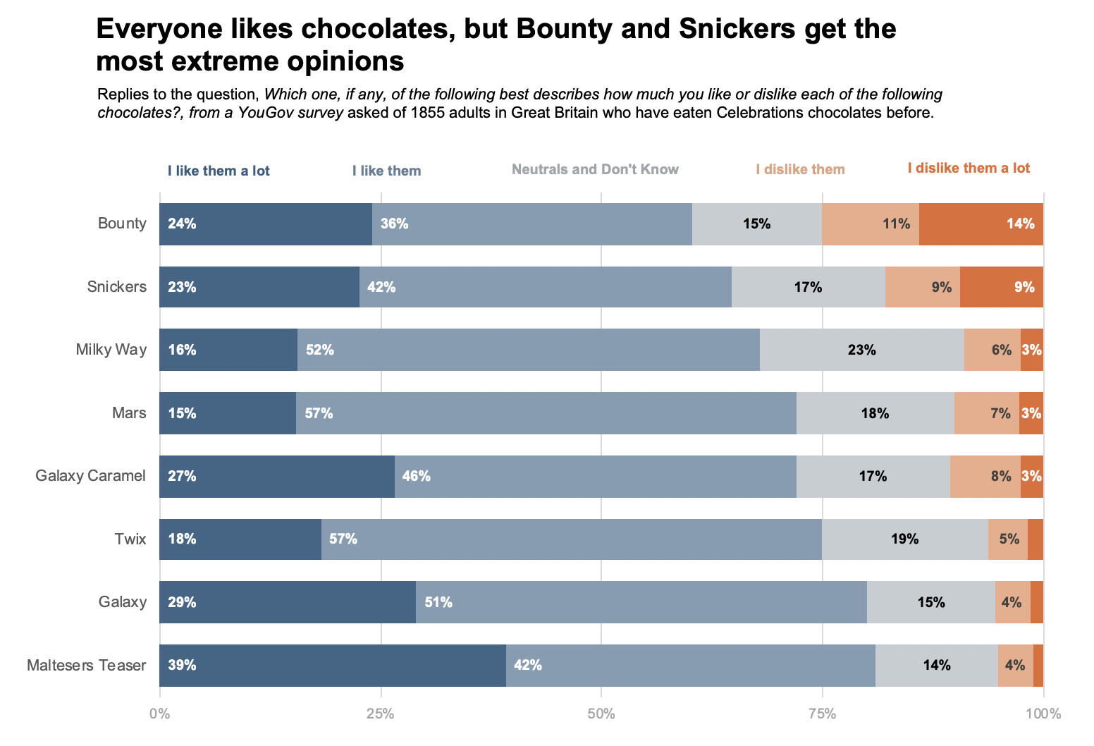
What works well?
- It is very easy to measure the end values, I dislike them a lot and I like them a lot. This is because in a 100% stacked bar chart the end values have a common baseline in 0% and 100%. This makes it easy for our eyes to compare the values.
- It is also very easy to compare the end values with each other, i.e., compare I. dislike them a lot with I like them a lot. The common baseline at 0% and 100% helps with this comparison.
- It is also easy to compare I dislike them a lot + I dislike them and I like them a lot + I like them. The 0% and 100% baseline helps with this too. It is easy to see whether the sum of dislikes is greater than the sum of likes for a brand of candy.
- A 100% stacked bar chart keeps the part to whole nature of the data intact.
What does not work well?
- It is hard to compare the Neutrals or in our case, the Neutrals and Don’t know. This is because there is no common baseline for the middle values of a stacked bar chart.
- For the same reason, it is hard to compare the values for I like them and I dislike them.
2 – Diverging bars with neutrals separate
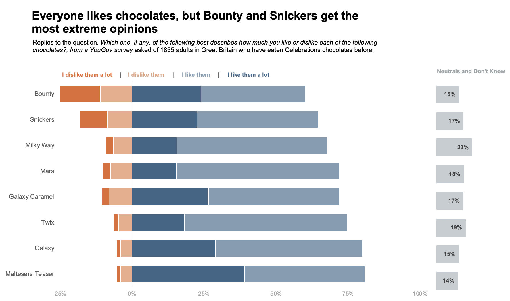
What works well?
- This chart gives the best idea of difference between like and dislike. With the neutrals out of the way, it is easy to see which Candy has more likes or more dislikes.
- It is also easy to compare the neutrals with each other.
What does not work well?
- The chart loses the part to whole nature of the data.
- Comparing the Likes (I like them a lot + I like them), Dislikes (I dislike them a lot + I dislike them) and neutrals is hard. This is because the dislikes do not have a common baseline.
- The chart takes up more space.
3 – Diverging bars with neutrals split
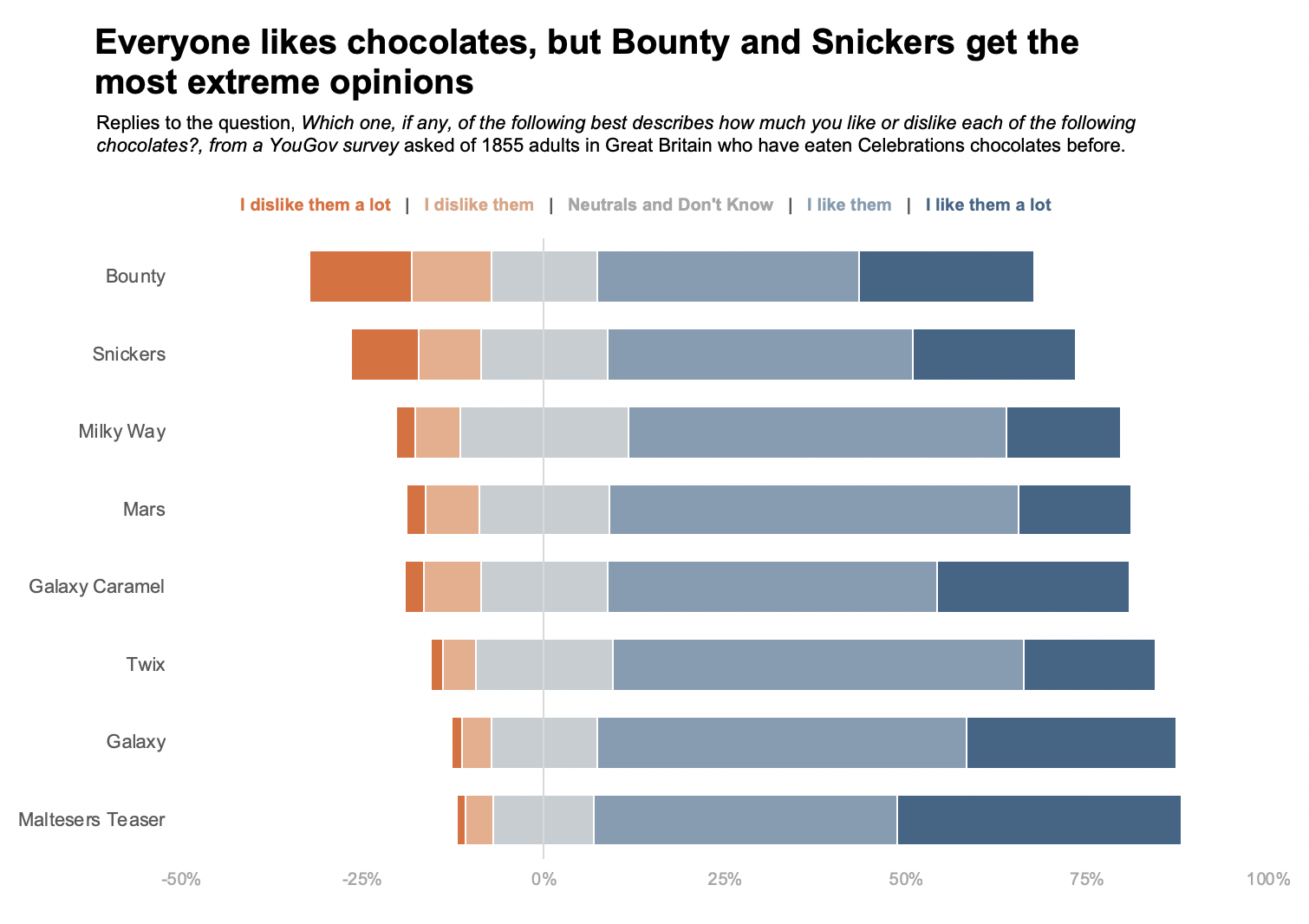
What works well?
- Diverging bar charts with neutral split let us see the general shapes of likes and dislikes. It is easy to answer questions like, in general, do people like or dislike Celebrations chocolates?
What does not work well?
- It is hard to compare values as none of the bars share a common baseline.
- It depends if we are OK splitting neutrals between likes and dislikes. Neutrals are not likes or dislikes. So it is technically incorrect to split them between likes and dislikes.
- The part to whole relation is not prominent. The zero divide, i.e., left of zero and right of zero takes precedence.
4 – Small multiple bars
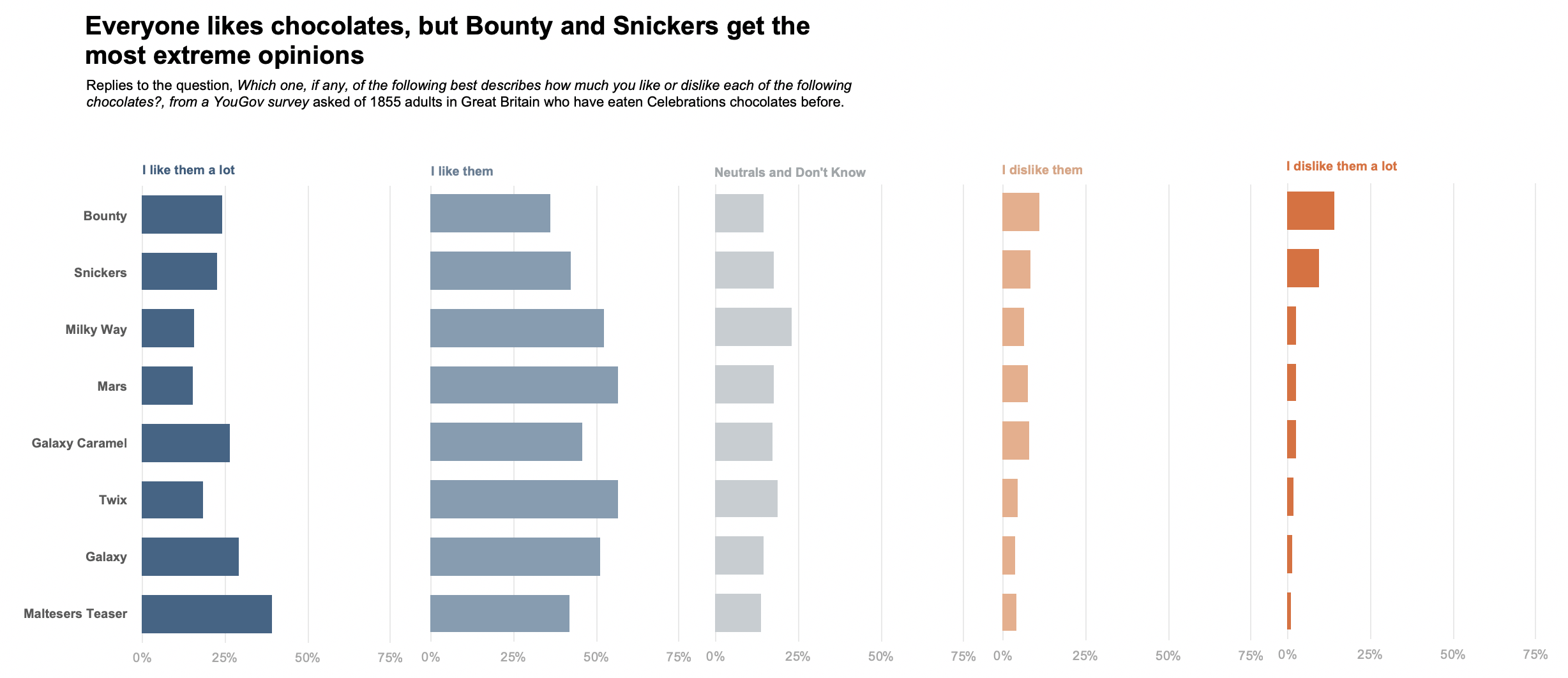
What works well?
- It is easy to read individual values well as each of them are in a separate bar chart.
What does not work well?
- The part to whole relation is lost.
- It is hard to read I like them a lot + I like them or I dislike them a lot + I dislike them together.
- Takes up more space. Cannot be used when space is a constraint.
Summary : When to use which Likert Scale visualization
| Read values of strongly agree + agree and strongly disagree + disagree | 100% stacked bar
Diverging bar with neutral separate |
| Read values of strongly agree and strongly disagree | 100% stacked bar
Small multiples |
| Read values of agree and disagree | Diverging bar with neutrals separate
Small multiples |
| Read values of neutral | Diverging bar with neutrals separate
Small multiples |
| Splitting the neutral responses equally between positive and negative is acceptable | Diverging bar with neutrals split |
| Splitting the neutral responses equally between positive and negative is misleading | 100% stacked bar
Diverging bar with neutrals separate Small multiples |
| Part to whole relationship is important | 100% stacked bar
Diverging bar with neutrals split |
| Part to whole relationship is not important | Diverging bar with neutrals separate
Small multiples |
If you would like see how to create these charts, here is the excel file.


Good post! Helped me see which way i thought was best without having to make them all myself. Cheers!
Thanks! Glad you found it useful!
Hi Vidya. We were discussing this at work just yesterday, so super timely.
But, how (what program) did you use to create the actual bar charts?
Thanks
c
Hi, I created the bar charts in Excel. There is a link to download the excel file at the end of the post or you can get it here.
I like this a lot! Is there anywhere I can go to see the code you used for the charts?
Hi Ryan! I created these charts in Excel. You can download the file here.
Thanks! Very useful. What program did you make these charts in? I want to make the diverging bars with neutral separate in Excel, but having difficulty…
Hi Nadia! I created these charts in Excel. You can download the file here. Hope that helps.
Very helpful! Keep up the good work!!!