What are heatmaps and what is a good way to use one?
Heatmaps visualize data through variations in coloring. Heatmaps are self-explanatory and are a great way to show to a general view of data.
Heatmap Framework
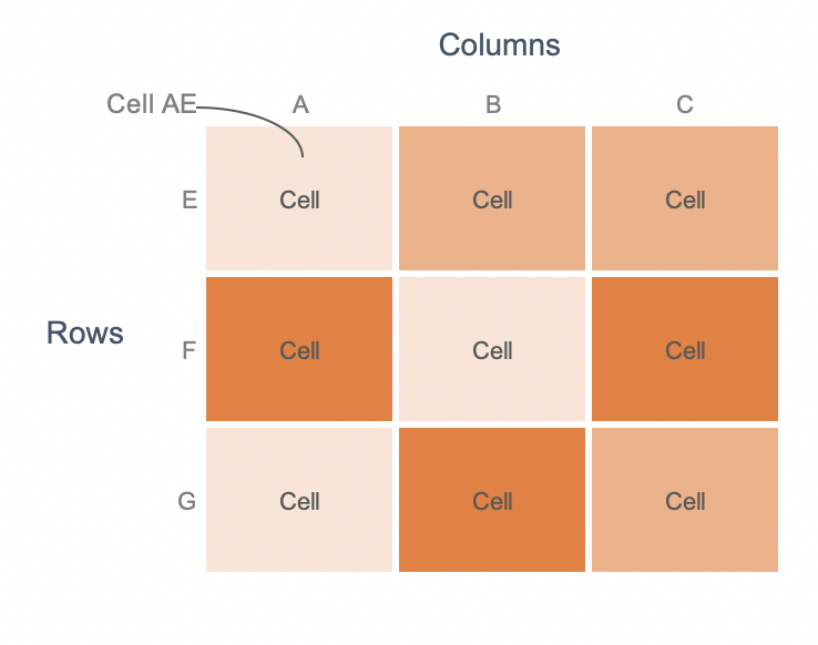
Heatmaps consist of multivariate data plotted in rows and columns in a matrix-like fashion. Cell AE, for instance, is based on the relationship between cells A and E.
When to use heat maps?
Heatmaps are useful for:
- Showing multivariate data
- Showing variance across multiple variables
- Revealing patterns in data
- Showing changes in time
- Showing a generalized view of data
What to keep in mind when using heatmaps?
There are a few points to keep in mind when using heat maps.
- Heatmaps require legends alongside. Since heatmaps rely on color to show data, they cannot be read without a legend.
- Heatmaps are better suited to show generalized information rather than accurate values. This is because it is hard for us to accurately differentiate between colors.
- Heatmaps can show categorical as well as quantitative data.
- Categorical data is color coded. For example, a heat map can show bad, average, good in 3 different colors.
- Quantitative data is usually shown using a gradient scale of colors. This is because we don’t perceive a rainbow of color hues quantitatively. For instance, which is greater – orange, blue, green, red or black?
- 2 types of color scales work well with heatmaps:
- Sequential scale: A single hue is expressed as a gradient that varies from light to dark with lighter hues representing lower values and darker hues representing higher values.
- Diverging scale: This scale uses 2 hues. Each hue is represented as a range of intensity from light to dark.
What are some good ways to use heatmaps?
Let’s see 3 uses for heatmaps with examples.
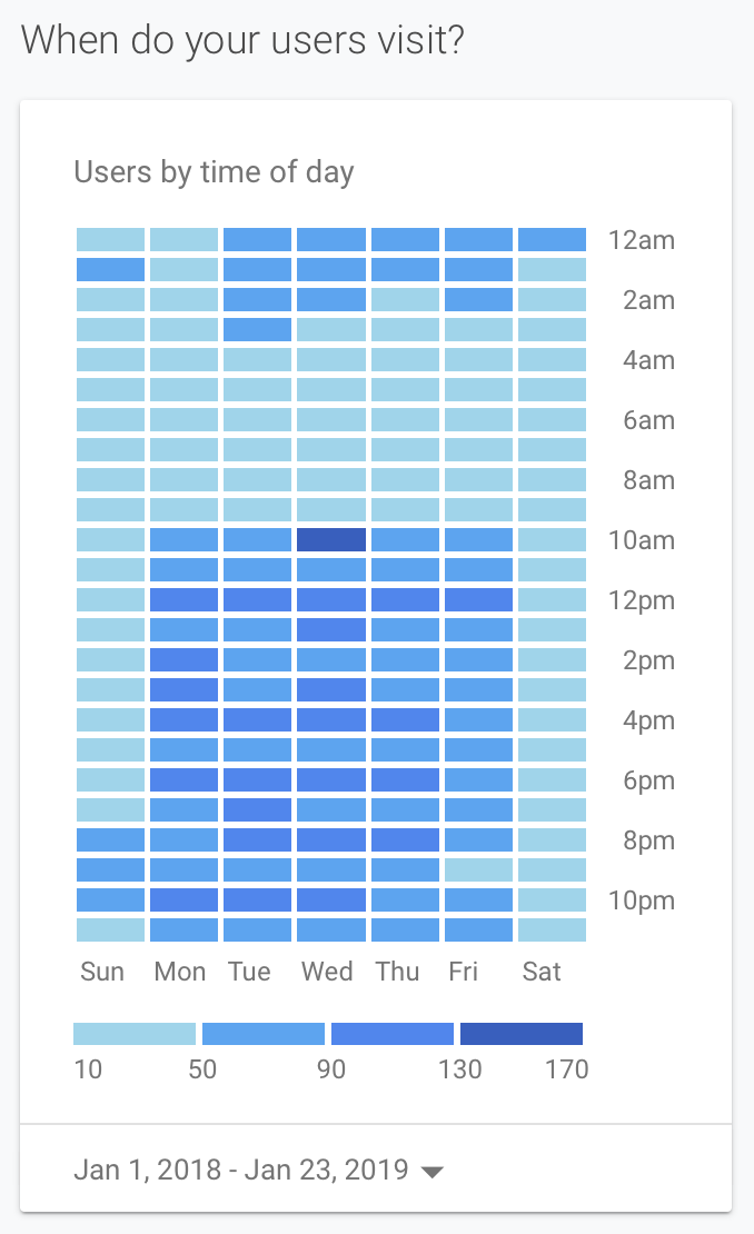
Show a generalized view with bins for accuracy
Google Analytics uses heat maps to show the number of visitors by the time of the day and day of the week. Notice how they use 4 shades of blue to represent intensity. The scale is not a continuous gradient that blends from one color to another. Instead, it is divided into 4 bins. This can be useful to bring in some accuracy to the visualization.
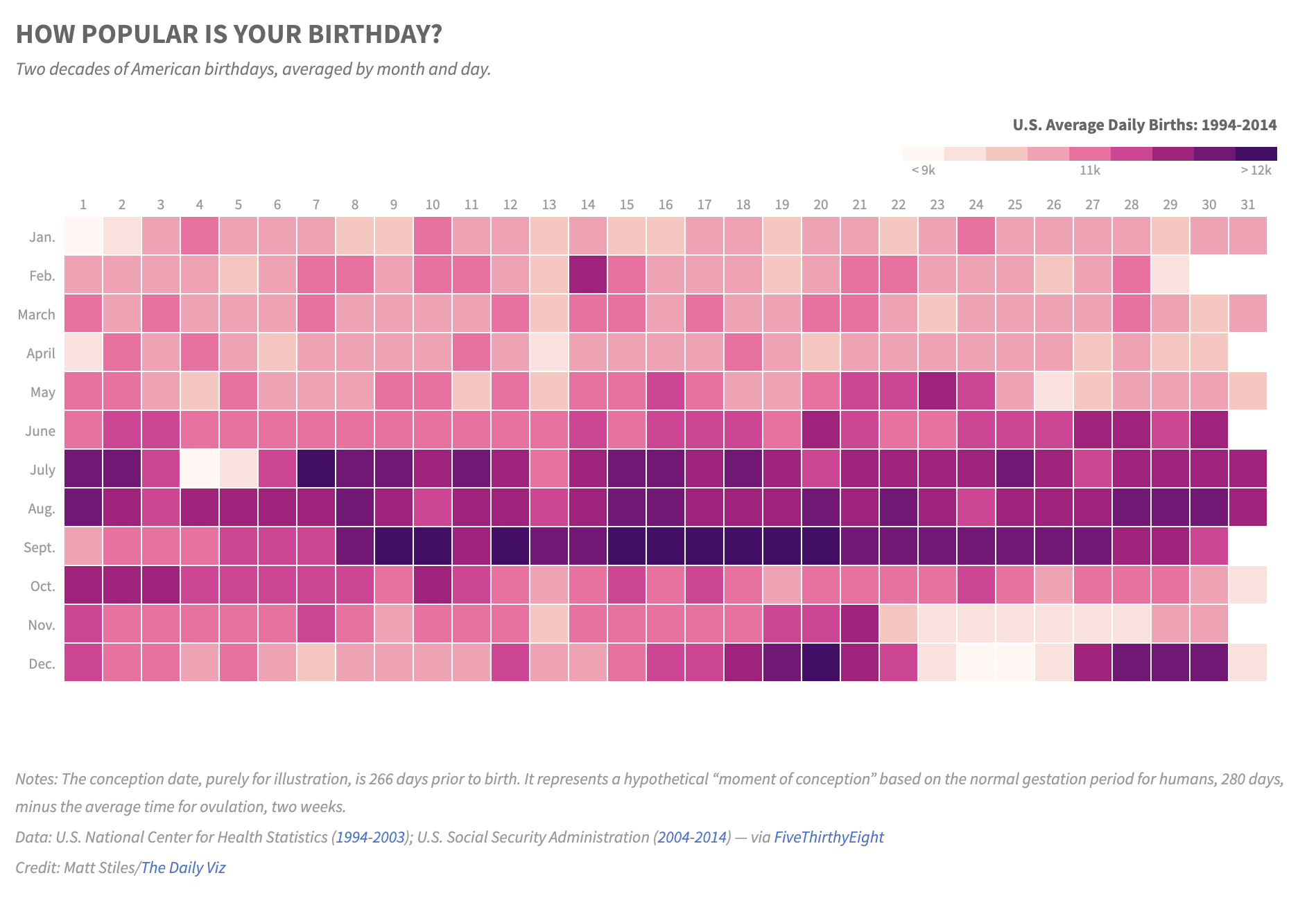
Show general patterns in data
The next example is from The Daily Viz. This is a representation of the U.S. average daily births by day of the month. They have chosen sequential pink color scale. The visual is very effective because we can immediately spot the popular birthdays. This is a good example of showing general patterns in data.
Show trend over time
The third example is a WSJ graphic. This uses a diverging scale with blues representing the lower numbers and reds representing the higher numbers. We can see how impactful this graph is. There is a stark difference in the count of measles reported before and after the vaccine was introduced. Though we can’t see the individual numbers, this graph does a great job in showing the trend over time.

Do you like to use heatmaps? How have you used them? Let me know in the comments below.