What are dot plots in data visualization?
Dot plots, as the name suggests, use dots to represent the position of value on the axis. They are also known as dot charts.
Dot plots show the distribution of quantitative data by plotting points on a number line.
When to use dot plots?
Distributions: Dot plots are useful to show data distribution. They clearly display outliers, clusters and gaps in data. Let’s look at this example from a NYT article
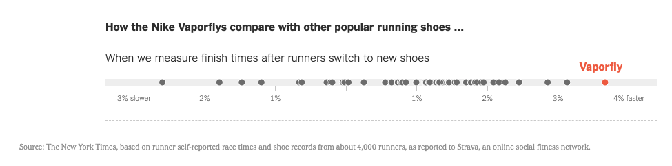
The dot plot clearly shows the outliers on the left and right as well as the clusters in the middle.
Comparisons: We are best able to make comparisons via the position of objects on a scale. This makes dot plots very effective for comparisons.
Cleaner charts: Dot plots make the chart area less cluttered. They have a high data-ink ratio.
Non-zero baseline: Dot plots are judged by position along the horizontal axis. Length is not an issue with dot plots. So dot plots do not need a zero baseline.
Let’s see 2 examples to understand this better.
Using dot plots – Examples
To replace bar charts: Dot plots are commonly used as an alternative to bar charts. They are especially useful when the values being compared are similar. It is also a good idea to replace your bar charts with dot plots if you want to give some variety to your presentations.
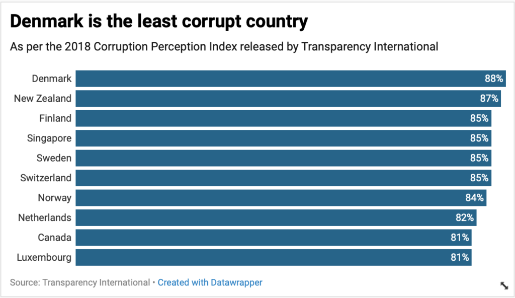
In this bar chart, look how close the values are. You can instead use a dot plot.
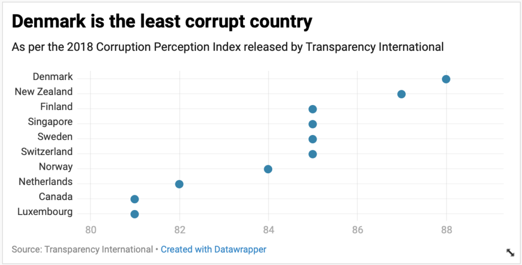
Dot plots are not as dense as a bar chart, so they easy on the eyes too.
Connected dot plots
Connected dot plots are charts that compare subgroups with respect two or more quantitative variables. Each subgroups values are plotted on a scale and are connected by a line.
To replace clustered or grouped bar charts: Dot plots can also replace clustered or grouped bar charts. I think this works especially well when comparing before and after changes or changes over 2 time periods.
In this example below, we are comparing the percentage of social logins for 2 time periods.
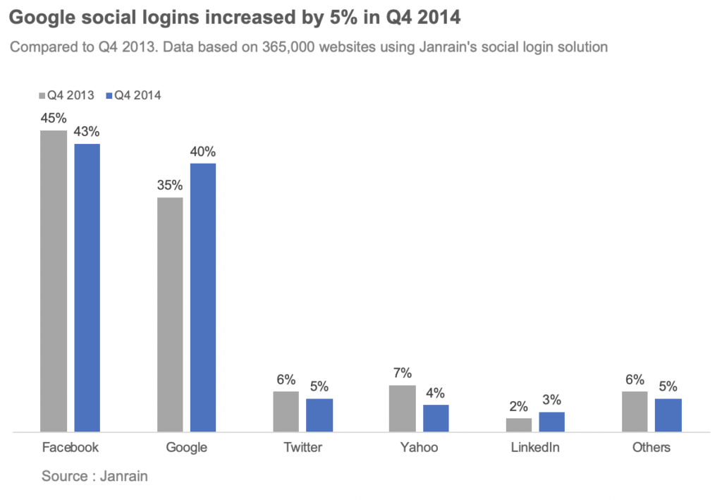
With a clustered bar chart, it is easy to see values for say Google, but it takes a bit of effort to compare the values for all the social networks. This gets worse as the number of categories increase.
In this connected dot plot, the social logins are 2013 are shown in grey and the ones for 2014 are shown in blue.
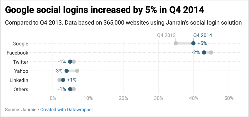
Dot plots make this comparison easier. It is easy to see how the social networks rank for the percent of logins. It is also clear who saw an increase, who saw a decrease and by how much. Connected dot plots are also sometimes referred as range plots.
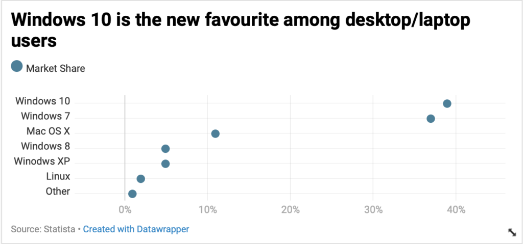
Here is another example of using a dot plot: DESI Index Makeover Chart
Have you used dot plots in your presentations? Try using them in place of bar chart or clustered bar charts and let me know how it works in the comments below.


One Comment