Less is more: Declutter your charts!
Removing unnecessary elements when communicating with charts can greatly impact the effect the chart has on your audience. If a chart appears complex, we assume it is hard to read. A cleaner chart is more likely to be read by people. When the chart focusses on a message, it is easier for your audience to focus directly on what is important.
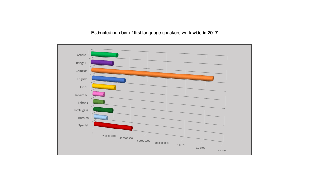
To understand the benefit, let’s look at an example. Consider how would you declutter this chart.
Initial chart
Here is the progression I went through to declutter this chart.

Each step is a small one, but collectively they make a huge impact on the final chart.
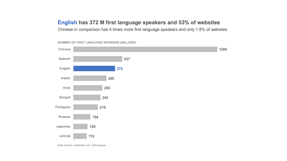
Final chart
Here are some components you can consider removing or editing to declutter your chart.
- Remove 3D effect (always)
- Remove borders
- Remove background fill (if necessary)
- Order data intentionally
- Label axis
- Remove unnecessary gridlines
- Mute necessary gridlines
- Use uniform font types
- Make numbers easy to read (convert large numbers to thousands, millions, billions)
- Add actionable title, subtitle and data sources as applicable
- Use font size to create a text hierarchy
- Use an intentional color scheme
- Use color to highlight key patterns and focus message