Should you use 3D charts?
The short answer is NO. With all the magical tools available at our disposal, it is very easy to create awesomely complex looking charts and graphs that add no value. 3D charts are one of them.
Edward Tufte called this conventional graphical paraphernalia that does not tell the viewer anything new. Furthermore, they come in the way of your audience understanding the data.
So why exactly are 3D charts bad?
Pseudo 3D charts are hard to interpret and provide no additional information
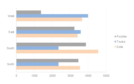
Take a look at the chart below and see if you can read the sales numbers for the 3 categories.
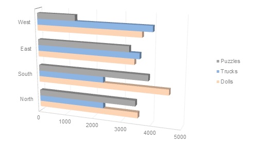
We regularly see such charts in our meetings and presentations. This is a pseudo 3D chart. There are only 2 axes here, the region and the sales numbers. But this chart was converted to a 3D view just for embellishment.
What challenges did you face?
Are the ends of the bars clearly visible?
Which end of the bar would you associate with the sales value? The front line or the shadowed back one?
Are the lengths of the bars easy to judge?
Confused? I thought so. Now let’s look at the 2D version of the same chart.
Do you see the difference?
Pseudo 3D charts provide no additional information.
Bars are not the only forms that are converted into 3D. Dots and squares are converted to spheres and cubes, lines are converted to thick ribbons. Let’s look at one more example.
Depth of true 3D charts makes it harder to align them to a scale
This is a true 3D chart with 3 axes. A Z-axis has been added to represent the categories here (depth)
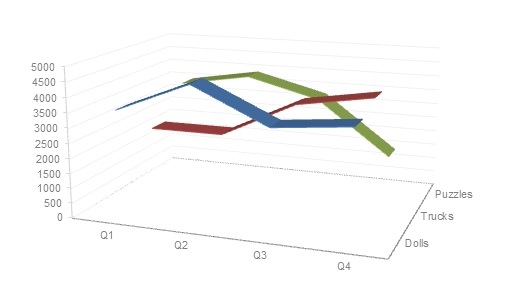
Can you guess which of these lines represent Dolls? Take a guess.
Here is it again with the legend.
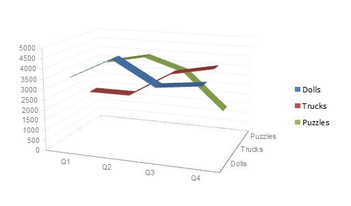
The additional depth in the chart makes it harder to align it to a scale. Hence it is not easy for us to see which line represents dolls, trucks, and puzzles. Again, the 3D chart adds no value.
Now let’s see the 2D version of this chart.
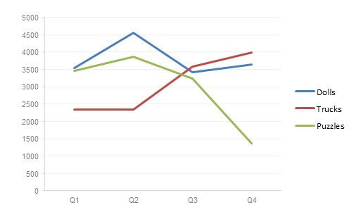
Did you notice that it is easy to read the chart with the third axis missing?
Less is More
In conclusion, 3D charts may look appealing and may make your charts look more complex, but remember they also make your charts complicated and impossible to understand.
Let’s create charts that choose information over embellishments. When it comes to visualizing data, less is more.
Evanesco 3D charts!!
(In case you are not a Harry Potter fan, that means “Vanish 3D charts!!”)
Do you agree? Drop a comment below to let us know.