Original

Analysis of the original
Here are a series of questions I use to analyse a chart.
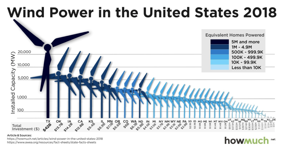
- Where are my eyes drawn? My eyes are drawn to these wind turbine pictures. The huge ones like Texas, draw my attention.
- What works in this visual? The states are sorted in the descending order. The addition of investment amount and homes powered adds more context to the chart.
- Identify clutter, make note of anything you find confusing: The wind turbine images used instead of bars make the chart look cluttered. The y-axis labelling is confusing. The x-axis text is not readable towards the right end.
- Is the take-away action clear? The chart title is topical. It does not give a clear take away message.
- Are pre attentive attributes used to draw user’s attention? Use of colors to show the number of homes powered works well. But this is lost in the windmill images and the colors don’t draw the user’s attention.
Makeover
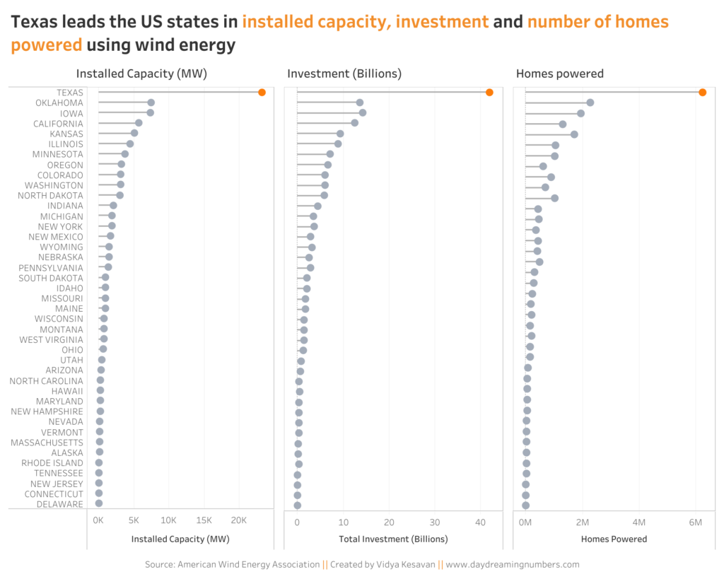
My aim with this makeover was to declutter the chart and show 3 pieces of information – installed capacity, investment and number of homes powered by Wind Energy.
I started with a bar chart, but quickly moved on to a Lollipop chart. As we can see from this chart, the states with the exception of Texas are closely clustered in installed capacity, investment and number of homes powered. In cases like this when the values are close to each other, a bar chart looks too heavy on the eyes. A lollipop chart, on the other hand uses less data-ink and is easy on the eyes.
I have previously written about dot plots and how to use them. Lollipop charts are similar to a dot plot but with a line connecting the dots to the axis.
I created this chart in Tableau using the steps from TabeauTipTuesday – Lollipop charts.
Here is the makeover.

Have you used Lollipop charts? Do you have feedback on this makeover? Let me know in the comments below.
If you want to try your own makeover, here is the data.
