Original

What works well?
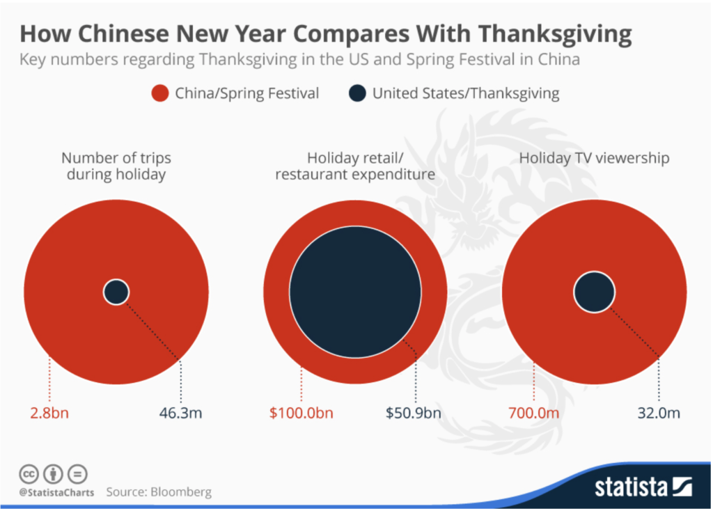
- Good use of colors to represent US and China.
- Inclusion of labels in the chart to clarify the numbers.
- The labels in the chart match the colors for US and China. This makes them intuitive to read.
What does not work?
- Comparing circles is very difficult. The charts would not be readable if not for the number labels.
- The title can be actionable.
Makeover
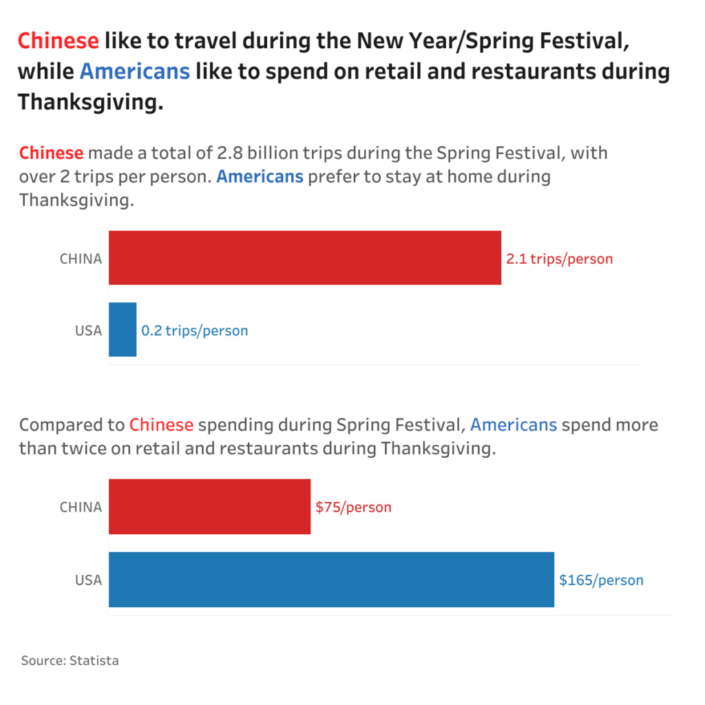
For this makeover, I wanted to bring in some context with population. Comparing China and US is not fair game. China’s population is at least 4 times that of US. As per the 2010 census, China’s population was 1.34 billion. US had a population of 0.31 billion at the same time.
I decided to compare the number of trips, TV viewership and Expenditure per person between the 2 countries.
Here is the makeover. Click the image to view the interactive version in Tableau.

If you want to try your own makeover, here is the data.
