#SWDChallenge : visualize variance
For this month’s SWDChallenge, Cole challenged us to visualize the variance in data.
Why is it important to visualize the variance in data?
A single statistic – the mode, the median or the mean may not be a model that represents the entire dataset accurately.
For this challenge, I took the monthly rainfall data for India from the open government platform website. I decided the analyze the 10 year period 2006-2015.
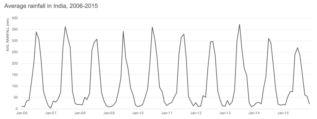
The monsoon or rainy season in India is between July to September. Knowing this we would expect to see peaks in the average rainfall between these months. Plotting the average rainfall, we get exactly that.
But this does not tell the whole story. India receives its rainfall from southwest monsoons and northeast monsoons from July-March. For most time of the year, some part of India receives heavy rainfall.
Let’s plot the MAX, MIN and AVG rainfall to see this.
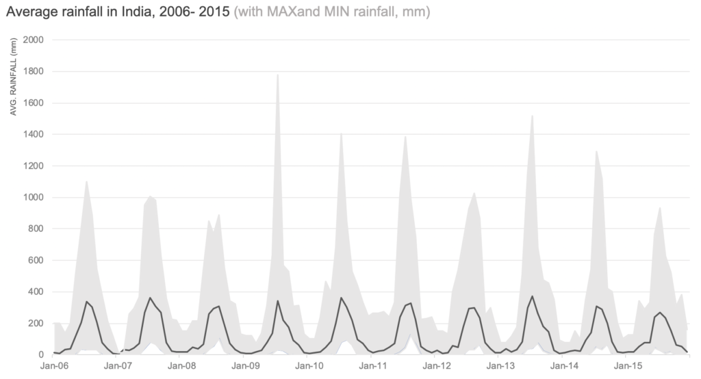
Though the average rainfall peaks between 300-400mm, the maximum rainfall is much higher and it spreads from April to December in most cases.
We have looked at average and max rainfalls. Let’s put these numbers into context. Next we’ll look at a boxplot to understand what is heavy rainfall in India.
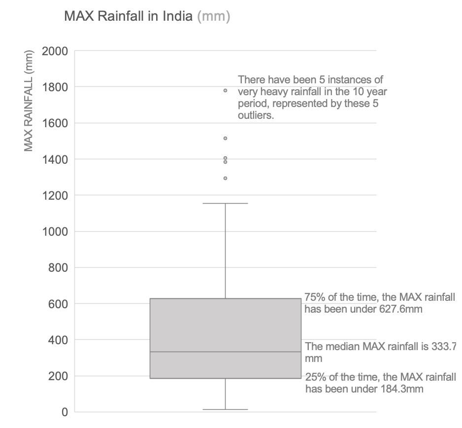
One way to understand this is to look at outliers. Outliers are values that are markedly higher than the other values. How higher? A commonly used rule in statistics is that a data point is an outlier if it is more than1.5 IQR above Q3 or less than 1.5 IQR below Q1, where Q3 and Q1 are the third and first quartiles respectively.
What is IQR?
IQR or interquartile range is the difference between the third quartile and first quartile.
IQR = Q3-Q1
Let’s calculate the outliers now.
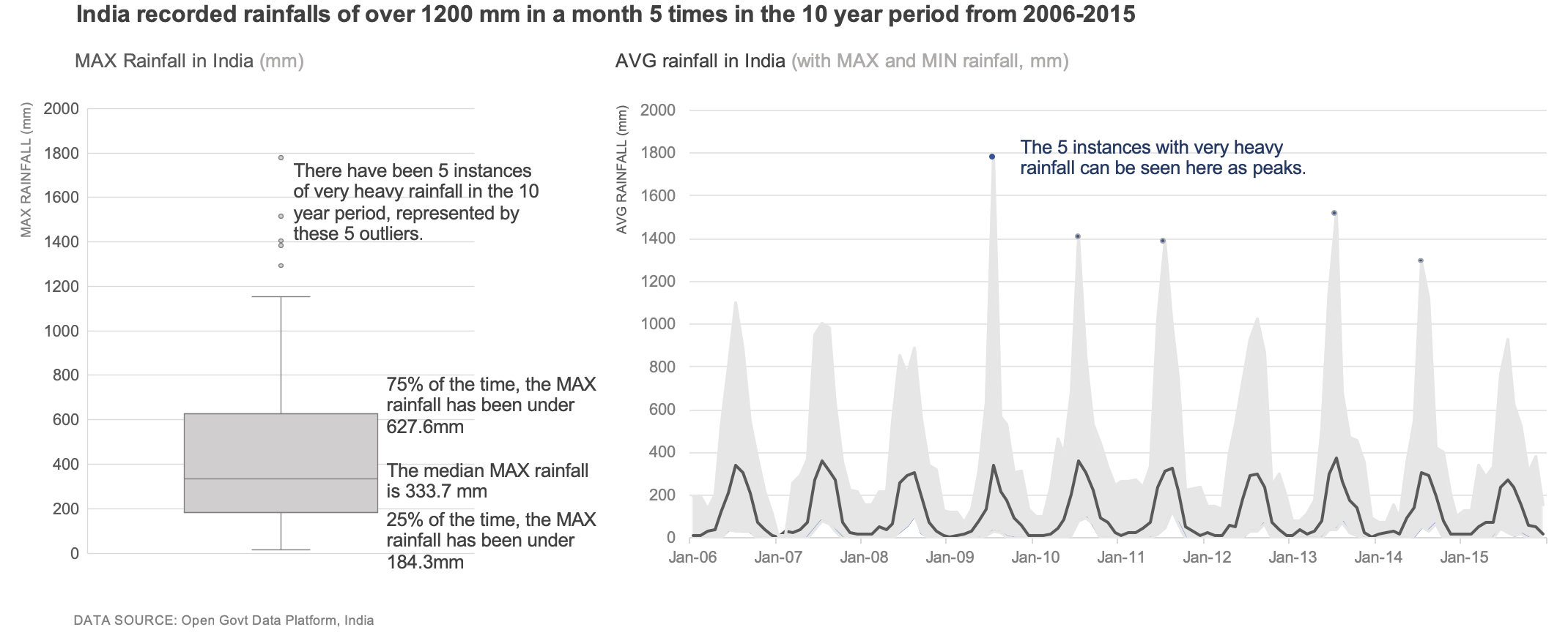
Putting it all together
Putting the 2 charts together, we can see that there have been only 5 months when India experienced very heavy rainfall of over 1200mm. They are seen as peaks on the line graph and outlier points on the boxplot.
The average rainfall for all these years has more or less stayed constant. Looking at the variance though we can see that the rainfall had its ups and downs. (Click to view enlarged image)


One Comment