How to make stacked bar charts readable?
There was a time when I believed stacked bar charts were all bad.
Stacked bar charts can be difficult to read. Beyond the first bar, we struggle to quantify the height of the bars as they do not have a common base. Is there a way to overcome this limitation? Let’s explore!
We will work through this problem with a visual that I came across in The Economic Times a few weeks back. This is the visual of a 100% stacked bar chart.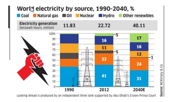
Let us change this up a bit, shall we?
There are 4 main areas where I have made modifications to the chart:
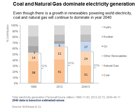
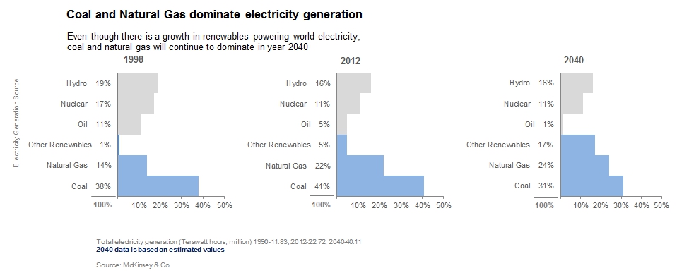
Colors: We will start with the colors. The chart is a comparison of ‘coal and natural gas’ with ‘other renewables’. Let us use colors for these 3 sources and keep the rest subdued. When choosing colors, in my opinion, it is best to stick to lighter shades of colors. These work well to highlight certain areas of the graph without taking up all the attention. The darker shades can be reserved for scenarios when we want to highlight a particular detail, for example, a huge loss in the previous quarter sales.
Order of the bars: Next, we will reorder the stacked bars. Stacking up the 3 sources we are comparing at the bottom limits eye movement during a comparison. This also makes the comparison easy as the bars are next to each other.
Notice how we are comparing coal+natural gas? So let us add them up and display the totals on the graph. This way our users do not have to do the math (and they will always thank us for that!)
Graphics on charts: This graph appeared in a newspaper article, so understandably there are some graphics to just draw reader attention. Use of eye candies in a chart is a sticky territory and the most visualization experts advise against it. You can read more about this here and here. As long as the images don’t come in the way of the graph, it is alright to keep them, if they are absolutely essential for you and your audience. But I did not see the value of visuals in this chart, so I have removed them in my version.
Footnote: The original visual has the electricity generation as a block above the graph. I found this information not directly related to the story and more of a ‘good to know’ data. So I have moved this to the footnote.
2040 values are estimated, this is highlighted to get the user’s attention.
Lastly, the source of the data should always be mentioned in a graph. Footnote is a good place to keep them.
An alternative to stacked bar charts
What if we want our audience to compare not just the 3 sources in the chart, but all of them? Sometimes we may find that even with modifications, stacked bar charts just don’t work. We could label all the stacked bars with values but we will find that the chart gets overcrowded too soon. Also, it would be like reading a table. A visual is successful only if our audience can see the story without having to struggle to find it. So let us look at a way of representing this data with good old bar charts. Ready?
(Please click on the image for an expanded view)
 A regular bar chart with minor changes can be an effective alternative for stacked bar charts.Let us see how.
- Firstly, bars do not have white-space between them. This gives the feeling that the bars add to something whole, in other words, a part-to-whole relationship. So do the percentages written along with the source names on the Y-axis.
- I have colored the 3 sources at the bottom to draw the users attention to these.
- Since this is a bar chart, reading individual values and even comparing them across the years is easy. But this chart would occupy more space (if space is a constraint!)
What’s your view on stacked bar charts? Please do leave a feedback if you like the redesign or if you have alternate ideas!