Preattentive Attributes in Visualization – An Example
Preattentive processing occurs without our consciousness at an extremely high speed. It is tuned to detect a specific set of visual attributes called Preattentive Attributes.
If you want to understand more about how we process a visual, please refer to this post on Visual Perception.
Preattentive attributes determine what information catches our attention. This is important in visualization because it enables us to direct our viewer’s attention towards the most important information in our visual.
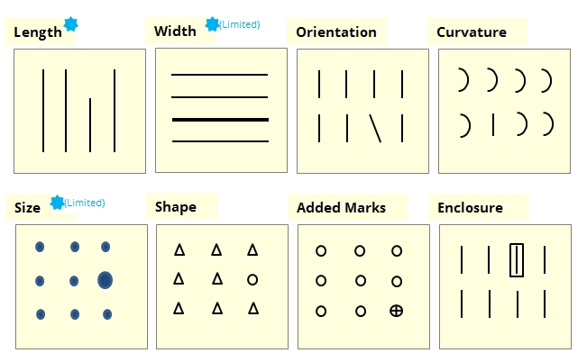
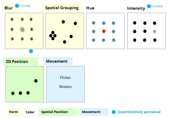
Colin ware, in his book Information Visualization perception for design, defined 4 categories of preattentive visual attributes.
- Form
- Color
- Spatial Position
- Movement
As you can see, the preattentive attributes – shorter line or the red dot catches your attention even before you realize it. This is preattentive processing at work.
Preattentive Attributes – Examples
How do we use preattentive attributes in data visualization? Let’s talk about this with an example.
Suppose you are an e-commerce company and you want to analyze your customer’s feedback data from the last quarter. You create a simple chart that looks like this.
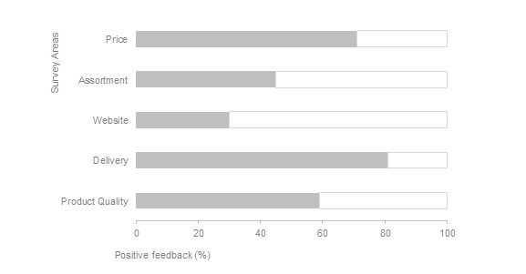
What’s the first thing you do when you see this chart? Compare the lengths. Even without looking at the numbers on the axis, you know Delivery scored the highest. Hence length is a very good preattentive attribute for quantitative information.
Let’s see another example, this time with Color. The Color is one of the most powerful preattentive attributes and when used wisely, it can drive your viewer’s attention to what you want them to focus on.
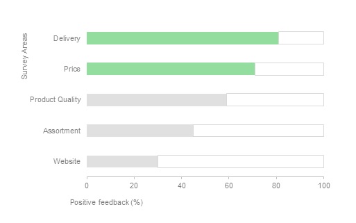
By highlighting Delivery and Price, we have drawn our viewer’s attention to these 2 top performers. Notice how the other 3 categories have been pushed to the background?
Now to share the opposite story, we could use a chart like the one below.
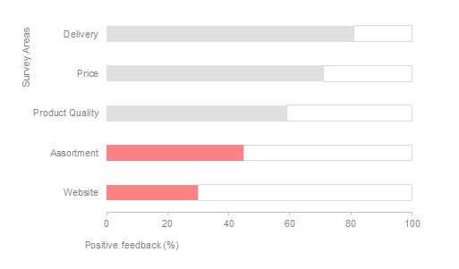
Suddenly, our viewer’s attention shifts to the bottom of the chart, the worst performers. We have set the stage for a discussion on what’s going wrong in these areas.
Strategic use of colors can be very powerful in framing our story. Remember to add a bit of context to colors when possible. We are tuned to certain familiar patterns, like green for positive and red for negative.
Want to learn how to apply Gestalt Laws to Visualization? Check this article.
Conclusion
Preattentive attributes become less distinct as variety increases. As Colin Ware wrote, it is easy to spot a single hawk in a sky full of pigeons, but if the sky contains a greater variety of birds, the hawk will be more difficult to see. Understanding preattentive attributes will help us create visuals that emphasize the most important information while keeping the rest of the information from competing for attention.
[mc4wp_form id=”361″]


5 Comments