How to add annotations to charts
Original
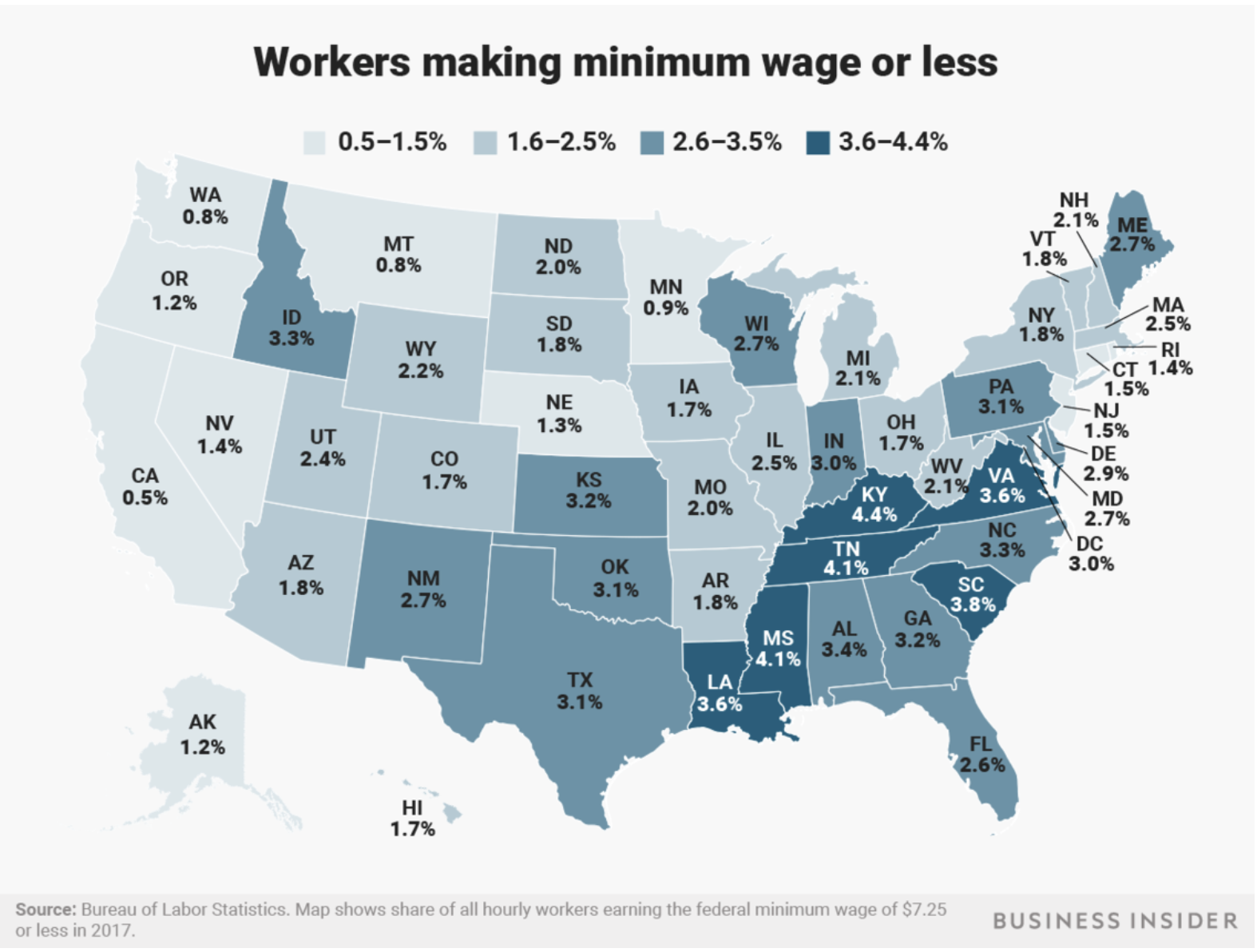
What works well?
- The color scale works well.
- It is easy to see clusters of states where there are more workers earning minimum wage or less.
What does not work?
- The chart looks cluttered with the text and percentage labels.
- Some states follow the federal minimum wage while some set their own mimimum wages. This detail appears in the article but not on the graph. Since we are comparing states on the minimum wages, it is important to call out these limits could be different for states.
Makeover
For this makeover, I decided to focus on the trend of percentage of Americans earning minimum wage or less from 2002 to 2017. This includes all Americans aged 16 years or older.
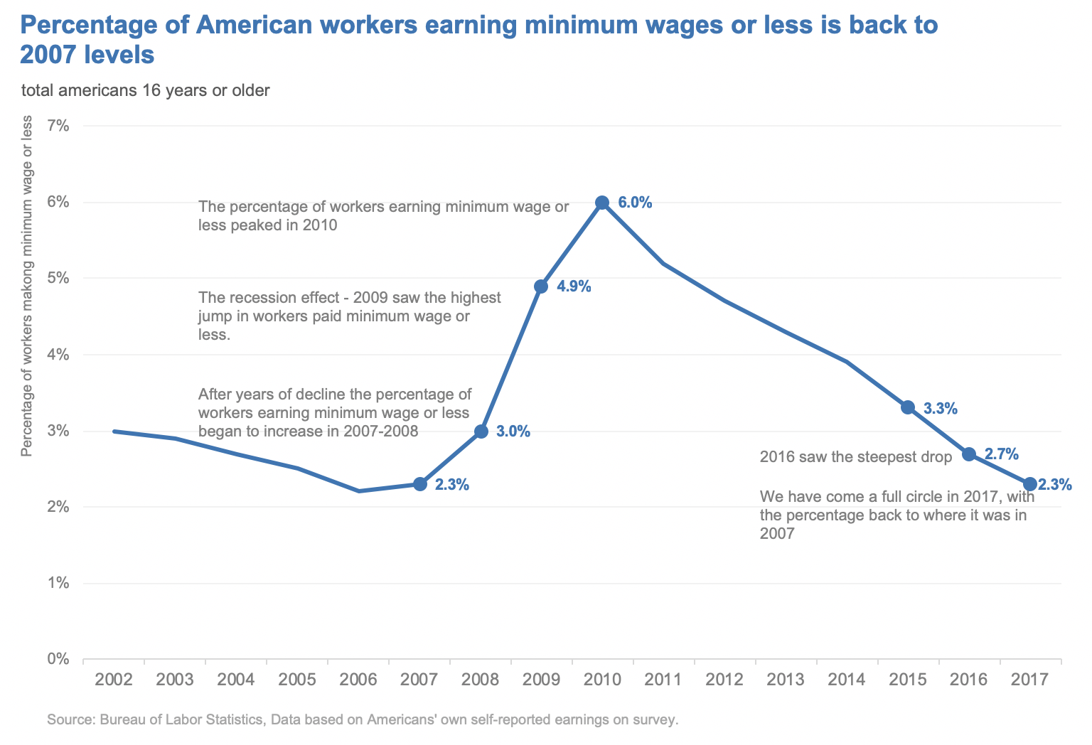
For this makeover, I wanted to practice annotations on charts.
Annotations help our readers better understand the context and our argument with the graph. They can also help us highlight specific points and show readers what to focus on.
Annotations come in the form of labels, title, subtitle and supporting text. I wanted to practice supporting text with this makeover.
Tips to add annotations to charts
Here are some lessons I have learnt on adding annotations to charts.
- Identify the key points that you would like your readers to focus on. Do not annotate every part of the chart. The principle of preattentive attributes applies to annotations also. If every point in the chart is labelled, the reader will not know where to focus on.
- Use annotations to clarify trends in the chart. For example, if sales went up by 15% last quarter, what did we do to increase the sales? Provide these additional nuggets of information alongside the graph.
- Make sure the annotations are positioned appropriately. It is easy to put a text box on the side of the graph and type a huge chunk of context there. But nobody is going to read that. Place annotations next to the relevant event. Align annotations so that they look neat. Appearance is the first thing the readers of our graphs notice. If a chart looks cluttered, they will just assume its too hard to understand.
- On the same note, do not create annotatiions in huge fonts and flashy colors. Remember, the chart is the hero. When using colors for annotations, make sure the colors are coordinated with the event or part of the graph the annotations explain.
Want to try your own makeover with annotations? You can grab the data here, 2019 W3 dataset: Data.world. Please drop a note in the comments below with thoughts on how you would approach this makeover.