Gestalt Laws Applied to Data Visualization
Gestalt is German for “Unified Whole”.
Gestalt psychologists Max Wertheimer, Kurt Koffka and Wolfgang Kohler sought to understand how we humans make sense of what we see from the chaotic stimuli around us. Their findings were that we seek to form patterns, group objects in particular ways and simplify complex images. The main principle of Gestalt Psychology is that the human mind forms a “Gestalt”, and this unified whole has its own reality, independent of its parts.
Hence the famous phrase by Kurt Koffka:
The whole is other than the sum of its parts.
What are the Gestalt Laws?
The number of Gestalt Laws vary by literature. Here are the 9 that I found apply to Data Visualization.
- Law of Proximity : We perceive objects close to each other as belonging to a group.
- Law of Similarity : We seek similarities and differences in objects and link similar objects as belonging to a group.
- Law of Closure : Our minds tend to see complete figures or forms even if a picture is incomplete.
- Law of Enclosure : We perceive objects as belonging to a group when they are enclosed in a way that creates a boundary or border around them.
- Law of Connectedness : We perceive objects connected to each other as a single group as opposed to objects that are not linked in the same manner.
- Law of Continuity : Our tendency is to see shapes as continuous to the greatest degree possible. The human eye follows lines, curves or a sequence of shapes to create pathways.
- Law of Figure and Ground : We tend to segment our visual world into figure and ground. Figure is the object that is in the focus of our vision and ground is the background.
- Law of Prägnanz (Simplicity) : Our eyes tend to find simplicity in complex shapes, preventing us from being overwhelmed by information overload.
- Law of Common Fate : We perceive elements moving together in the same speed and/or direction as belonging to a group.
How to apply Gestalt Laws to Data Visualization?
1. Law of Proximity
We perceive objects close to each other as belonging to a group.
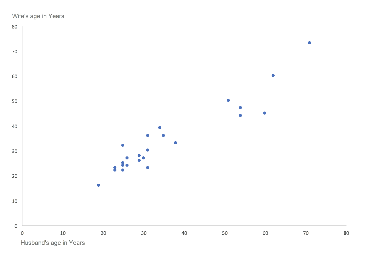
In this chart, we see 2 groups or clusters of dots, though there are no visible markings of a group.
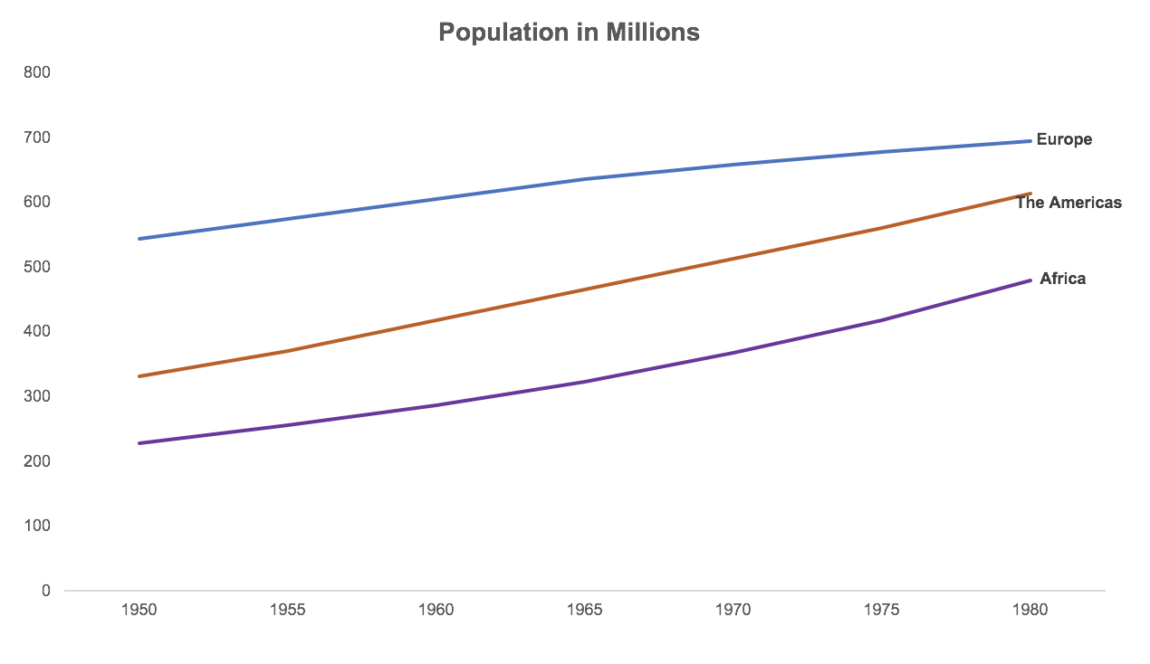
In this chart, we associate the labels Europe, The Americas and Africa with the corresponding lines because they are positioned close to the line. We can get away with not using a legend with this law of proximity.
2. Law of Similarity
We seek similarities and differences in objects and link similar objects as belonging to a group.
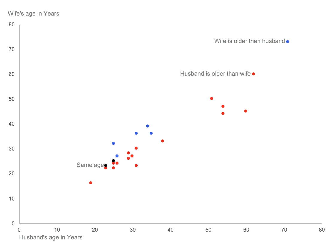
We see 3 groups in this chart – dots of colour Red, Blue and Black. Though the Red dots do not appear close together, we see them as a group since they are all Red.

Colouring the labels Europe, The Americas and Africa with the same colour as the lines, adds an element of similarity between the lines and labels.
Want to learn how to use colour in charts? Read this article on Preattentive Attributes.
3. Law of Closure
Our minds tend to see complete figures or forms even if a picture is incomplete.
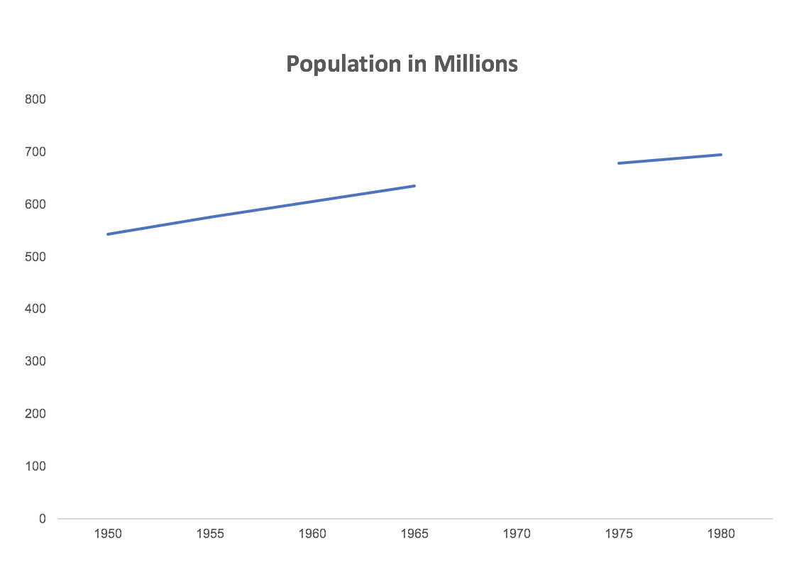
Here is a chart with some missing data for the year 1970. When we look at this, our minds automatically imagine a line connecting the 2 broken lines. Like this:
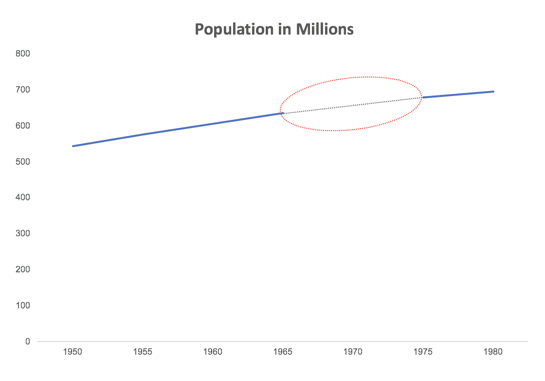
This is one of the pitfalls of the law of closure. We should be careful when showing graphs with breaks because our minds tend to form complete shapes even if the shape is incomplete.
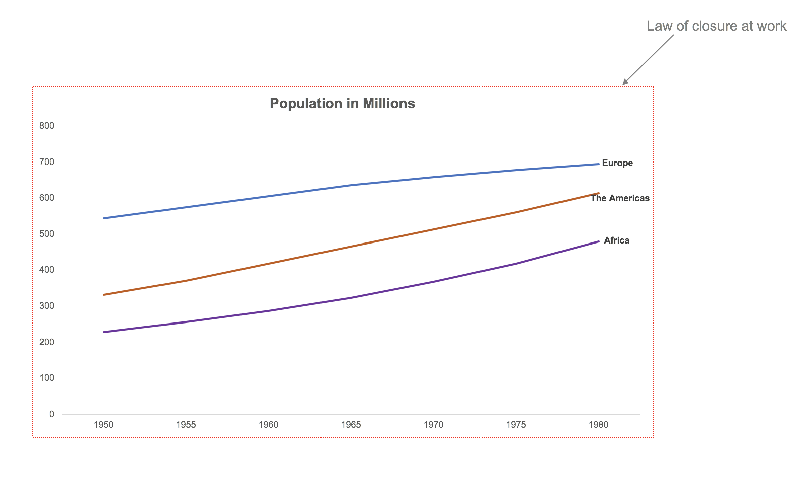
This is an example where the law of closure actually helps us avoid the clunky borders around the chart. We tend to form a complete picture of the chart (with borders) in our heads though there are no borders. So go ahead and remove the default borders that excel creates in charts because we rarely need them.
4. Law of Enclosure
We perceive objects as belonging to a group when they are enclosed in a way that creates a boundary or border around them.
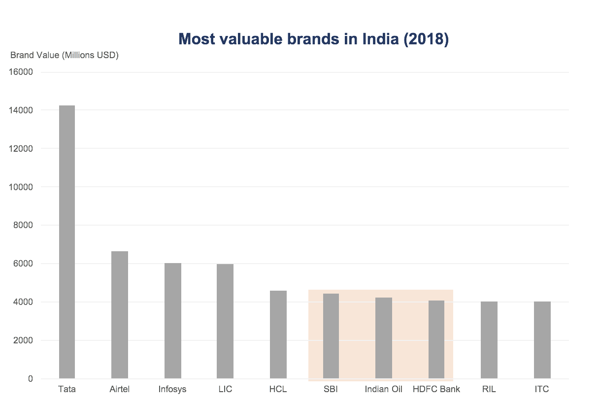
The 3 bars with the orangish shade appear to be part of a group. This is because when we enclose objects with a border or a boundary our mind perceives them as a group. Use this technique when you want to get the audience to focus on a group of objects in your chart.
5. Law of Connectedness
We perceive objects connected to each other as a single group as opposed to objects that are not linked in the same manner.

The blue dots appear to be connected, since they are connected to each other with a line. The orange dots seem like a scatter. But look at this chart below.

Now the orange dots appear connected.
This is another way of bringing the group-effect.
6. Law of Continuity
Our tendency is to see shapes as continuous to the greatest degree possible. The human eye follows lines, curves or a sequence of shapes to create pathways.
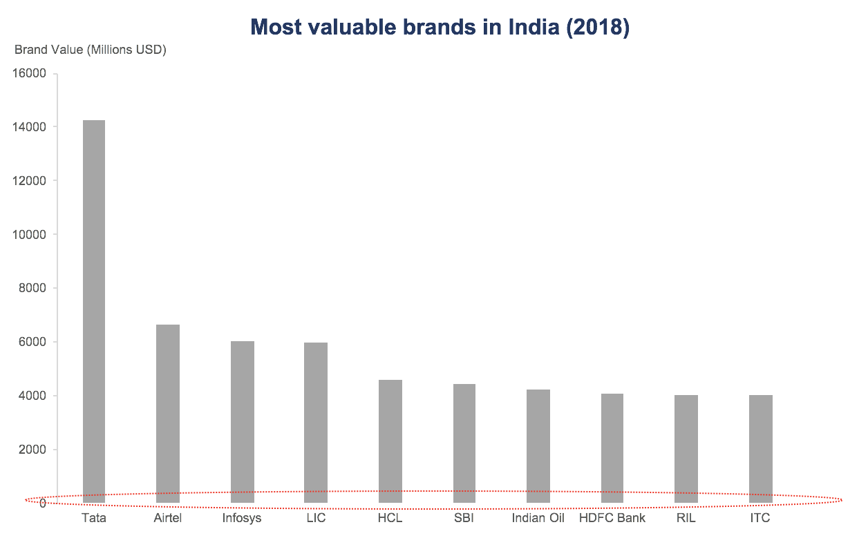
If you look closely, we haven’t used the X-Axis line in this chart.
But we see these bars as sharing a common baseline due to the law of continuity.
7. Law of Figure and Ground
We tend to segment our visual world into figure and ground. Figure is the object that is in the focus of our vision and ground is the background.
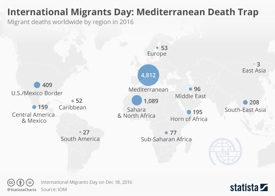
https://www.statista.com/chart/7253/number-deaths-migrants-worldwide-2016/
The blue bubbles form the figure in the chart, they are in the forefront and capture our attention. The map in the background comes into focus next.
Figure and Ground are sometimes interchangeable depending on the contrast between the two.
Another area where the Figure Ground law can be applied is in choosing a background colour for charts. It is important to choose a background colour (ground) that does not interfere with the chart (figure).
8. Law of Prägnanz (Simplicity)
Prägnanz is a German word that means “pithiness” or “concise and meaningful”.
Our eyes tend to find simplicity in complex shapes, preventing us from being overwhelmed by information overload.
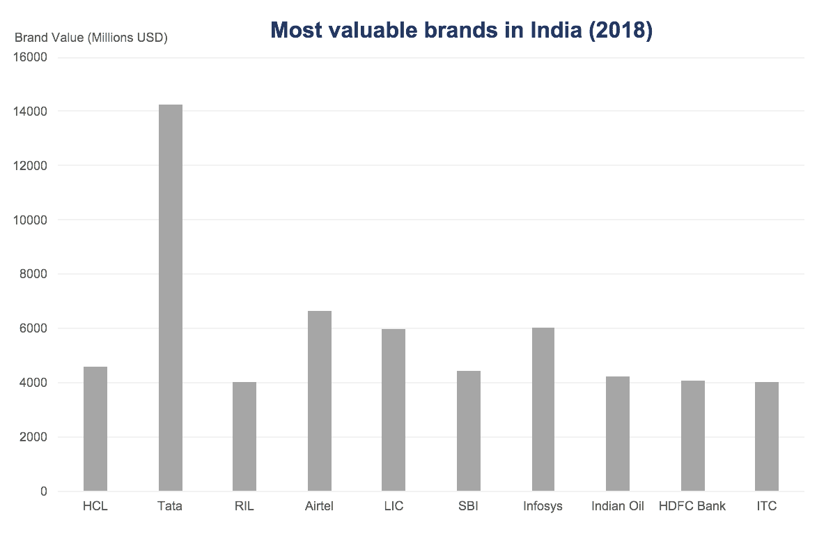
When we see this chart, we search for a pattern or something that helps us make sense of this chart.

When the same chart is sorted in order, we find much more clarity in it.
The takeaway here is to design charts that are easy for our audience to make sense of.
9. Law of Common Fate
We perceive elements moving together in the same speed and/or direction as belonging to a group.

Source: Gapminder
In this chart from Gapminder, we can see the bubbles move right and upward. We perceive this as an improvement in Life Expectancy with increase in GDP. The elements that move in the same direction are perceived to have the same fate.
Conclusion
The main idea behind Gestalt Laws is to really understand how we perceive information. As we have seen, these laws are powerful and when applied correctly they can get our visualizations to have the intended effect on our audience.
How would you use Gestalt laws? Do you have any other examples of applications of Gestalt laws in data visualization? Let me know in the comments below.


2 Comments