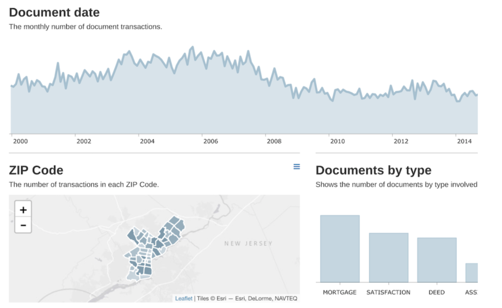
Original

Analysis of the original
- What works in this visual? The area chart gives a good overview of the number of real estate transfers. The bar charts provides a nice comparison of the type of transfers.
- Identify clutter, make note of anything you find confusing: The titles “Document Date” and “Documents by type” are not clear. What is a document?
- Is the take-away action clear? There is no takeaway action.
Makeover
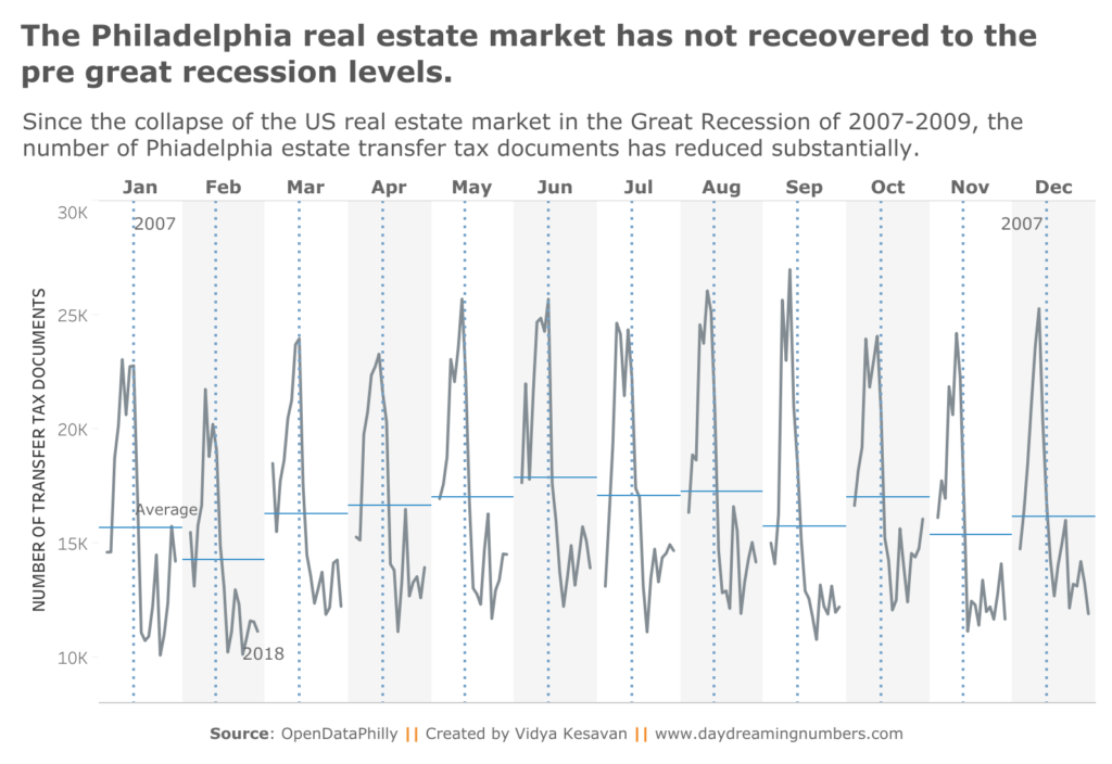
We sometimes come across a dataset that stumps us. The Philadelphia Real Estate Transfers dataset was one such dataset for me. I struggled to understand the financial data in this dataset. So I decided to create a visual with only the transfers data.
I noticed that Eva Murray used a cycle plot. I had never created a cycle plot before. So I starting learning about what cycle plots are and how to use them for this data.
Here is my makeover inspired by Eva Murray’s work.

If you would like to create your own makeover, here is the data.

One Comment