Original

What works?
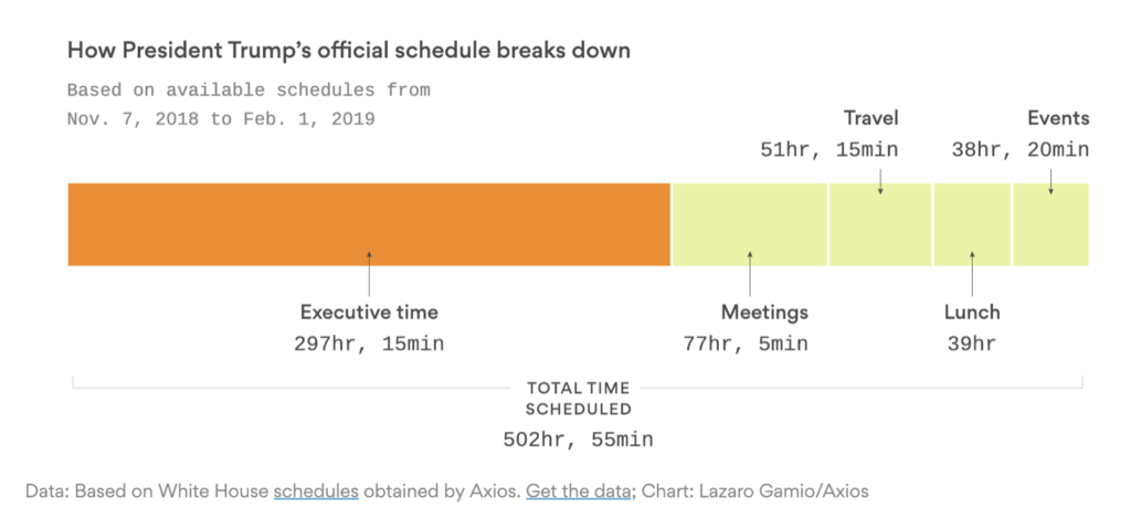
- Good visualization of time share between various categories
- Good use of color to draw attention to Executive time
What does not work?
- I couldn’t really find much that was wrong with this chart. It is a summary view of how President Trump spends his time.
Makeover
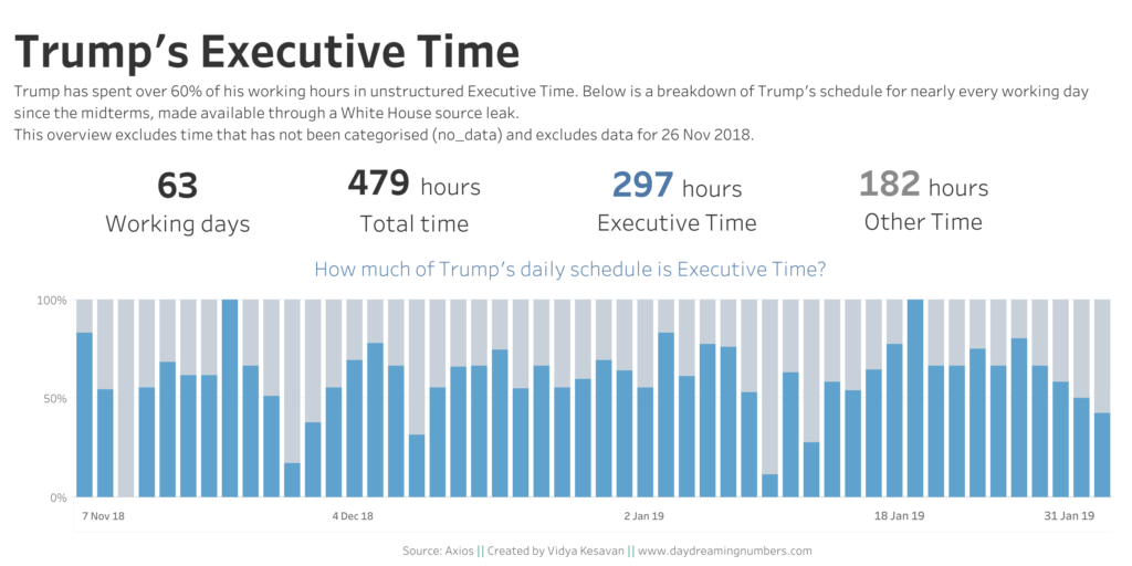
I wanted to go one step deeper into understanding how this executive time is spread across each day. The original shows 297 hours in executive time. I wanted to answer the question what percentage of each workday does Trump spend in executive time?
For this makeover, I took inspiration from Eva Murray’s design. I am trying to create the Makeover Mondays in Tableau as part of my effort to improve my Tableau skills. I tried to replicate her design in Tableau.

If you would like to try your own makeover, here is the data.
