Makeover Monday: What kind of waste appears on UK beaches?
Original
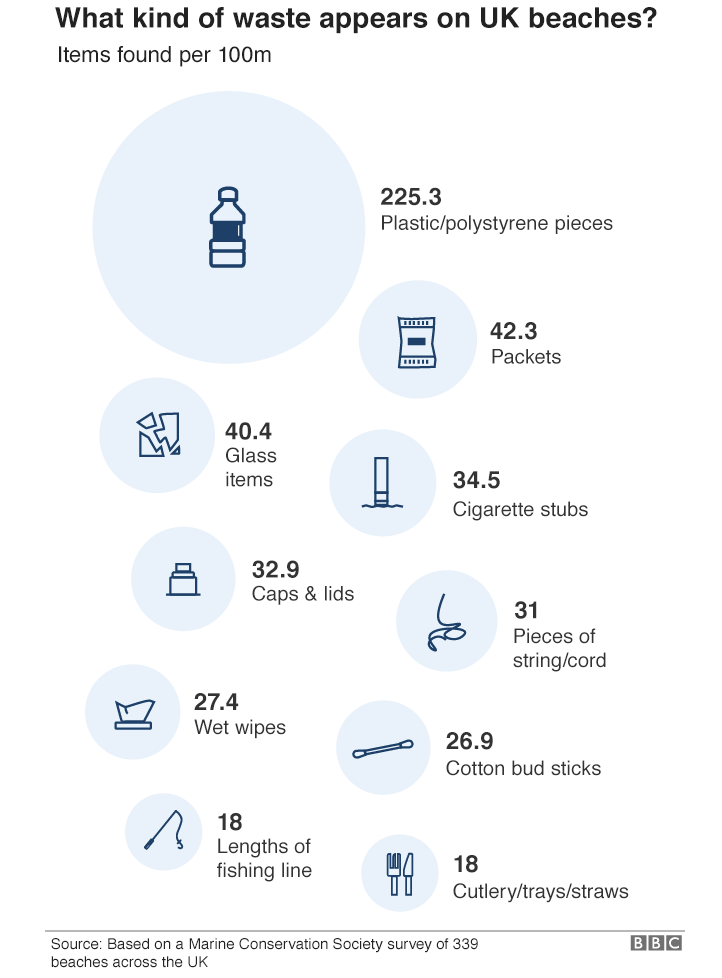
Analysis of the original
What works?
- Good title
- Clear labelling of circles
What does not work?
- Circular shapes are hard to compare. We can spot the intensity of plastic waste from the circle sizes. The rest of the circles are so similar in size that we have to rely on the labels.
- The decimal precision in the number of items seems unnecessary.
Makeover
For this week I created a quick makeover using Datawrapper. My aim was to allow easy comparison between the 10 waste sources and highlight the primary source of waste. I chose to use the trusted old bar chart.
If you would like to try your own makeover, here is the data.


