Bar Charts in D3.JS : a step-by-step guide
Let’s learn how to create a bar chart in D3.js.
To access the entire code for this tutorial, follow this link.
First a few basic concepts.
SVG:
SVG stands for Scalable Vector Graphics and is commonly used to display a variety of graphics on the web. SVG is nothing more than simple text files that describe lines, points, curves, colours, text etc.
SVG is human readable and can be easily modified by CSS or Javascript. This is the main advantage of SVG over other graphic formats such as PNG or JPG.
SVG does not use a pixel grid to render a graphic. Instead it uses shapes, numbers and coordinates. This means they are resolution independent and infinitely scalable. Hence they are not pixelated when scaled.
D3 can be used to generate and modify visuals as SVGs. We will learn how to do this in a bit.
Data:
To keep this example simple, we will use an array of numbers as our dataset.
var dataset = [ 5, 10, 13, 19, 21, 25, 22, 18, 15, 13,11, 12, 15, 20, 18, 17, 16, 18, 23, 25 ];
Step 1: Define the height and width of SVG container.
The first step to create a bar chart is to define the area in which the chart will be drawn. We do this by specifying the height and width parameters for the SVG container. Remember the graphics we will create are all SVG.
This is done using these 2 lines of code:
var w = 600;

var h = 250;
So the width is set to 600 pixels and height is set to 250 pixels.
Step 2: Define the scales
What are scales in D3?
Let’s understand the concept of scales in D3.
The visual representation of a scale are the numbers we see on the axes. The scale itself is a mathematical relationship between the data we want to represent and the pixels on the screen.
Suppose these are the number of pens sold by a stationery each month:
var pens = [150, 200, 250, 400, 500];
If we use the data values directly as display values, the bar heights in pixels would be 150 pixels, 234 pixels and so on upto 500 pixels. This may still work. But what if the stationery sells 2000 pens next month? The point here is the data values cannot be directly used as display values because they are not scalable. This is where scales come in. They convert the data into pixels.
Mike Bostock defines D3 scales as: Scales are functions that map from an input domain to an output range.
A scale’s input domain is the list of values in the data. In our example, input domain is [150, 500] which means we have values ranging from 150 to 500.
A scale’s output range is the range of possible output values, commonly expressed in pixels. This output range is determined by the designer.
So here are the input domain and output range for our example.
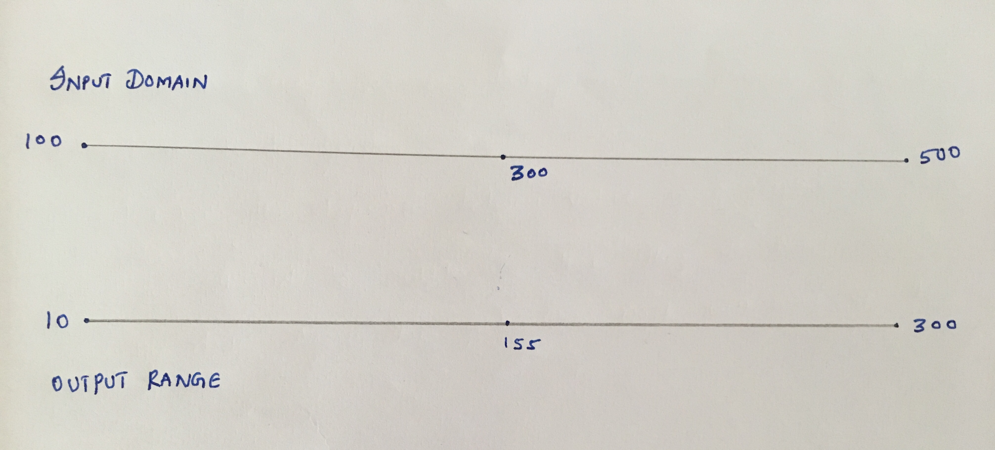
If you would like to try it out, open the Javascript console on your browser and try this code:
var scale = d3.scaleLinear();

scale.domain([100,500]);

scale.range([10,300]);
Now try:
scale(100);
Ordinal Scale
The type of scale we use in the bar chart is an ordinal scale. Ordinal scales are used for ordinal data, data that represents categories with some inherent order.
//create ordinal scale

            var xScale = d3.scaleBand()

                           .domain(d3.range(dataset.length))

                           .rangeRound([0,w])

                           .paddingInner(0.05);
scaleBand is used to position many visual elements in a particular order with even spacing between them. In this case, we have vertical bars, positioned left to right, with even spacing between them.
Ordinal scale domains
Ordinal scale domains do not need a range because they represent categorical items. For example, if we are creating a bar chart to represent the sales of Apples, Oranges and Mangoes, the domain would be:
.domain([“Apples”, “Oranges”, “Mangoes”])
Since we do not have explicit categories for our bar chart, we will use an ID corresponding to the position within the dataset. Our categories will be [0,1,2,3,4,5,6,7,8,9,10,11,12,13,14,15,16,17,18,19]
.domain(d3.range(dataset.length)) : d3.range(dataset.length) is nothing but d3.range(20) which generates [0,1,2,3,4,5,6,7,8,9,10,11,12,13,14,15,16,17,18,19]. And .domain() sets the domain of our ordinal scale to those values.
Ordinal scale range
.rangeRound([0,w]) : D3’s scaleBand divides the output range into even sized bands.
W = 600
.rangeRound([0,600]) = (w-0)/dataset.length = (600-0)/20 = 30
So each band is 30 wide.
Padding
Finally .paddingInner(0.05) makes sure that there is space between the bars. In this case the padding is set to 5%.
Creating a linear scale
var yScale = d3.scaleLinear()

                        .domain([0, d3.max(dataset)])

                        .range([0, h]);
The y scale for the chart is continuous, hence we use d3.scaleLinear()
.domain([0, d3.max(dataset)]) : This simply sets the domain as [0, 25]. d3.max(dataset) returns the maximum value in the dataset.
.range([0, h]) : This sets the range as [0, 250] since the container height is 250 px.
Step 3: Build the bars
Before we build the bars, we need to create an SVG element.
//Create SVG element

            var svg = d3.select("body")

                                .append("svg")

                                .attr("width", w)

                                .attr("height", h);
d3.select uses a selection. Selections provide methods to manipulate selected elements.
Now that we have a reference to SVG, we can move on to creating bars. Here is the code.
 //build bars

           svg.selectAll("rect")

                 .data(dataset)

                 .enter()

                 .append("rect")

                 .attr("x", function(d,i){

                    return xScale(i);

                })

                 .attr("y", function(d){

                    return h - yScale(d);

                })

                 .attr("width", xScale.bandwidth())

                 .attr("height", function(d) {

                    return yScale(d);

                })

                 .attr("fill" ,"teal");
svg.selectAll(“rect”) : Returns all the “rect” in the DOM. Since there are no rects yet, this returns an empty selection.
.data(dataset) : counts and parses the data values. Since there are 20 elements in our data, everything from now on is executed 20 times.
.enter() : this is used to create new data bound elements. Enter looks at the current DOM selection and the data being handed. If there are more data elements than DOM selections, enter creates placeholder elements for the data.
.append(“rect”) : takes the empty placeholders created by .enter() and adds “rect” elements to them.
.attr(“x”, function(d,i){ return xScale(i); }) : This line of code sets the starting position of the bars. We have already defined the xScale. So xScale(0) would be the starting position of first bar, xScale(1) for the second bar and so on. We do this using an anonymous function with d and i as parameters. d is the dataset and i is the index variable that goes from 0 to 19.
.attr(“y”, function(d){ return h – yScale(d); }) : In a SVG, the coordinates (0,0) are at the top of the container. This means that our bars start at the top and grow down. The y attribute denotes this top. Hence we scale the data value and subtract it from the height of the container to get the y attribute.
.attr(“width”, xScale.bandwidth()) : The bandwidth() function automatically calculates the width of the bar for the scale.
.attr(“height”, function(d) { return yScale(d); }) : The height here refers to where the bars end. Remember the bars grow down. This is simply the scaled value of the data.
Step 4: Colour the bars
.attr(“fill” ,”teal”) : This fills the bars with teal colour.
Step 5: Add text labels
//text labels on bars

           svg.selectAll("text")

                 .data(dataset)

                 .enter()

                 .append("text")

                 .text(function(d) { return d; })

                 .attr("x", function(d,i){

                    return xScale(i) + xScale.bandwidth() / 2;

                 })

                 .attr("y", function(d){

                    return h - yScale(d) + 14 ;

                 })

                 .attr("font-family" , "sans-serif")

                 .attr("font-size" , "11px")

                 .attr("fill" , "white")

                .attr("text-anchor", "middle");
svg.selectAll(“text”) .data(dataset).enter().append(“text”) : This set of code is similar to the create bars code, except here we are creating text elements.
.text(function(d) { return d; }) : We use an anonymous function to get the data value. This is the label that would be displayed on the bars.
.attr(“x”, function(d,i){ return xScale(i) + xScale.bandwidth() / 2; }) : This is the x-position of the label. We want the labels to be in the middle of the bars. The bars start at xScale(i. So adding half the bandwidth to it, gives us the starting position of the labels.
.attr(“y”, function(d){ return h – yScale(d) + 14 ; }) : We want the labels to be inside the bars, closer to the top. h – yScale(d) represents the top of the bar. To bring the label inside, we add a few pixels ( remember 0,0 is at the top left). We add 14 pixels here to bring the label within the bars. This is a number that we get by trial and error.
Finally, we format the text.