How to create your first Slopegraph in R
Slopegraphs first appeared in Edward Tufte’s book The Visual Display of Quantitative Information.
Slopegraphs compare changes usually over time for a list of nouns located on an ordinal or interval scale – Tufte
Creating a Slopegraph in R
While there are templates and tools available to create a Slopegraph, creating one in R still takes a good deal of time. So in this post, I give you 7 easy steps to create your first Slopegraph in R.
Data
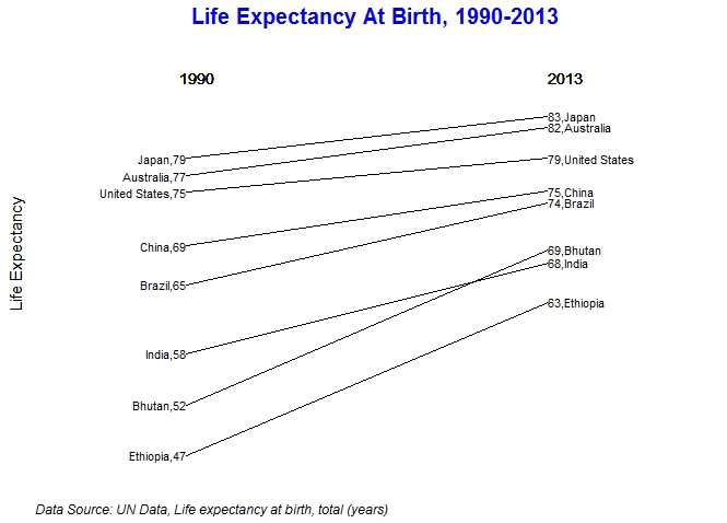
The dataset for this Slopegraph is from the UN data “Life expectancy at birth, total (years) “
The original dataset contains 238 countries. To keep it simple, I have used a sample of 8 countries for this graph. You can download the data for this graph here.
Steps to create a Slopegraph in R
These are the 7 steps to create a basic Slopegraph in R
- Format the data
- Create the labels
- Draw the plot
- Adjust spacing around the plot for labels
- Set the labels
- Print the plot
- Add a footer
1. Format the data
Most often, the data you download may not be in the format required for a Slopegraph.
There are 3 important variables in a Slopegraph –
- List of nouns we are measuring the change for (countries in our example)
- The value we are measuring (life expectancy)
- Time period (1990 to 2013)
life <- read.csv("LifeExpectancy.csv",header=TRUE)

tmp1990 <- life %>% filter(Year==1990)

tmp2013 <- life %>% filter(Year==2013)

year1990 <- tmp1990$Value

year2013 <- tmp2013$Value

group <- tmp2013$Country

years <- 23

a <- data.frame(year1990,year2013,group)
The code above will make our data look like this:
[splus]
year1990 year2013 group
76.99463 82.19756 Australia
52.46232 69.10293 Bhutan
65.34032 74.12244 Brazil
69.47156 75.35302 China
47.09956 63.44220 Ethiopia
57.94373 67.66041 India
78.83683 83.33195 Japan
75.21463 78.84146 United States
[/splus]
We also create a variable for the x-axis called years. This is set to 23 to represent the difference between 2013 and 1990.
2. Create the labels
A slopegraph uses labels on both ends of the line. The next step is to create these labels.
The label used here is group name + value.
lab1990 <- paste(a$group, round(a$year1990),sep=",")

lab2013 <- paste(round(a$year2013), a$group, sep=",")
3. Draw the plot
It’s time to draw the graph!
First we create a basic plot using ggplot. We will use geom_segment to create the slope lines for the Slopegraph.
p <- ggplot(a) + geom_segment(aes(x=0,xend=years, y=year1990,yend=year2013), size=0.5)+ ggtitle("Life Expectancy At Birth, 1990 & 2013")+theme(plot.title = element_text(face="bold",size=20,color="blue"))
Let’s also set the background, grids, ticks, text and borders to blank.
p<-p + theme(panel.background = element_blank())

p<-p + theme(panel.grid=element_blank())

p<-p + theme(axis.ticks=element_blank())

p<-p + theme(axis.text=element_blank())

p<-p + theme(panel.border=element_blank())
4. Adjust spacing around the plot
This is where creating a slopegraph becomes a bit of trial and error. The spacing around the plot must be adjusted so that we can accommodate the labels we created in Step 2. This is done using xlim and ylim.
Depending on the data you may need to adjust these values.
p <- p+ xlim(-8,(years+9))

p <- p+ylim(min(a$year2013,a$year1990),max(a$year2013,a$year1990)+7)
5. Set the labels on the plot
We use geom_text to set the labels on the Slopegraph.
The label y position is determined by the value of life expectancy (from the value column in our data) and the x position is 0 and 23 for the left and right sides respectively.
p<-p+geom_text(label=lab2013,y=a$year2013,x=rep.int(years,length(a$year2013)),hjust=0, vjust=0.5,size=4)

p<-p+geom_text(label=lab1990,y=a$year1990,x=rep.int(0,length(a$year2013)),hjust=1, vjust=0.5,size=4)
We also set the labels to call out the years at the top.
p<-p+geom_text(label="1990",x=0,y=(1.05*(max(a$year2013,a$year1990))),hjust=0.2,size=5)

p<-p+geom_text(label="2013",x=years,y=(1.05*(max(a$year2013,a$year1990))),hjust=0,size=5)
Again, depending on the data, this step will need some adjustments to the hjust and size parameters.
Let’s also add a title to Y axis. The X axis in this graph does not need a title.
p<-p+xlab("")+ylab("Life Expectancy")+ theme(axis.title.y = element_text(size = 15, angle = 90))
6. Print the plot on the screen
print(p)
7. Add a footnote
Finally, as with any graph, this needs a footnote with the data source and any other useful information.
grid.newpage()

footnote <-"Data Source: UN Data, Life expectancy at birth, total (years)"

g <-arrangeGrob(p, bottom = textGrob(footnote, x = 0, hjust = -0.1, vjust=0.1, gp = gpar(fontface = "italic", fontsize = 12)))

grid.draw(g)
Here’s our final graph.
The entire code and data for this graph can be accessed from Slopegraph-in-R
If you found this post helpful or if you have any questions or comments, please leave a note in the comments section below.
References:
These are some articles I found useful while creating this Slopegraph.
https://acaird.github.io/computers/r/2013/11/27/slopegraphs-ggplot
https://github.com/jkeirstead/r-slopegraph/blob/master/slopegraph.r


2 Comments