This month’s #SWDChallenge was to visualize a specific dataset and create visualization(s) to answer specific questions. This is different from an open-ended data analysis where we go on looking for interesting stories in the data.
Most often in our jobs, we use data visualization to communicate answers to predefined questions – for example, who are our top spending customers, how does user engagement vary with time. This was a very similar and targeted exercise.
There is no single “right” way to visualize data. Data can be visualised in multiple ways and each view allows us to see something different about the data. The premise of this challenge was to see the differences and similarities of the views created.
The data
The data for this exercise comes from Aiddata. In this dataset, each row represents a financial transaction between 2 countries – a donor and a recipient. The other attributes in the data are Year, Commitment amount and Coalesced purpose. I downloaded this version of the dataset.
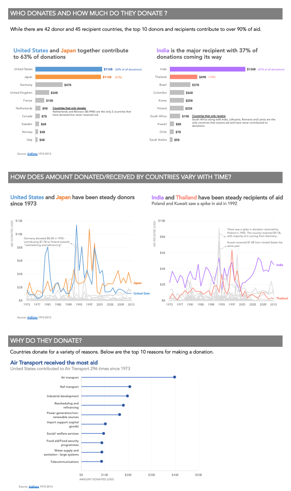
I created a report-like format to visualize this data.

Question 1: WHO DONATES AND HOW MUCH DO THEY DONATE?

I noticed that the bulk of the donations from 1973-2013 came from the United States and Japan. Similarly, 37% of all donations went to India. Most countries both donate and receive aid. There were exceptions to this rule though. Netherlands and Monaco only donated and never received aid. South Africa, India, Lithuania, Romania, and Latvia were the only countries that received aid but never donated.
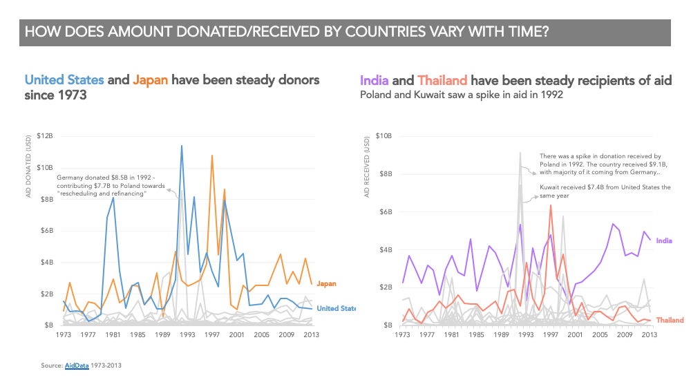
Question 2: HOW DOES AMOUNT DONATED/RECEIVED BY COUNTRIES VARY WITH TIME?

There were some interesting spikes in the data which I annotated. The year 1992 was interesting with some spikes in donations. Germany donated a sizeable amount (7.7B USD) to Poland and Kuwait received 7.4B USD from the United States the same year.
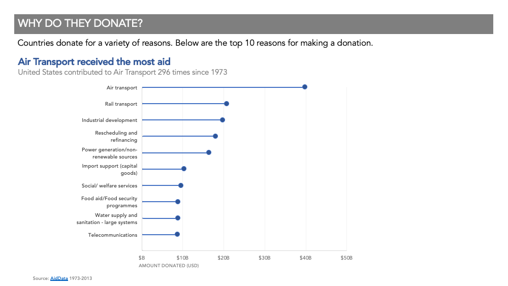
Question 3: WHY DO THEY DONATE?
It turns out “Air Transport” gets at least twice the donation amount compared to any other reason.

- I used R to analyze the data and get these insights. Specifically, I used dplyr package for all analysis and tidyr package to reformat the data for question 2.
- I created the charts in excel.
- I created the final designs in powerpoint.
If you would like to see the entire report, here is the PDF I submitted for this challenge.
