Makeover Monday: Operation Fistula
Original
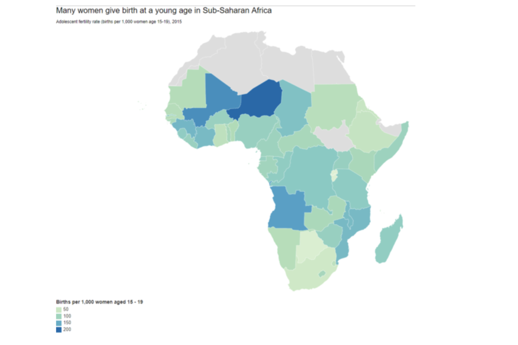
Analysis of the original
Here are a series of questions I use to analyse a chart.
Where are my eyes drawn? : My eyes are drawn to the dark blue showing countries with more than 200 births per 1000 women aged 15-19.
What works in this visual? : Good title, good use of colors, good tooltips
Identify clutter, make note of anything you find confusing: The legend labels are whole numbers instead of a range (say 0-50). This is confusing because the map colors are actually ranges.
Is the take-away action clear? Yes, the title clearly states the takeaway action.
Are pre attentive attributes used to draw user’s attention? Yes, the colors are used well to draw attention.
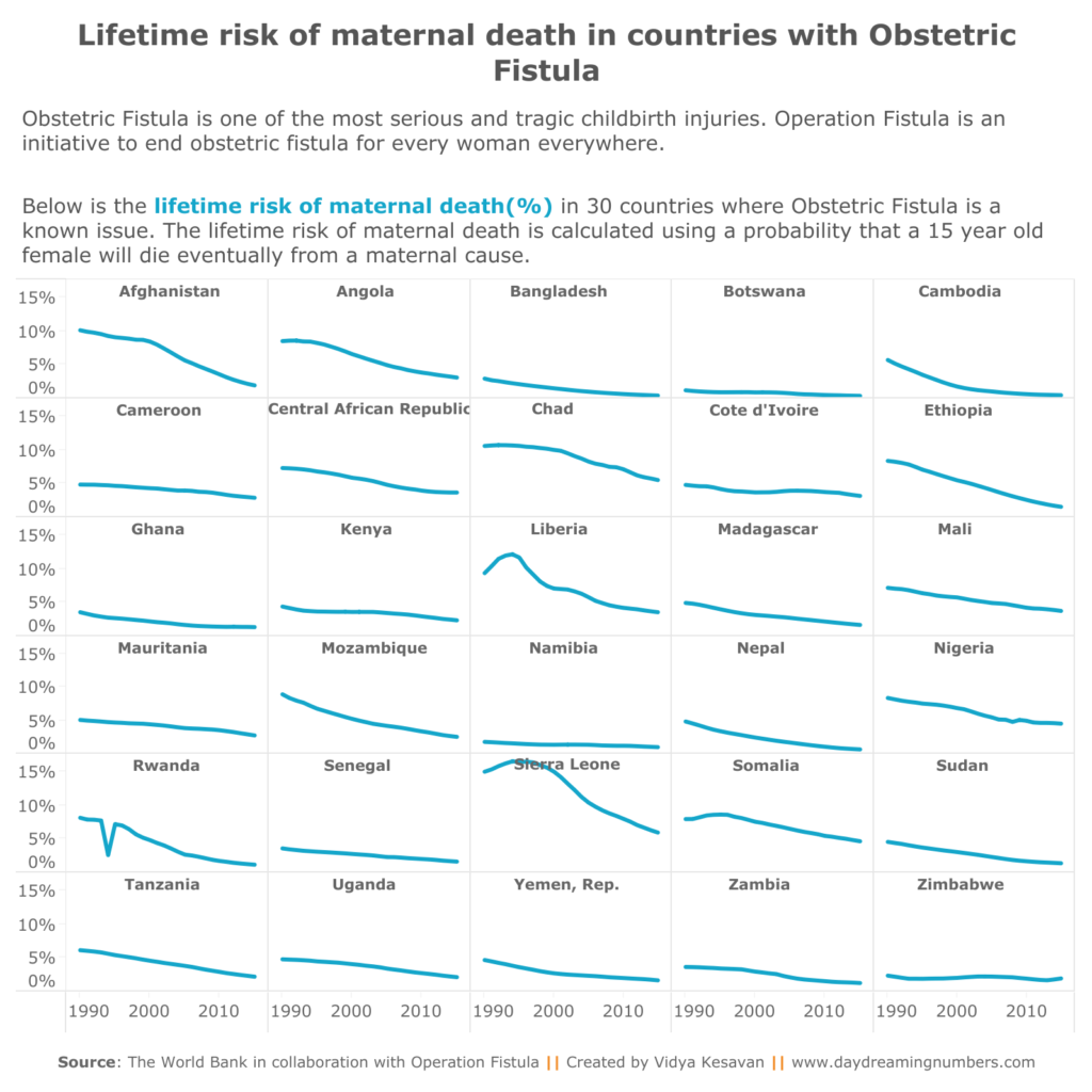
Makeover
My aim with this makeover was to create a chart that shows the relation between Obstetrics Fistula (OF) and lifetime maternal deaths in various countries.
Obstetric Fistula is one of the most serious and tragic childbirth injuries. It mostly affects women in remote parts of the world who tend to be isolated and ostracised as a result of the injury.
There currently exists no real estimates of the prevalence of OF around the world. Using world health indicators and knowledge of countries that treat OF, Operation Fistula has created an indicator suggesting which countries may have OF.
In this week’s makeover, I compare the lifetime risk of maternal death (%) in 30 such countries from 1990-2015.
For this makeover, I wanted to practice small multiple charts in tableau. It turns out it is very simple to create these in Tableau. Here is a tutorial: Small multiples in tableau.
If you would like to create your own makeover, here is the data.