Consistency in charts
In this post let’s talk about the importance of consistency when telling a story with charts.
So what is consistency? Consistency in story telling comes from colors, type of charts, font and size of messaging, alignment of various chart objects, to name a few. Consistency is everything that makes a chart look neat and easily readable.
Let’s look at this with an example.
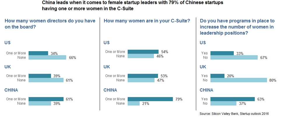
I came across this visual that talks about how China beats the US and UK when it comes to female start up leaders
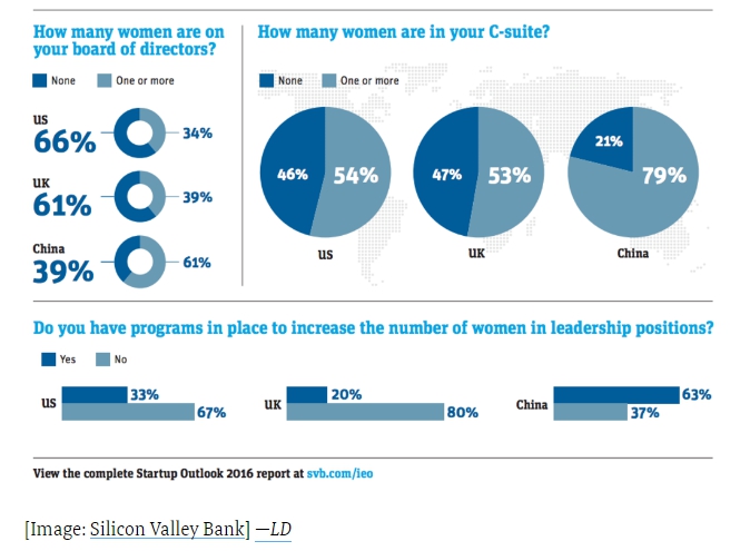
At a first glance, this is a a good visual.
Each of these charts do a good job of communicating the message. There is good color selection and there aren’t too many colors. I think overall, the visual does a great job of telling the story that China leads the world in terms of women leaders in startup companies.
This visual has one major negative though – Inconsistency. Let’s dig deeper into this.
Color consistency:
Let’s start with the Donut and Pie charts first. The dark blue color indicates a negative sentiment here (No women in board of directors or the C-Suite).
When we move on to the bar charts though, the dark blue color represents a positive sentiment (having programs in place to increase the number of women in leadership positions).
Colors are a vital part of a visual and they should be used strategically and meaningfully.
We very easily adapt to the color sentiment in a chart. When I scanned through this chart I instantly associated the colors with the kind of message they represent, which became confusing as I got to the bar chart.
Chart selection:
The next question that came to my mind was – “Why use 3 different type of charts in this story?”
In my opinion, this has no practical significance, it just adds a bit of variety to the visual. It hinders comparison between the 3 charts in the story. Donut and Pie charts are not meant for comparisons.
When I compare these 3 charts I have to rely heavily on the numbers. If a single chart type, like say a bar chart was used, the comparison would be much easier.
When a story draws messages from multiple charts in a visual, it is important to choose charts that are easy to compare.
Legends:
This is outside the consistency topic, but it is an important aspect in readability of charts.
Use of colors does not always necessitate a separate legend. It is important to understand why we use colors in the chart. In this example, we use colors to draw attention to a common sentiment across various categories. The problem with using a legend here is that our eyes go back and forth between the legend and the chart. Not very fun.
Now that we have addressed these 3 issues, let’s see a makeover of this visual.
The colors here portray a uniform sentiment throughout the visual. Dark blue for positive and light blue for negative.
The bar charts make the comparison across the 3 charts easier.
The legends are replaced by the categories on the left. We can scan through the chart left to right or top to bottom without having to glance at the legend each time.
What are your thoughts on consistency when telling a story with charts?