The Pie Debate
Let’s talk about one of the most hated charts in the data visualization community – Pie Charts.
While pie charts are one of the most commonly used visual forms, they are also the most debated. There are numerous articles about why pie charts are a bad idea and a lot of critics are vocal about not using pie charts. And there are counter arguments about why pie charts are not that bad after all. In this article, we will trace back the origins of a pie chart and answer some basic questions.
Here is what we will cover in this article:
- Understand why pie charts are so common
- The origin of a pie chart
- When to use a pie chart
- When not to use a pie chart
- The alternatives to a pie chart
- Links and references for further reading
Ready? Let’s dive in.
So why are pie charts so common?
Pie charts are very easy to understand. They depict the part-to-whole relationship in a way no other graphical form can effectively do. As children, we learn fractions using a pie chart. So we are in a way familiar with pie charts from very early on.
Pie charts are also overused (and abused) in the business world. And sometimes, a simple table can convey the information better than a pie chart. They are hence the object of hatred for the data visualization community.
Origin of a pie chart
The use of circles was common in mathematics and logic diagrams. Ramón Llull used them in his Ars Magna (1305–08).
The earliest known pie chart is generally credited to William Playfair’s Statistical Breviary of 1801, in which two such graphs are used. Playfair presented an illustration, which contained a series of pie charts depicting the areas, populations, and revenues of European states.

One of those charts depicted the proportions of the Turkish Empire located in Asia, Europe, and Africa before 1789.
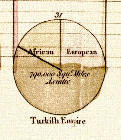
This was the first pie chart to display proportions and to differentiate them by color. [3]
In the early 20th century, the pie became the subject of criticism. Provoked by criticisms, a number of psychological experiments were conducted on graphs where subjects were required to estimate quantities represented by various graphical forms. These experiments were generally inconclusive about the inferiority of the pie charts. But by mid 20th century, a number of critics held strong opinions against the pie.
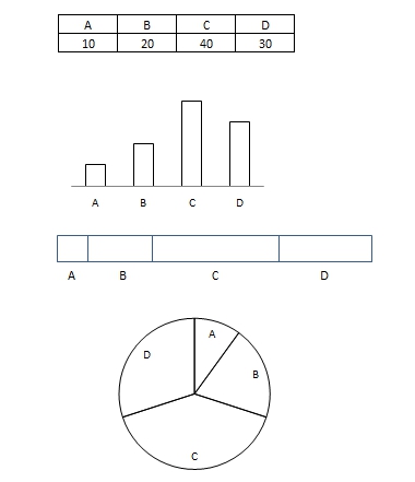
Cleveland and McGill (1984) were the first to develop a theory of graphical perception based on the observation that certain perceptual judgments were made more accurately than others and that, as a consequence, graphs that incorporated these elements would be more-or-less successful depending on which elements they employed.
As Naomi Roberts points out – We make angle judgments when we read a pie chart, but we don’t judge angles very well. These judgments are biased; we underestimate acute angles (angles less than 90°) and overestimate obtuse angles (angles greater than 90°). Also, angles with horizontal bisectors (when the line dividing the angle in two is horizontal) appear larger than angles with vertical bisectors. (Naomi Robbins, Creating More Effective Graphs, Wiley, 2005, p. 49)
Hence, it would appear that pie charts are not as effective as bar charts for comparison of proportions.
But is that always the case? Let us find out!
When do pie charts work?
A pie chart is a very useful tool for displaying proportions, especially when the user is required to make comparisons using a combination of components.
In 1991, Ian Spence and Stephan Lewandowsky performed a series of experiments which suggest that pie charts are superior to bar charts when the reader is required to make comparisons of components and combinations of components.
When users were asked to make comparisons such as A+B Vs. C+D, pie charts actually fared better than a bar chart or a table.
We are very good at spotting 90% and 180% on a circle. A pie chart has natural anchors at 0%, 25%, 50%, 75% and 100%, making it easy to read values that fall on these anchors.
Pie charts work well to show a part-to-whole relationship. Pie charts are also good to highlight on a particular segment or subset in comparison to the whole.
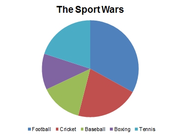
For example, in the chart below, we can see that football seems to be the most popular sport. But can you spot which is second? Is it Tennis or Cricket?
P.S – I totally made up this data, so don’t worry, your favorite sport is safe 🙂
Pie charts work for relative proportions using 2 wedges. A pie chart with just 2 wedges is easy to read and compare.
When do pie charts not work?
Pie charts do not work well for precise comparisons especially if there are no labels. Going back to the example in Figure 4, comparing data points is not what a pie chart does well.
Side by side comparison of components is not a strength of pie charts. As you can see from the visual below, it is very hard to compare two pie charts side by side.
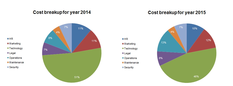
A pie chart is not a comparison chart.
Edward Tufte said “the only worse design than a pie chart is several of them, for then the viewer is asked to compare quantities located in spatial disarray both within and between pies” (Edward Tufte, The Visual Display of Quantitative Information, Graphics Press, 1983, p. 178.).
Pie charts tend to be cluttered as the number of categories increase. A pie chart simply doesn’t scale well to more than 2 categories.
Pie charts do not work well for showing trends. They are terrible at showing trends with absolute numbers. Showing trends involve comparisons and as we know pie charts are not meant for comparing values.
What are the alternatives to a pie chart?
The alternatives to a pie chart depend on what type of message we want to communicate.
One option is to show the numbers directly without the need for a graph.

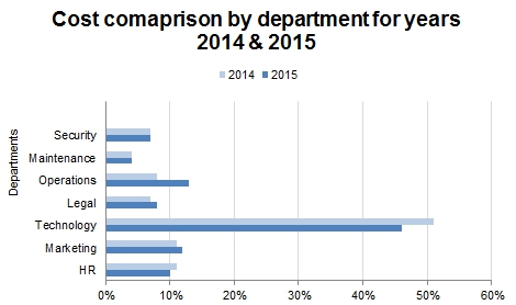
A bar chart works well for comparing values side by side. Compare the visual below to Figure 6. A bar chart is a clear winner!
A slope chart may be even better.
If the intent is to maintain the part-to-whole relationship from a pie chart, a horizontal 100% stacked bar chart often works well.
A simple bar chart can also be tweaked to build in the part-to-whole relationship by adding a percentage scale.
As you can see, the alternatives to a pie chart are endless. This is not to say that a pie chart is all bad and you should always use the alternatives. If you are using a pie chart or for that matter any chart in your visual, pause and ask why. If you can justify the use of a chart in a visual, then you have given it enough thought. Play the pie to its advantages if you must use it!
References and further reading
[1] Applied Cognitive Psychology Vol.5 (61-77) 1991, Displaying proportions and percentages, Ian Spence and Stephan Lew Andowsky, http://www.psych.utoronto.ca/users/spence/Spence_Lewandowsky_1991.pdf
[3] Journal of Educational and Behavioral Statistics Winter 2005, Vol. 30, No. 4, pp. 353–368
http://www.psych.utoronto.ca/users/spence/Spence%202005.pdf
[4] http://www.storytellingwithdata.com/blog/2014/06/alternatives-to-pies


One Comment