Makeover Monday: Digital Economy and Society Index (DESI)
Original
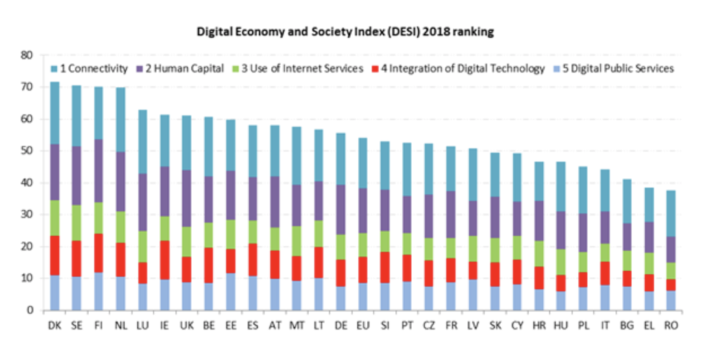
What works well?
- Easy to compare the total DESI score.
- Nice sorting from highest to lowest.
- The abbreviated country codes work well in the horizontal axis.
What does not work?
- Hard to see the trend for the 5 parts.
- Use of colors in the bars. My eyes are drawn towards Integration of Digital Technology and I expect that to be the main story. But being a middle bar in the stack, it is not easy to compare the values for the red bars.
- The title can be actionable.
Makeover
For this makeover, I wanted to tell 2 stories with the chart.
- Which countries improved the most?
- Which countries have the highest and lowest DESI scores in 2018?
I decided to go with a dot plot to show the DESI scores for 2017 and 2018. The main focus of this chart is to show the growth from 2017 to 2018. Hence I sorted the countries in descending order of growth.
It is easy to see who leads the pack and who is at the trailing end. It is also easy to see who improved the most and least.
I kept the European Union 28 average value in the chart because it gives a nice picture of who is above and below average, both in terms of growth and DESI scores.
Here is the makeover. I created this dot plot in Datawrapper.
This is just one way to visualise this data better.
What are your thoughts on this makeover? Do you have suggestions on how you would improve this? Please let me know in the comments below.
You can download the data for this makeover here.


One Comment