I was introduced to the concept of signifiers and affordances by Don Norman’s book, “The Design of Everyday Things”.
Though this post is about signifiers, it is important to start with affordances as they go hand-in-hand.
What are affordances?
The term affordance was coined by James Gibson (1977, 1978) and concept originates from ecological psychology. Gibson viewed affordance as action possibilities offered by the environment to the animal.
Years later, in 1990, Don Norman, in his book, “The Design of Everyday Things”, defined affordance as the relationship between a physical object and a person.
Well, the definition of affordance that I relate to most in data visualization is
Affordances suggest what action is possible – Don Norman
A common example for affordance is what action is possible on a door? Push or Pull or Slide? Sometimes we can tell by looking at the door. But sometimes we need a nudge, a signifier.
What are Signifiers?
Signifiers communicate where the action should take place. A signifier is a perceivable indicator.
A door handle or a sign that says ‘slide the door’ is an example of a signifier.
Signifiers in Data Visualization
We tend to believe that signifiers do not apply to static visualizations as there is no interaction with the user. I think of it this way – a user does interact with a static visualization – understanding the graph, taking action based on the graph. In static visualization, signifiers tell our readers where they should focus and what action should they take?
There are 4 important signifiers in visualization:
- Highlight
- Bold
- Color
- Size
- Title
- Sub-title
- Annotation
Highlight
Highlighting in visualization helps us direct our reader’s attention to the most important aspects of the graph. However, it is essential to remember that over highlighting dilutes the effect of highlight.
Bold
Bold text means more important. Bolding a text adds minimal visual noise and indicates that the text is important.
Color
The color is one of the most powerful preattentive attributes and when used wisely, it can drive our reader’s attention to where we want them to focus on. Again, too much color can dilute the effect of color and leave the reader confused.
Size
Size is another way to highlight and signal importance. A bigger font size indicates that the message is important.
Title
The title is one of the first things that a reader sees in a graph. A good title clearly communicates the message of a visual.
Ann Emery and Stephanie Evergreen have written wonderful posts on this topic.
One of the points they suggest is to make the title a declarative statement. Instead of saying “XYZ company sales for 2015-16” say “ XYX company sales increased by 16% quarter-on-quarter during 2015-16”. The title is valuable real estate. Make it stand out.
Sub-title
A subtitle can provide additional helpful information to the reader and allow them to understand the visualization better and in turn, draw conclusions.
For example, a subtitle could be “Our new product launch in Q3 was a huge success with a $173 million in sales for the quarter”
Annotations
Use annotations to call out attention to specific parts of the graph. A good practice is to keep them short and only provide important information.
An Example
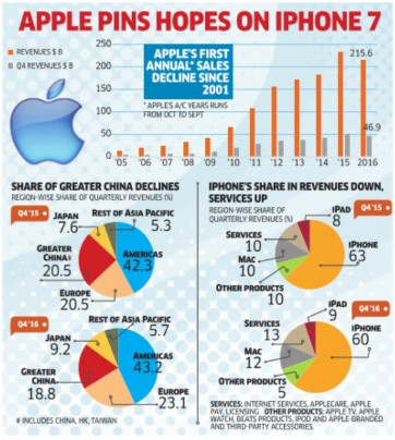
Let’s look an example and try to identify signifiers.
What do you think stands out in this graph? What are you, as a reader, being asked to focus on?
Truth be told, it is very confusing. The colorful pie charts fight for our attention. The bar chart is almost non-existent and the apple logo definitely catches our attention.
In the absence of clear signifiers, confusion ensues.
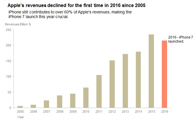
Now let me show you another version of this graph
Let’s answer the same questions:
What do you think stands out in this graph?
What are you, as a reader, being asked to focus on?
The title and the red bar stand out in the graph.
I am being asked to focus on the decline in Apple revenues for the first time and Apple’s dependence on the iPhone sales. Boom! No confusion!
What are the signifiers here?
Highlight – Bold and bigger title text, Red color of the bar for 2016
Title text
Subtitle text
If you are Apple and you want to build a plan to increase revenues and reduce dependence on one product, you got your audience’s attention to present the story now.
Conclusion
Good design is easy to understand, navigate and use. A visualization hinges on good design. Signifiers are one of the most important aspects of a good design. Next time you create a graph, pay attention to the signifiers. I promise it will be worth your while.
If there are additional signifiers you use in your work, please let me know in the comments section below. Sharing will make us all better designers. Thanks for reading!


Hi Vidya,
This is Sankar, your UG classmate.
I am not into any report development work.
But, I have come across few charts where they also use smileys as signifiers. i.e., happy smileys for ups and sad smileys for downs in any scale. Not sure if this is useful info.
Thanks for the response Sankar, nice to hear from you! Good point. Smileys or emojis can act as mood signifiers. If we are creating a fun chart, there is no harm using emojis (in moderation) to tell our audience we are happy or sad. In professional settings, where this may not be encouraged, we can use color to show the mood. Green for ups and red for downs for example.