You are currently viewing Sketching survey data
Survey-sketch

Sketching survey data

  • Post author:
  • Post comments:0 Comments
  • Reading time:3 mins read

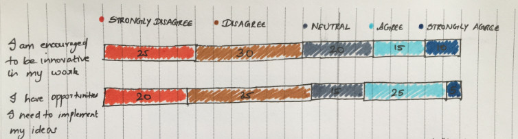
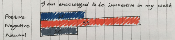
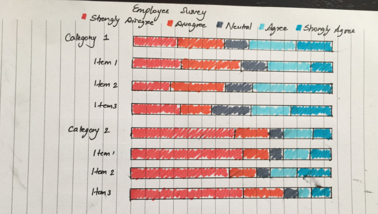
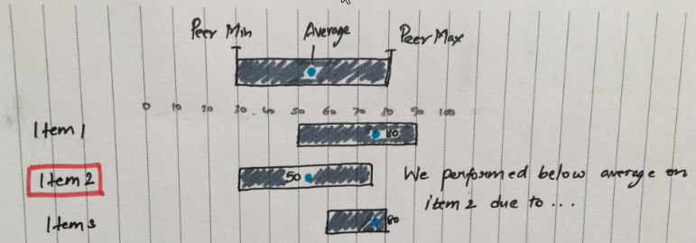
The creative part of my brain has been asleep for a very long time 🙁 If you are like me, one way to get your creative juices flowing is to sketch on paper. This is a post with sketches on how to visualize survey data.


A Simple Stacked Bar
A simple stacked bar and a simple survey


A survey with more categories
A survey with more categories, stacks are getting messy
Diverging Stacked Bar
Diverging stacked bar to the rescue. Positives and negatives are aligned to a center.
Diverging Stacked Bar with a neural responses
Diverging stacked bar with neutral responses. Neutral is split at the center.
Diverging Stacked Bar with a neural responses
Diverging Stacked Bar with neutral responses split at the ends.
A Clustered Bar
A clustered bar, to give that individual attention
A Clustered Bar with positives and negatives grouped
A clustered bar with all positives and all negatives grouped
Showing performance in categories
Showing performance in categories. Category/Theme can also be ranked.
Peer Comparison
Peer Comparison. How did we do compared to peers, averages?

There are so many ways to show survey data. It all depends on the story we want to tell. More on that in another post.

Are there any more sketches you would like to add?

P.S. Most of the data is fabricated.

Leave a Reply

This site uses Akismet to reduce spam. Learn how your comment data is processed.