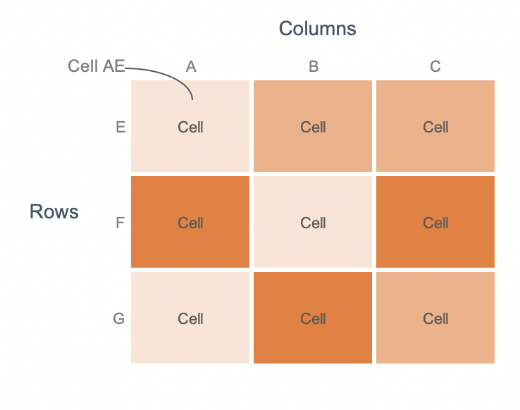
#SWDChallenge : visualize variance
For this month’s SWDChallenge, Cole challenged us to visualize the variance in data. The mode, the median or the mean may not be a model that represents the entire dataset accurately. Hence it is important to visualize variance.