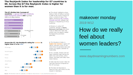
Makeover Monday: How do we really feel about women leaders?
Original Analysis of the original Here are a series of questions I use to analyse a chart. Where are my eyes drawn?: My eyes are drawn to the blue arc for G7 average. What works in this visual?: The circular bars are sorted. Good use of colors to represent countries and average. Identify clutter, make…