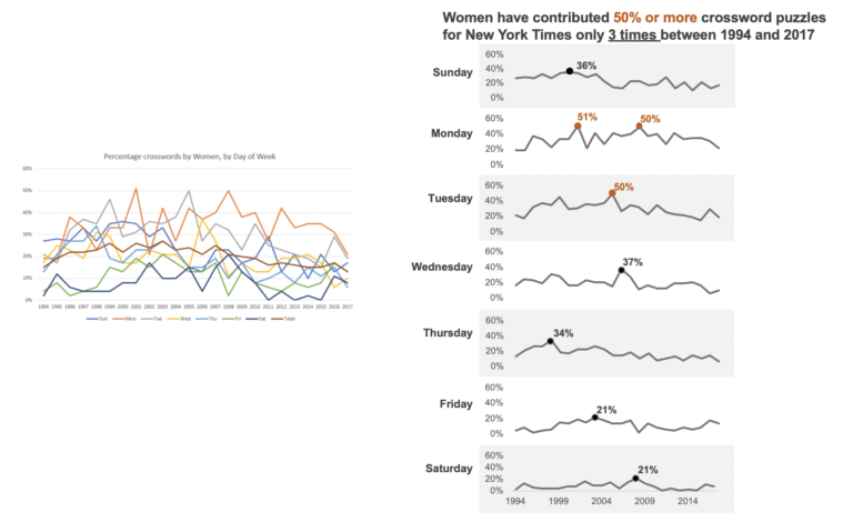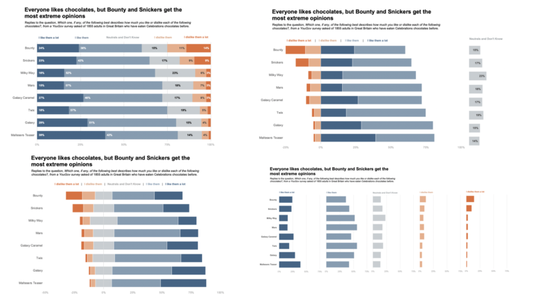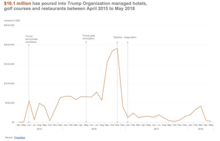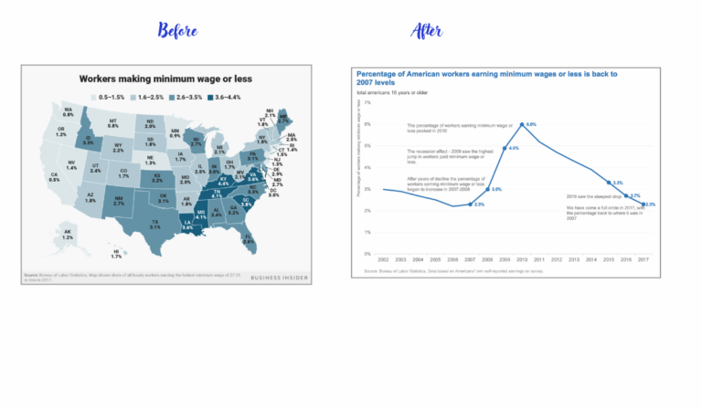
How to add annotations to charts
For this makeover, I wanted to practice annotations on charts. Annotations help our readers better understand the context and our argument with the graph. They can also help us highlight specific points and show readers what to focus on.