Skip to content
Daydreaming Numbers
  • Start here
  • BlogExpand
    • Design Thinking
  • ResourcesExpand
    • Chart guide
    • Makeovers
    • How-to
  • About
  • Portfolio
  • Work with me
Daydreaming Numbers
  • declutter-after

    Less is more: Declutter your charts!

    Removing unnecessary elements when communicating with charts can greatly impact the effect the chart has on your audience. If a chart appears complex, we assume it is hard to read.

    Read More Less is more: Declutter your charts!Continue

  • Makeover Monday: Which states produce the most wind energy?

    Makeover Monday: Which states produce the most wind energy?

    My aim with this makeover was to declutter the chart and show 3 pieces of information – installed capacity, investment and number of homes powered by Wind Energy.

    Read More Makeover Monday: Which states produce the most wind energy?Continue

  • Measures of variation

    Basic statistics for exploring data : Measures of Variation

    Measures of variation describe the width of a distribution. They define how spread out the values are in a dataset. In this article, we will look at 4 measures of variation and when to use them.

    Read More Basic statistics for exploring data : Measures of VariationContinue

  • MOM 2019 W7.png

    Makeover Monday : President Trump’s “Executive Time”

    The original shows 297 hours in executive time. I wanted to answer the question what percentage of each workday does Trump spend in executive time?

    Read More Makeover Monday : President Trump’s “Executive Time”Continue

  • SWDChallenge_Feb_2019

    #SWDChallenge : visualize variance

    For this month’s SWDChallenge, Cole challenged us to visualize the variance in data. The mode, the median or the mean may not be a model that represents the entire dataset accurately. Hence it is important to visualize variance.

    Read More #SWDChallenge : visualize varianceContinue

  • Makeover Monday: How Chinese New Year compares with Thanksgiving

    Makeover Monday: How Chinese New Year compares with Thanksgiving

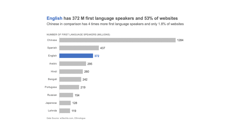
    For this makeover, I wanted to bring in some context with population. Comparing China and US is not fair game. China’s population is at least 4 times that of US.

    Read More Makeover Monday: How Chinese New Year compares with ThanksgivingContinue

  • Dot Plot

    What are dot plots in data visualization?

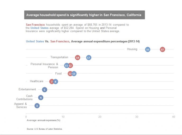
    Dot plots use dots to represent the position of value on the axis. They are useful for comparisons and are a good replacement for bars or clustered bars.

    Read More What are dot plots in data visualization?Continue

Page navigation

Previous PagePrevious 1 2 3 4 5 6 … 10 Next PageNext
  • Blog
  • Resources
  • About
  • Work with me
  • Privacy Policy

© 2026 Daydreaming Numbers - WordPress Theme by Kadence WP

  • Start here
  • Blog
    • Design Thinking
  • Resources
    • Chart guide
    • Makeovers
    • How-to
  • About
  • Portfolio
  • Work with me
Search