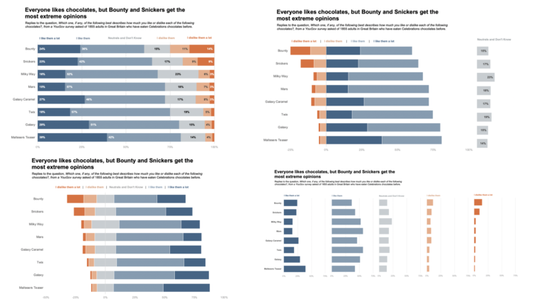
MakeOverMonday – How many women have constructed crosswords for The New York Times?
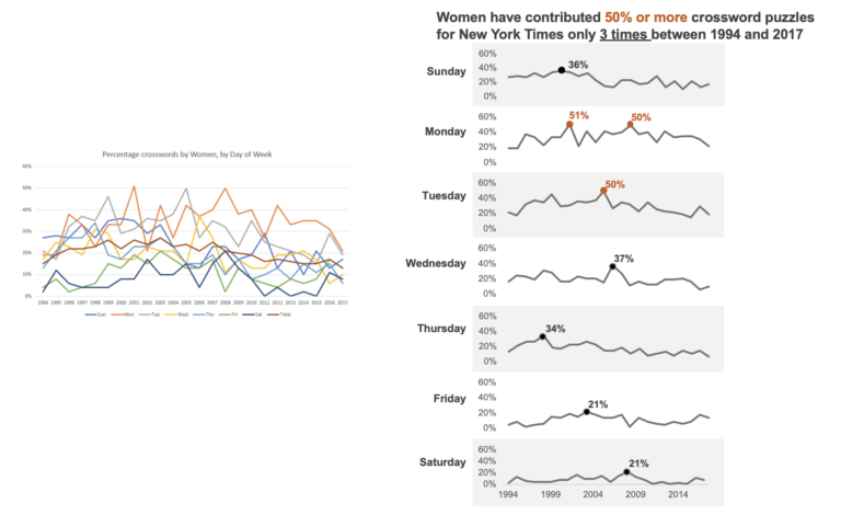
This week’s MakeOverMonday dataset comes from XWord Info. Here is the original graph What works well? The title is clear. The time is alone the X-axis, which is how we normally visualize time. What could be better? The 7 lines create a spaghetti effect. It is not easy to see the trend of a single…