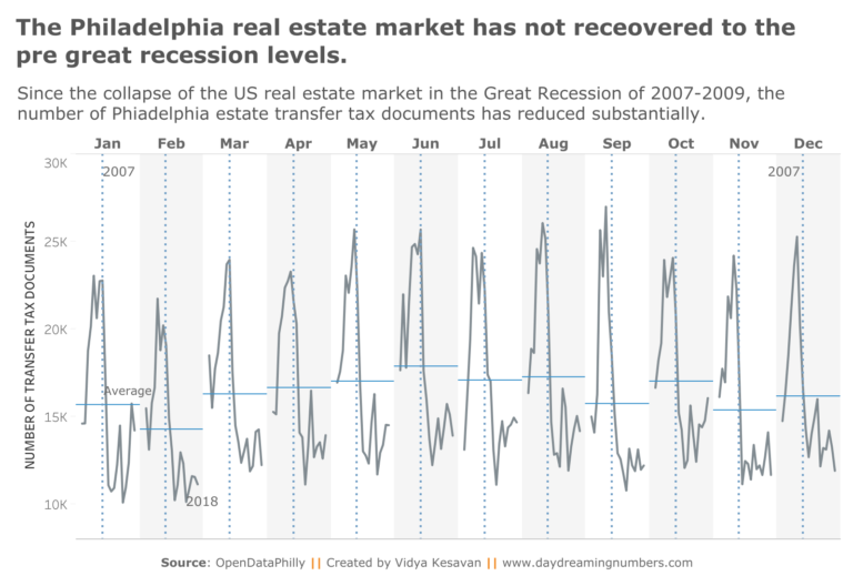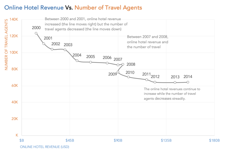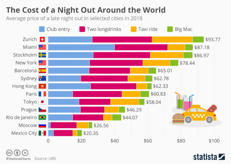
How to fix a multi-colored stacked bar chart?
The problem with using so many colors in a chart is it introduces a sense of complexity. People perceive more aesthetic designs as easier to use. They tend to be more engaged with a chart if it appears pretty.