Makeover Monday: Operation Fistula
My aim with this makeover was to create a chart that shows the relation between Obstetrics Fistula (OF) and lifetime maternal deaths in various countries.
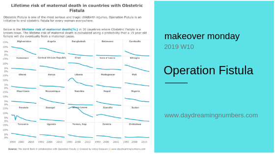
My aim with this makeover was to create a chart that shows the relation between Obstetrics Fistula (OF) and lifetime maternal deaths in various countries.
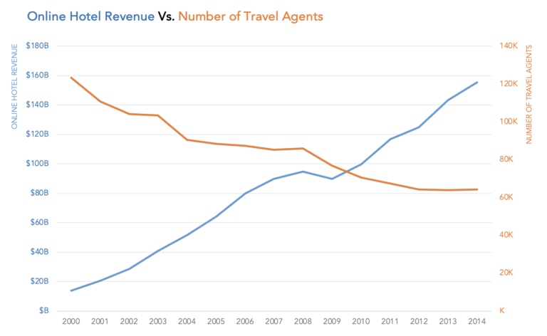
Like with most other charts, dual axis charts have their good and bad. They are often used to compare two data series in a small amount of space.

Sometimes we need more than one chart to communicate our message. This makeover is a good example of how one chart may be inadequate to convey the whole story.
Removing unnecessary elements when communicating with charts can greatly impact the effect the chart has on your audience. If a chart appears complex, we assume it is hard to read.

My aim with this makeover was to declutter the chart and show 3 pieces of information – installed capacity, investment and number of homes powered by Wind Energy.

Measures of variation describe the width of a distribution. They define how spread out the values are in a dataset. In this article, we will look at 4 measures of variation and when to use them.

The original shows 297 hours in executive time. I wanted to answer the question what percentage of each workday does Trump spend in executive time?