Nike in Asia – Visualization project

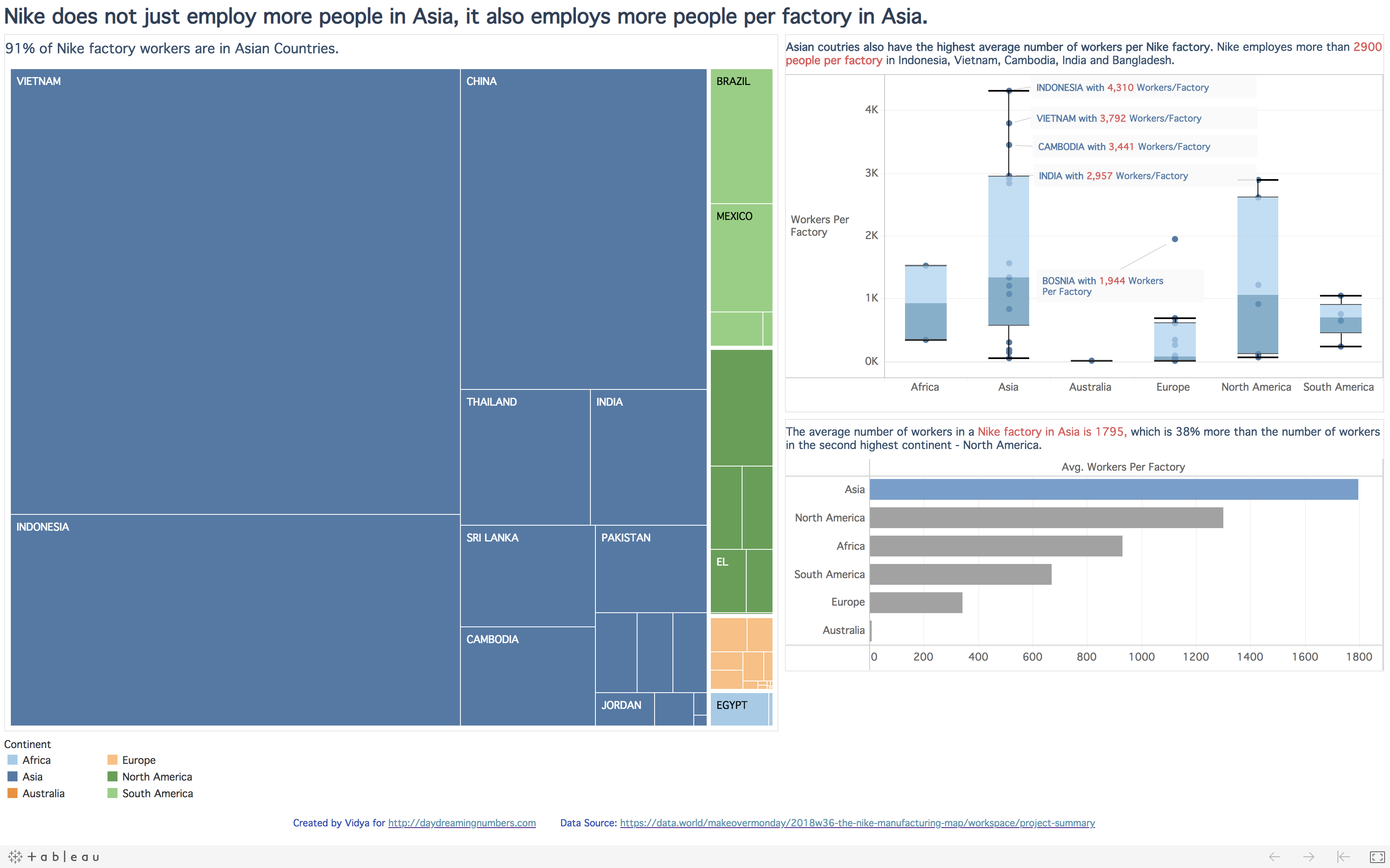
This visualization project was created as part of the MakeOverMonday project. Dataset The dataset for this project is hosted on Data.world The original visualization My goals with this visualization project: My main goal with this project was to make it Explanatory. I set out to answer these questions with this project: Where does Nike have the most number…

0 Comments

Overtourism Vs Undertourism

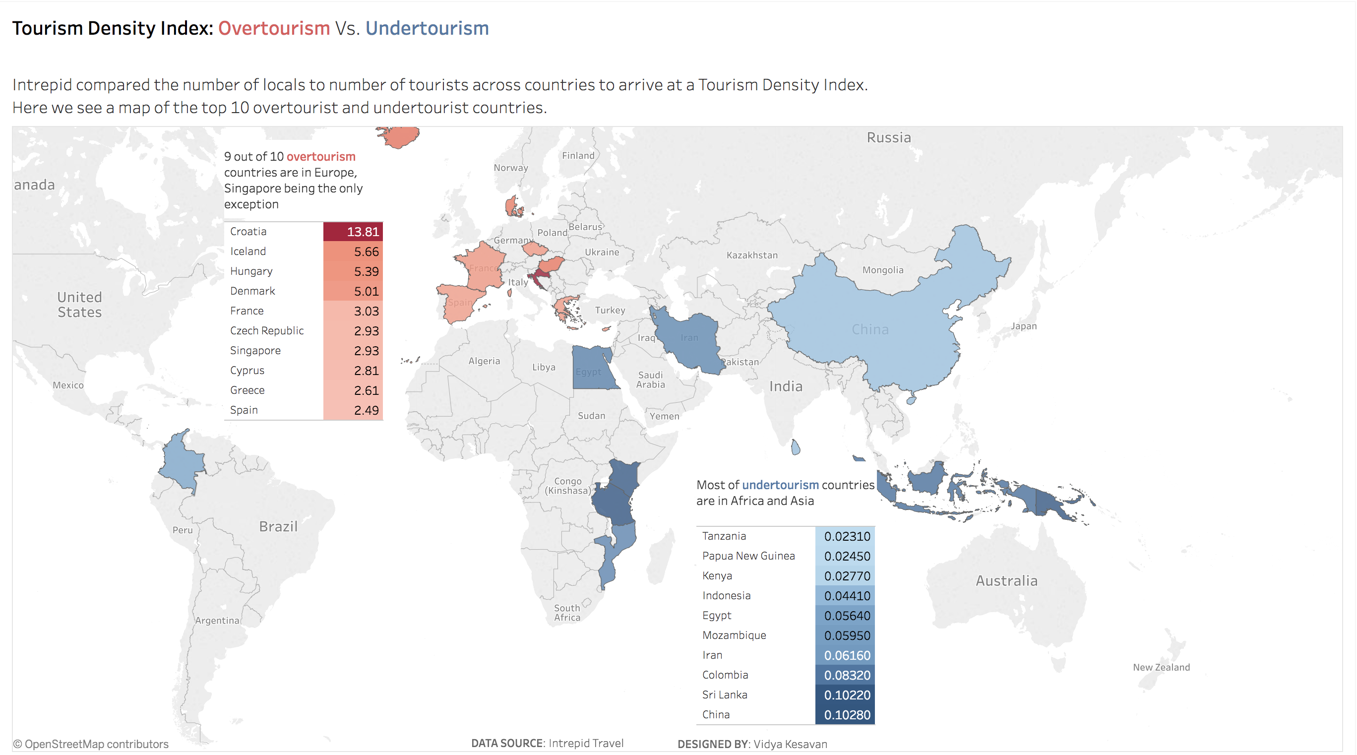
Dataset The dataset for MakeOverMonday project is hosted on data.world. Original Visualization What works in the original visualization? The visual represents the overtourism and undertoursim magnitudes in a single graph. The terms overtourism and undertourism are explained well. What doesn't work in the original visualization? Circular shapes are not best suited for comparison and I…

1 Comment

Makeover Monday Project – iPhone revenues

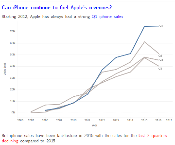
This week I decided to work on the data from the Makeover Monday Project. I used Tableau to create the visual. Using a tool like Tableau, I realized, offers great flexibility in the number of charts I can create in the exploration phase. Having created most of my  previous visuals using Excel, this was a…

0 Comments

Visual of the Day – Bird Extinctions

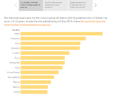
The only way to learn visualization is to create more visuals. If you are like me and struggle to find data or topics to visualize, here is a project for you to work along. Visual of the Day is a project to create a visual story based on the daily celebration topic from NationalDayCalendar. Today is…

0 Comments