#SWDchallenge : let’s try something new!
January 2019 SWDchallenge is all about going beyond our comfort zones – to make a visualization using a new tool. I make most of my visualizations using R, Excel or Tableau. For this challenge I decided to try Datawrapper.
I am a huge fan of blog posts on Datawrapper. I have never used Datawrapper before, so I signed up for a free account. I remade this chart that I had originally created back in September 2018 in Excel.
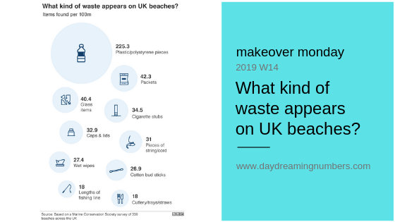
Original chart created in Excel
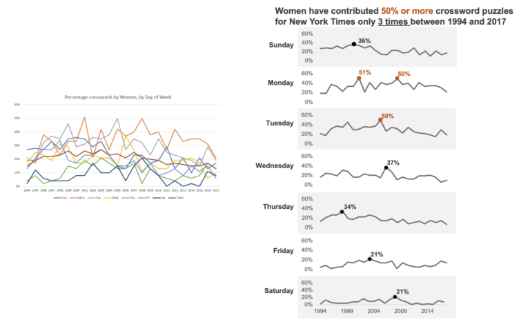
Datawrapper chart
How did I go?
Datawrapper is a very simple tool and it took me less than 30 minutes to create this chart. The interface is intuitive and I could get this chart looking almost like the original. Here are the features I liked the most about Datawrapper.
Easy to learn:It is very simple to learn and use. It took me less than 30 minutes to sign up and create this chart.
Multiple options to import data: One can copy and paste the data, upload xls or csv file, import a google spreadsheet or link to an external dataset.
Range of useful chart types: The tool gas a range of chart types to choose from: tables, bars, dot plots, arrow plots, lines, area charts, pies and donuts.
Clean interface: Nice interface to edit colors, title, data source. The tool also provides different chart sizes to suit various devices.
Colorblind check: The colorblind check feature is inbuilt and is very useful to see how the chart looks like for different color blindness. I appreciated this feature the most.
But there were some frustrations:
- It took me a bit of time to figure out how to get the number formatting to show percentages.
- I couldn’t figure out how to get back-to-back bars, then accidentally clicked on the option “Mirror bars” and it worked.
- The one thing I couldn’t do was vary the color saturation for the bars as I had done in Excel or add color emphasis to the title.
I think Datawrapper is very intuitive and can help create insightful visualizations in just a few minutes. I can see myself using it in the future again!


One Comment