Reframe for clarity
As data viz creators, we are in a constant battle between the multiple ways in which we can present our data to an audience. Which is the best way to present the data? It depends. There is no one best way. But a good practice to follow is to choose one with clarity.
Let me provide an example. Take a look at the graph below.
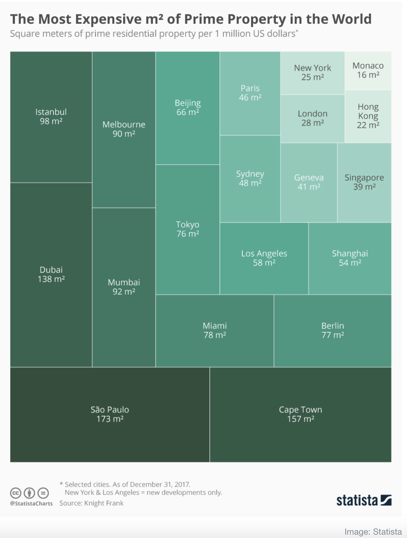
This is a treemap showing the most expensive square meter of property around the world.
It took me a bit of time to orient myself to the message. The graph shows how many square meters of property one can buy for 1 million US dollars. The more square meters of property one can buy, the less expensive the property.
While there is nothing wrong with this approach, a simpler approach is to show the cost per square meter of the property. We measure expensiveness of property by the cost per square footage, not by how much we can buy for 1 million dollars (given that most of us have never seen a million dollars).
So here is the same data, after a small calculation to arrive at the cost per square meter. The message is straightforward and the graph ranks the top 20 places in terms of most expensive real estate.

It is important to ensure the message in a visualization is simple and straightforward. Reframe for clarity not complexity.
Which of these 2 graphs do you think conveys the message with clarity? Do you agree that reframing the message for clarity is a good practice? Let me know in the comments below.
If you would like to use this data to create your own graph, here is the link