9This series is a collection of small changes in data visualization that make a big difference to the end result.
In this article we cover two of the most underrated elements of a graph – Tick marks and Gridlines.
What are tick marks and gridlines?
Tick marks and gridlines do not represent values themselves. They help interpret values in a graph.
Tick marks are the small lines on a scale that establish the position of values on a scale.
Gridlines are horizontal or vertical lines that run through the values on a scale.
Tick Marks
Tick marks are supporting components in a graph. Hence it is a good idea to subdue the tick marks in comparison to the actual data. Thin grey lines usually work well.
The number of tick marks should be proportional to the size of the graph.
In this graph, there are too many tick marks.
Tick marks can be placed inside, outside or on the scale.
Gridlines
Gridlines are supporting components in a graph. Hence they should also be subdued in comparison to the actual data. Thin grey lines usually work well here too.
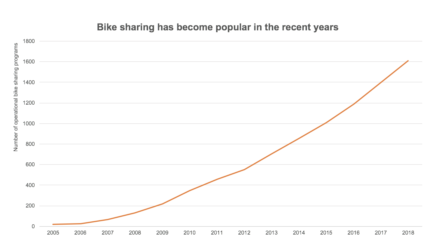
Gridlines are especially useful in wide or long graphs where some values are farther away from the axis. Like in this example below. With a long x-axis it would be hard to read the value for 2018 without the help of gridlines.
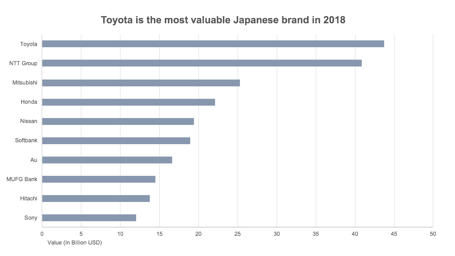
Gridlines are also useful when the values being compared are too close to each other. Like in this one.
Other considerations
I usually avoid tick marks when using gridlines, but this is a personal preference.
Tick marks are not essential for categorical scales. But if you would like to use one, make sure the tick marks are positioned correctly. Default placement of tick marks in tools like Excel is incorrect for categorical data.
In this example below (which is the default from Excel), the tick marks on the x-axis are positioned incorrectly. Notice how hard it is to position where in the scale is the value for 2015?
Be sure to adjust the position of the tick marks so they are in line with the labels, like this one below.


