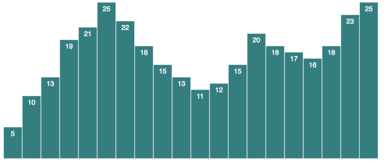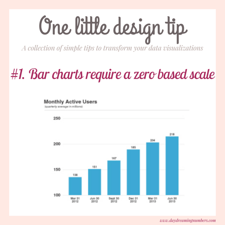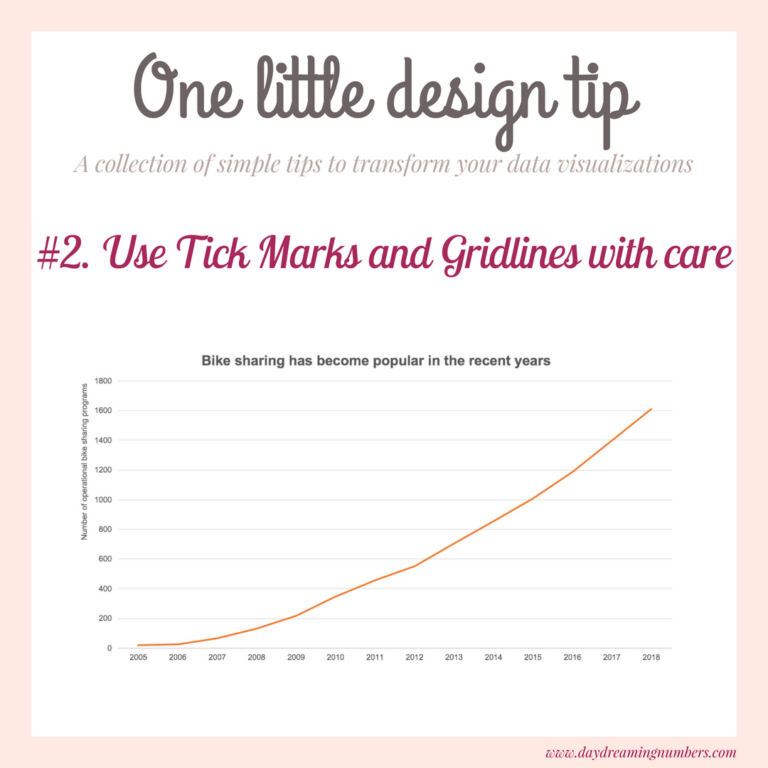
Use Tick Marks and Gridlines with care
9This series is a collection of small changes in data visualization that make a big difference to the end result. In this article we cover two of the most underrated elements of a graph – Tick marks and Gridlines. What are tick marks and gridlines? Tick marks and gridlines do not represent values themselves. They…