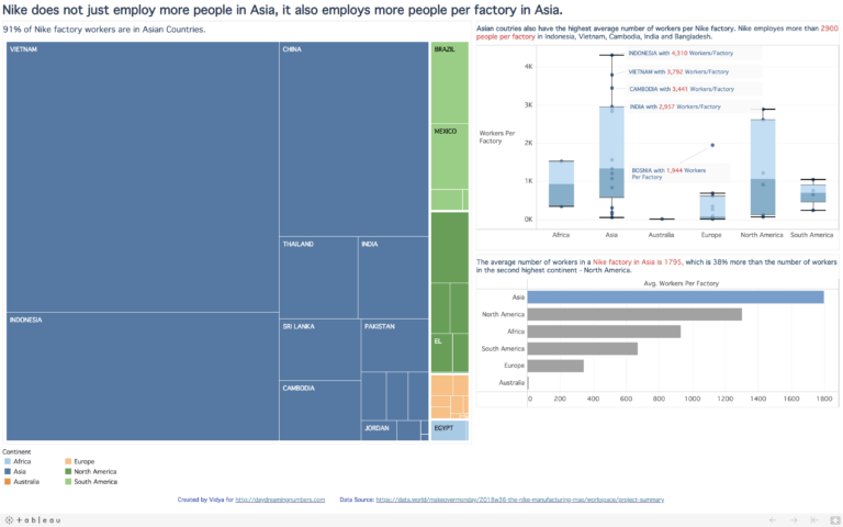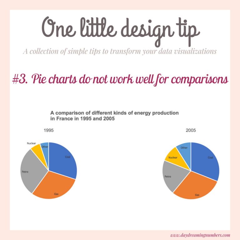
#SWDChallenge: a makeover
The #SWDChallenge this month is a makeover project. The challenge instructions come with a wonderful article by Elizabeth Ricks of SWD on the art of undertaking chart makeovers. I found the article very insightful and I took a lot of notes. In a nutshell, here are a few steps to get started with doing “good…