How to fix a multi-colored stacked bar chart?
A stacked bar (or column) chart is basically a pie chart unrolled to make a stick.
The challenge with stacked bar charts is they are usually not very effective. When we use stacked bar charts it appears as if we are attempting to answer too many questions with a single chart.
In this article, let’s look at one way to fix this problem.
Uses and limitations of stacked bar (or column) charts
Stacked bar charts are good when we want to compare totals across different categories plus within a given category, we want some understanding of the individual sub components.
What are its limitations?
Stacked bar charts are not good to compare the individual sub components across the categories. This is because beyond the first category (first and last in 100% stacked bars), there is no consistent baseline.
This is the main drawback of stacked bar charts. If there is anything of interest happening further up the stack we cannot see it because it is stacked on top of things that are also changing.
How to fix a multi-colored stacked bar chart?
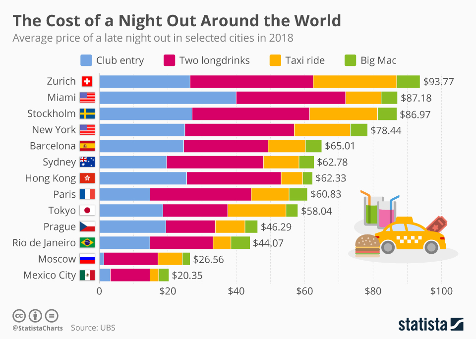
The problem with using so many colors in a chart is it introduces a sense of complexity. People perceive more aesthetic designs as easier to use. They tend to be more engaged with a chart if it appears pretty.
Of course, we could use a different chart type – but let’s assume our audience demands to see all the data and we are short on space.
Here are some ideas to make a stacked bar like the one above easier to interpret.
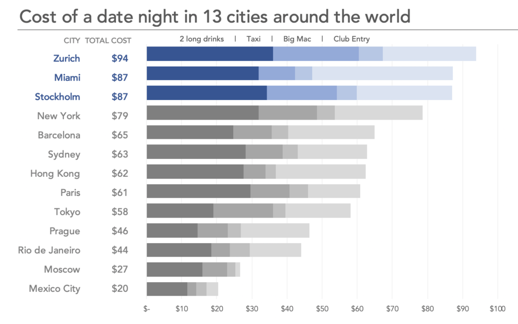
Identify your focus. Stacked bar charts can be used to compare the totals as well as understand the contribution of sub components. But they cannot do both with ease. It is important to identify what your focus with the chart is and arrange the chart accordingly.
In this example, my focus is the total cost, hence the chart is arranged in descending order of total costs. As you can see it is hard to compare the cost of long drinks for instance. Thats a compromise we need to make with stacked bar charts.
Limit the number of sub components in the stack. Stacked bar charts work best with 2 or 3 sub components. If there are too many sub components in your chart, try grouping tinier parts into “others”. In this example, since there are only 4 sub components, I decided to show them all.
Put the piece of most interest in the baseline so it’s easier to compare across categories.
Use color with discretion. Highlight the most important piece with color and subdue the rest using greys.
Can you think of any more tips to add on? Let me know in the comments below.