Creating an infogrpahic

As the Olympic Games and fervor go on for a few more days, FiveThirtyEight.com published an article early this week, titled “Hosting the Olympics is a Terrible Investment“. The ongoing Rio Olympics had overrun its budget by 50% by the time the Olympic torch was lit at the opening ceremonies.

What sort of investment goes into hosting an Olympics?

The below numbers are from a study led by Bent Flyvbjerg at the University of Oxford.

P.S. The study notes that the numbers from China may look skeptical. There is no direct evidence that the numbers have been manipulated and hence they are included in the study with the caveat that the numbers for China are less reliable than those of other nations.
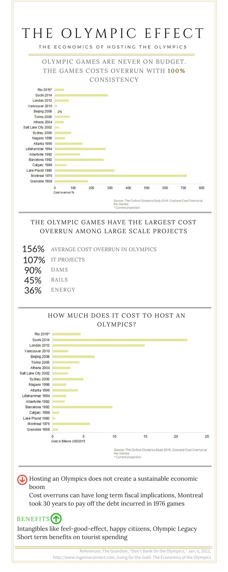
The Cost of Hosting the Olympics

This inforgraphic was created using Canva. The charts were created in Excel. Data and the Excel visuals for this infographic are available here
You Might Also Like

  • Visualizing Survey Data

    Visualizing Survey Data Working back to back on 3 survey visualization projects, I have come to realise that visualizing survey data can be pretty standard for the most part. Yes, every dataset from a survey will be different and insights will be different. But the ways in which we can visualize survey data can be…

  • Sketching survey data

    The creative part of my brain has been asleep for a very long time 🙁 If you are like me, one way to get your creative juices flowing is to sketch on paper. This is a post with sketches on how to visualize survey data.     There are so many ways to show survey data….

  • An alternative to euler’s chart

    Dataset The dataset for MakeOverMonday project is hosted on data.world. Original Visualization What works in the original visualization? The visual represents the overtourism and undertoursim magnitudes in a single graph. The terms overtourism and undertourism are explained well. What doesn’t work in the original visualization? Circular shapes are not best suited for comparison and I…

  • Comparing change through time

    A clustered bar chart is one of the most commonly used representations to compare change through time. A clustered bar chart, though a good option to compare values, does not represent the change through time effectively. Here is some data on which technology products consumers intend to buy in 2016 and how it compares against…

  • Consistency in charts

    In this post let’s talk about the importance of consistency when telling a story with charts. So what is consistency? Consistency in story telling comes from colors, type of charts, font and size of messaging, alignment of various chart objects, to name a few. Consistency is everything that makes a chart look neat and easily readable. Let’s look…

Leave a Reply

Your email address will not be published. Required fields are marked *

This site uses Akismet to reduce spam. Learn how your comment data is processed.