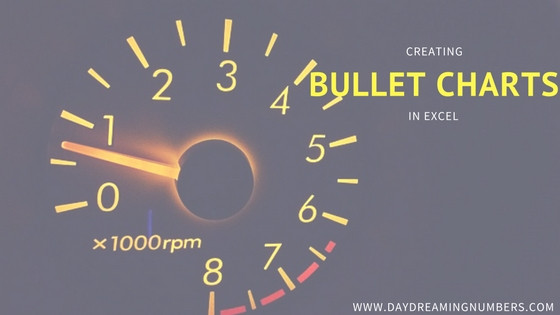
Horizontal and vertical bullet charts in excel
Bullet Charts were developed by Stephen Few to replace the meters and gauges that are often used in business dashboards. Here is one such dashboard from Oracle BI Discoverer tool. The idea of gauges and meters is borrowed from an automobile dashboard where they are used to display data in a small amount of space….